Kids Draw Love
Identity
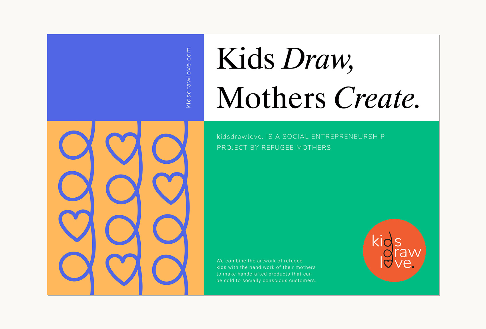
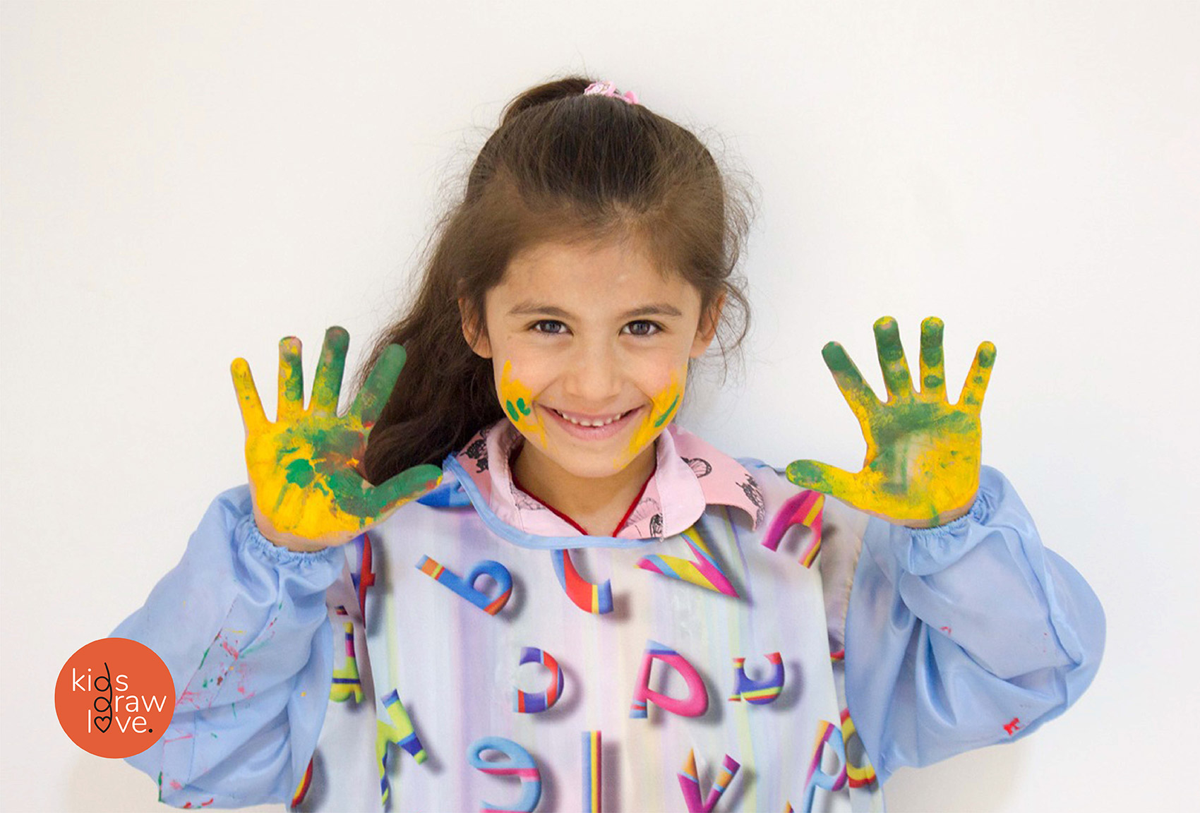
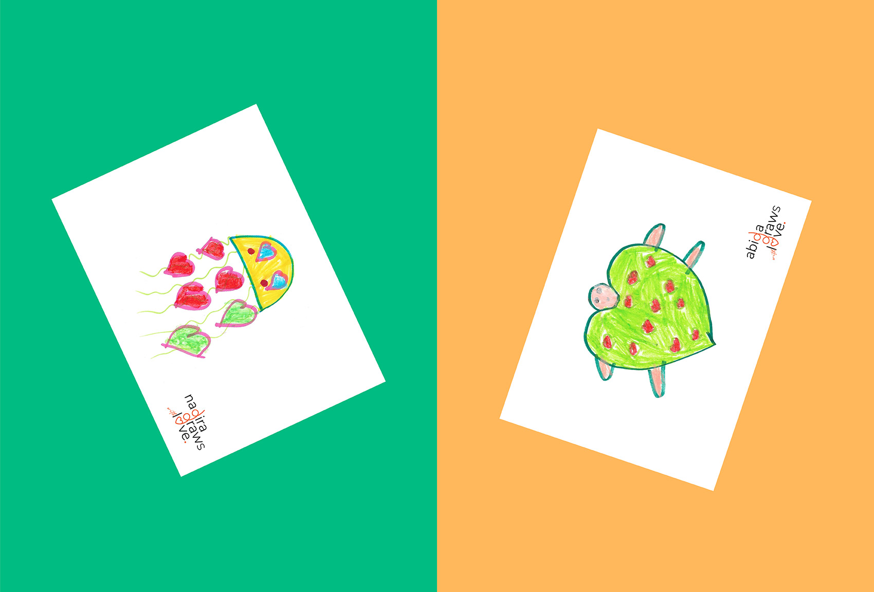
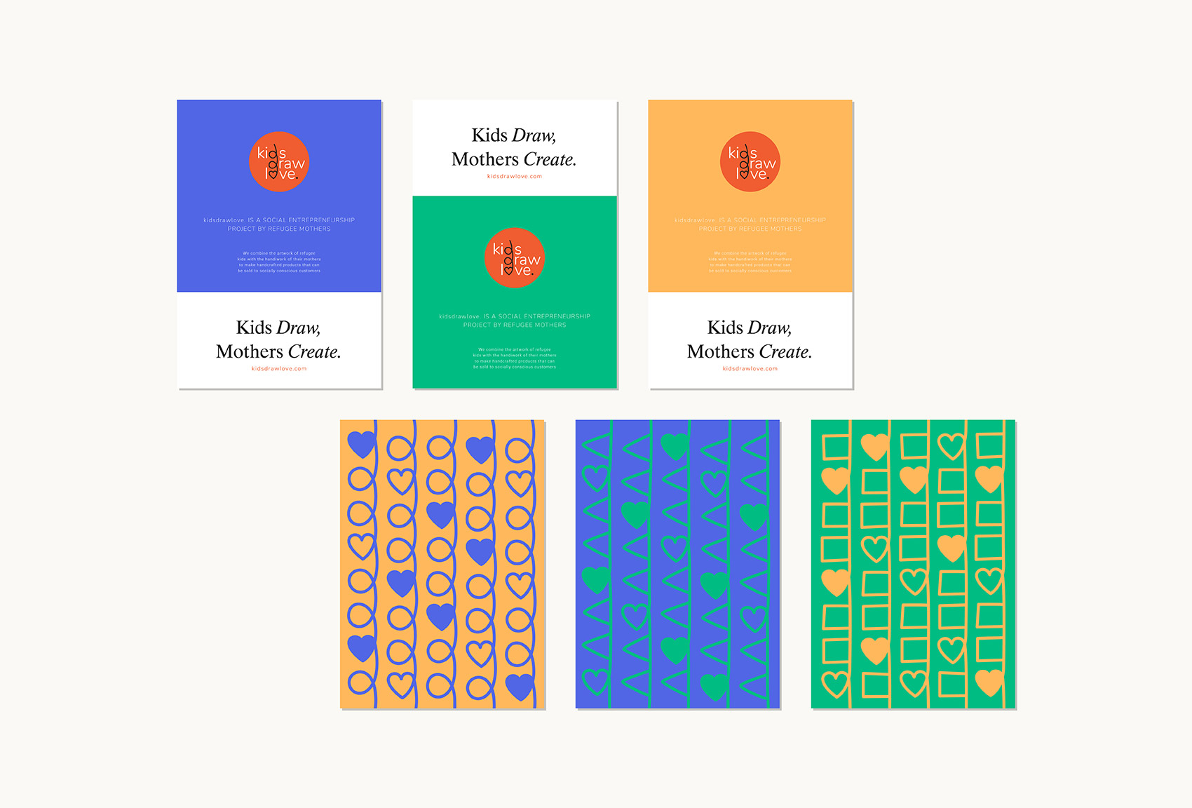
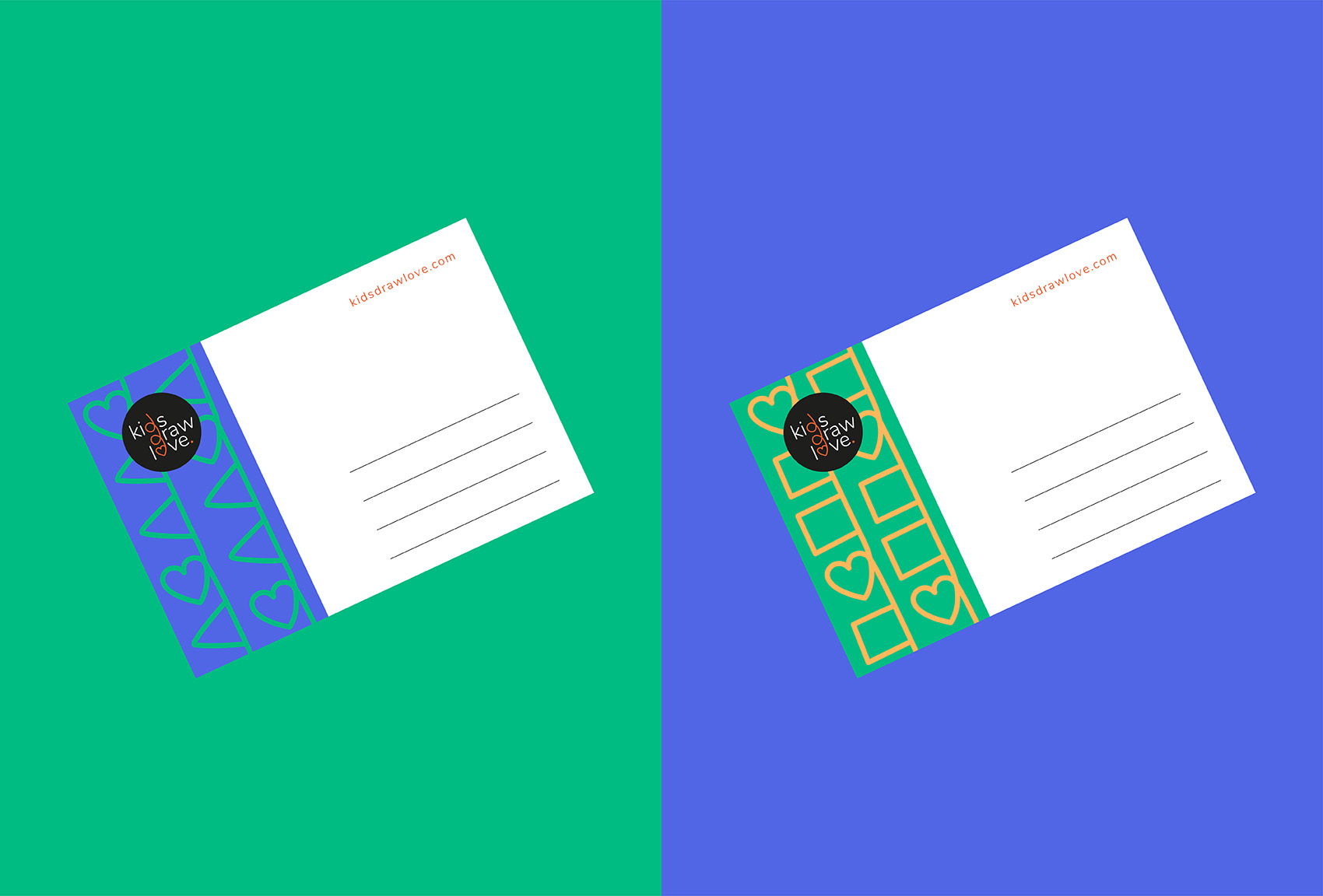
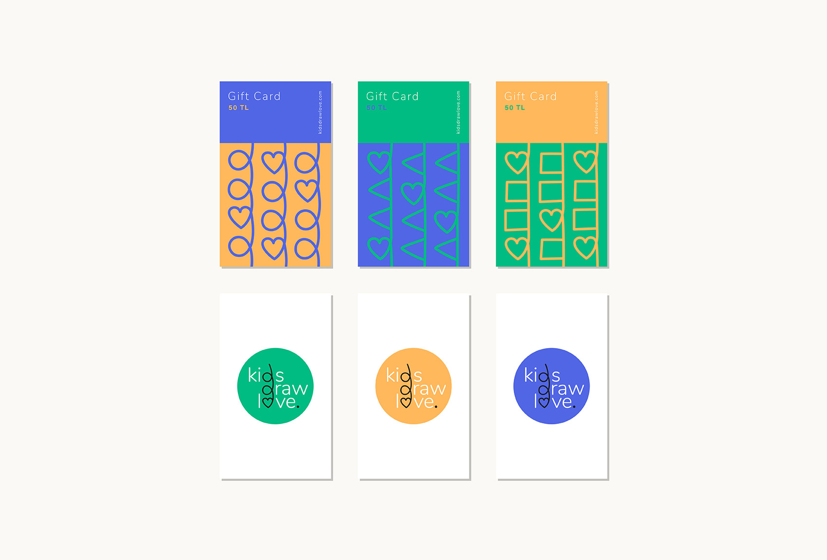
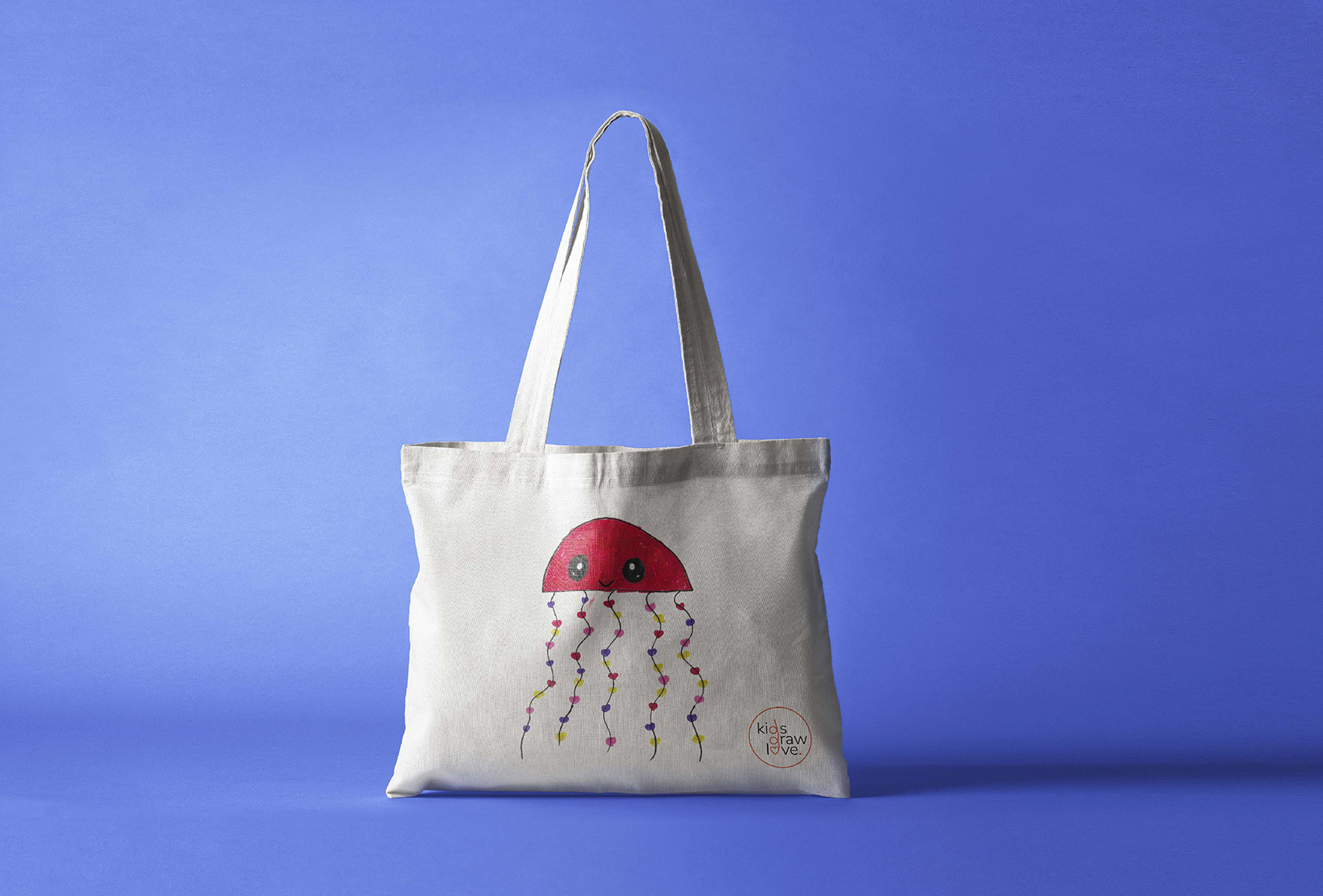
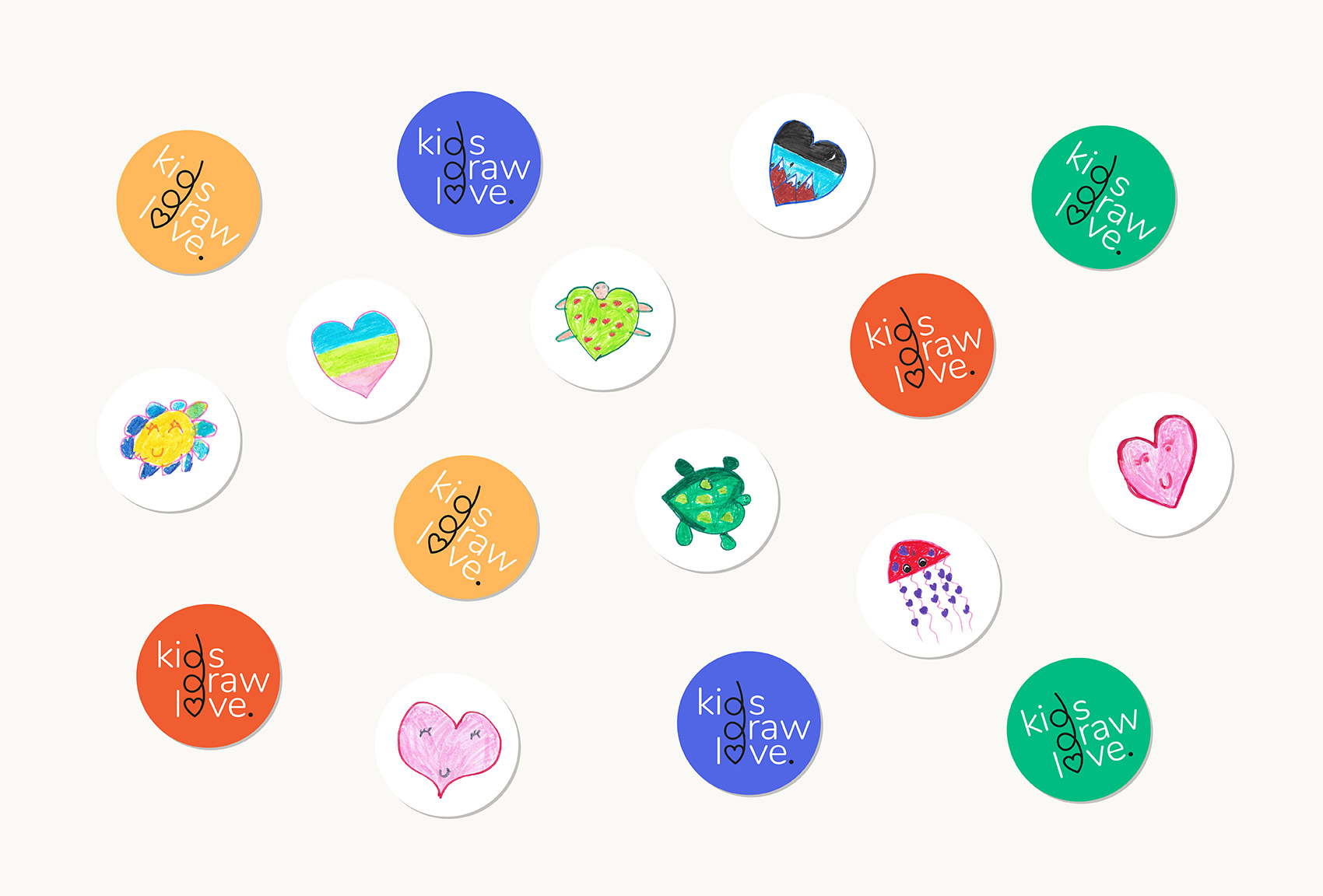
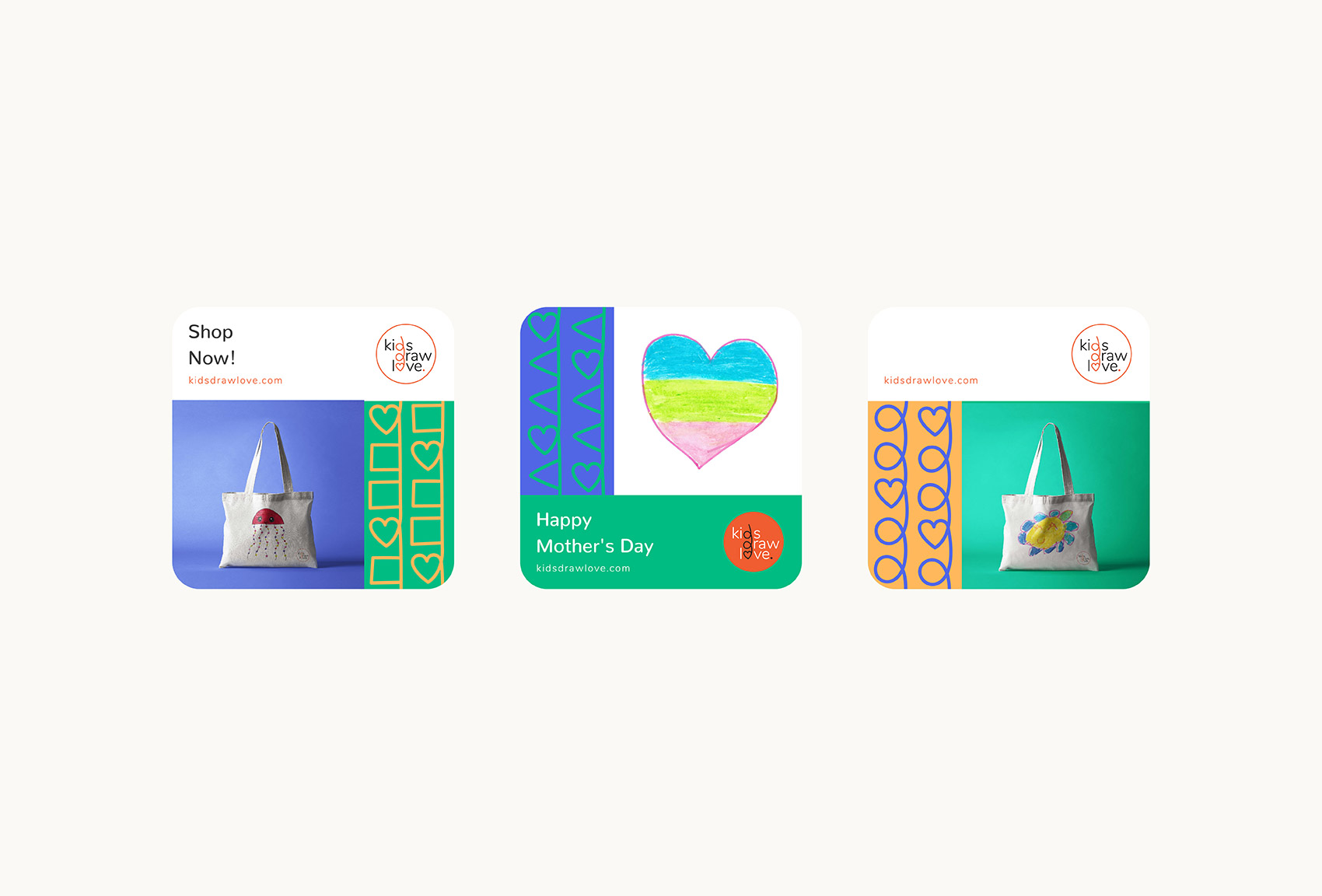
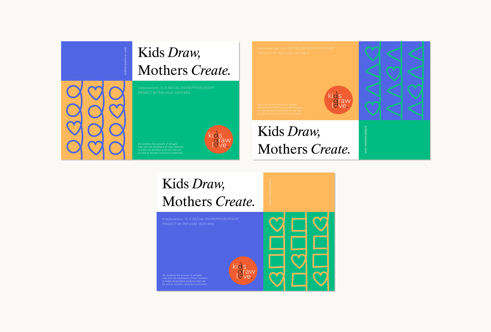
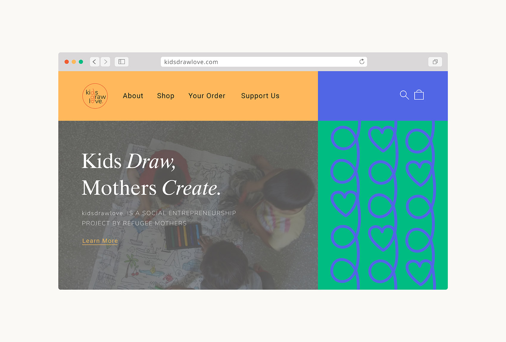
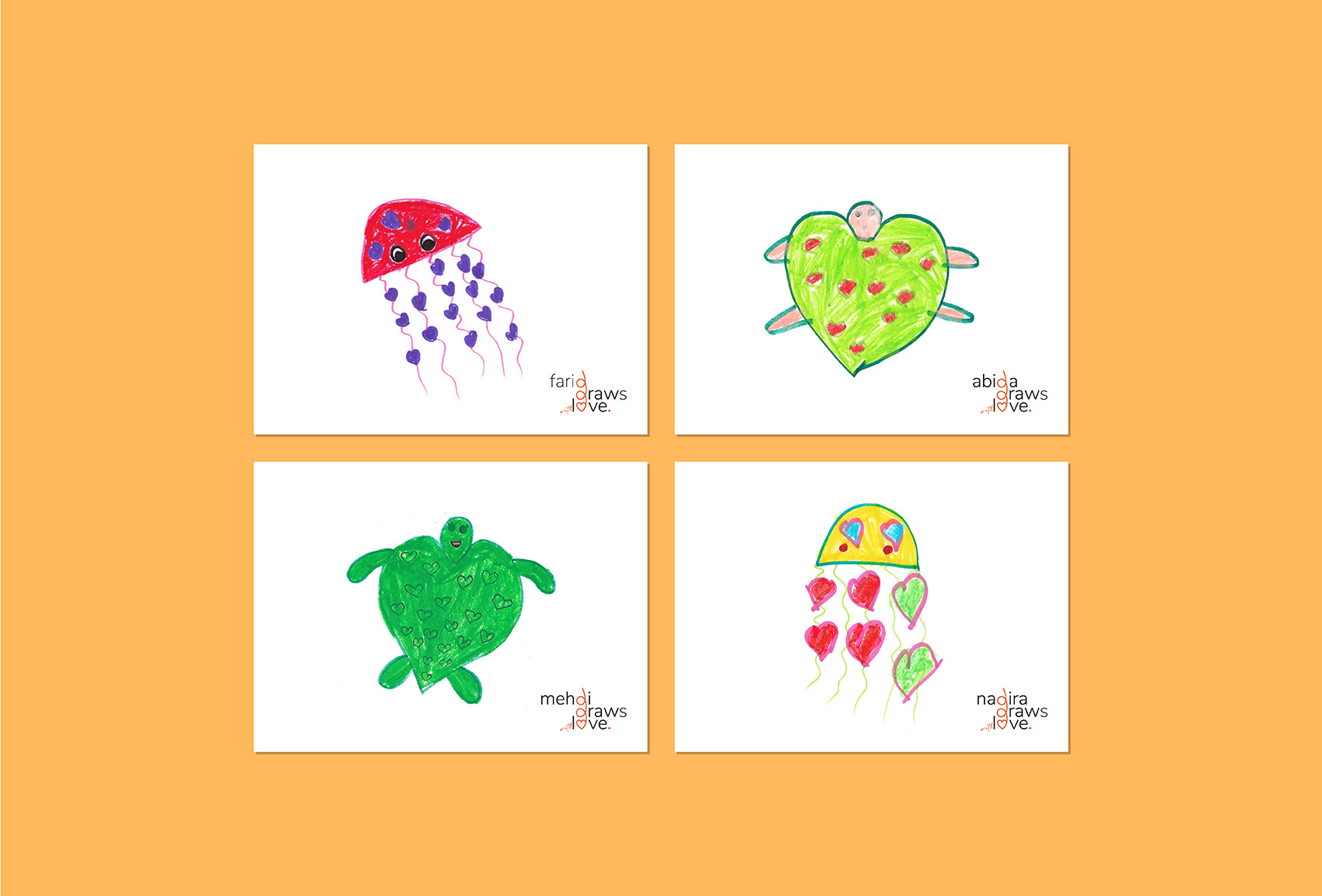
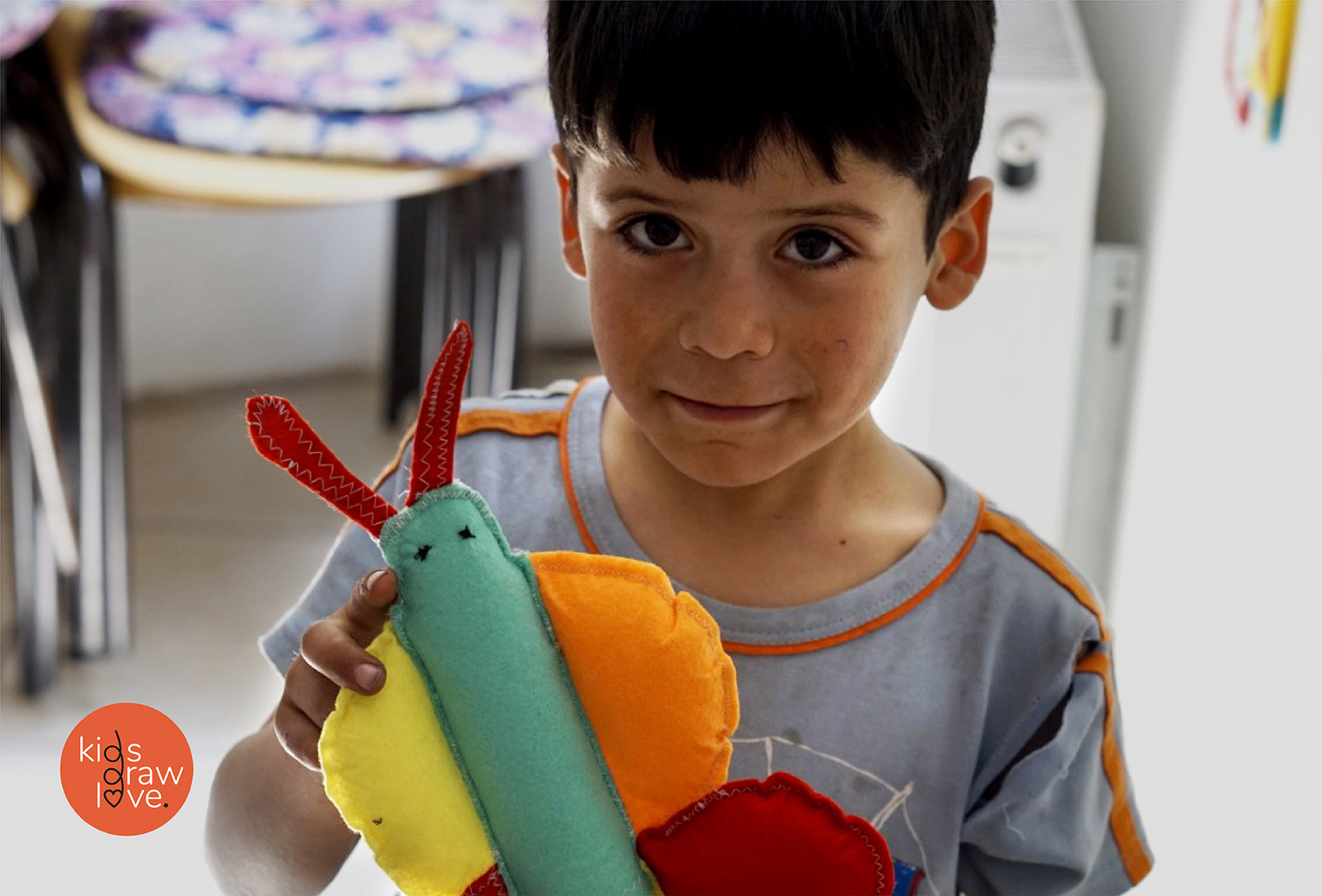
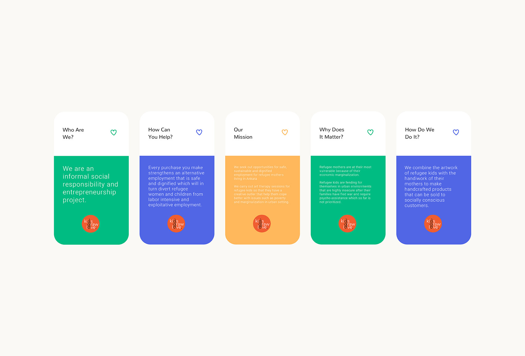
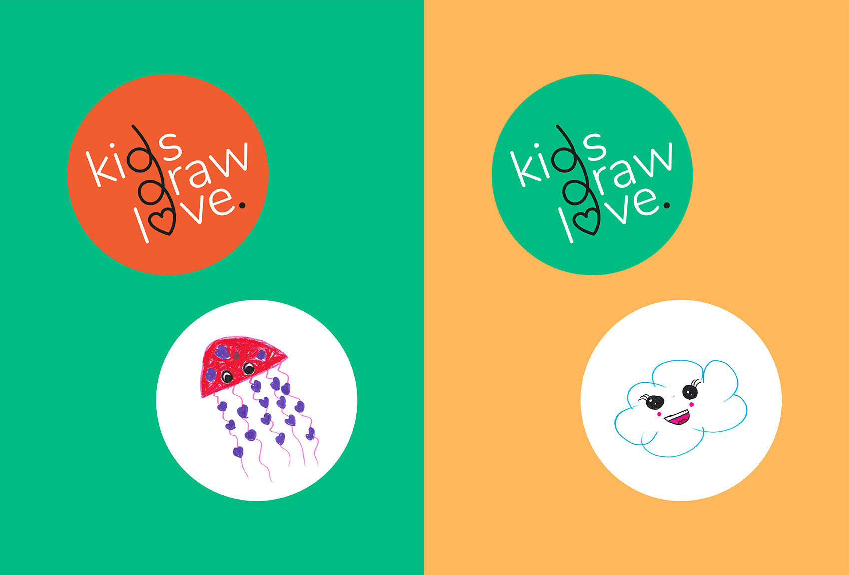
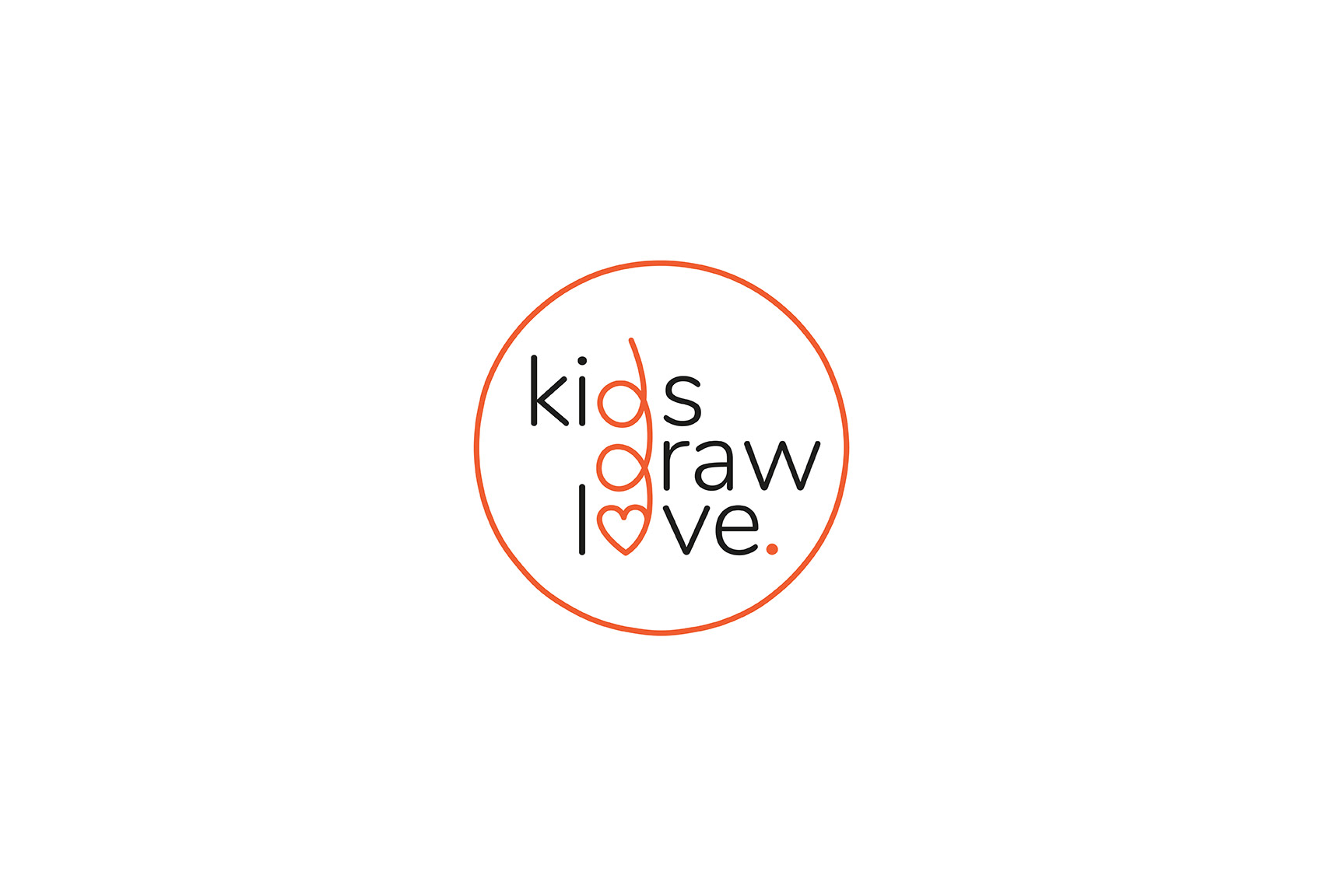
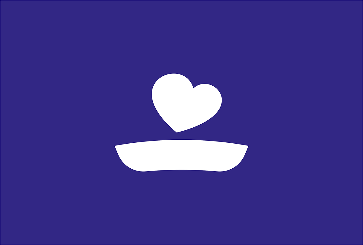
Kids Draw Love is a social entrepreneurship project by refugee mothers. Refugee kids and their mothers collaborate through the combination of the artwork of kids with the handiwork of their mothers to make handcrafted products that can be sold to socially conscious customers.
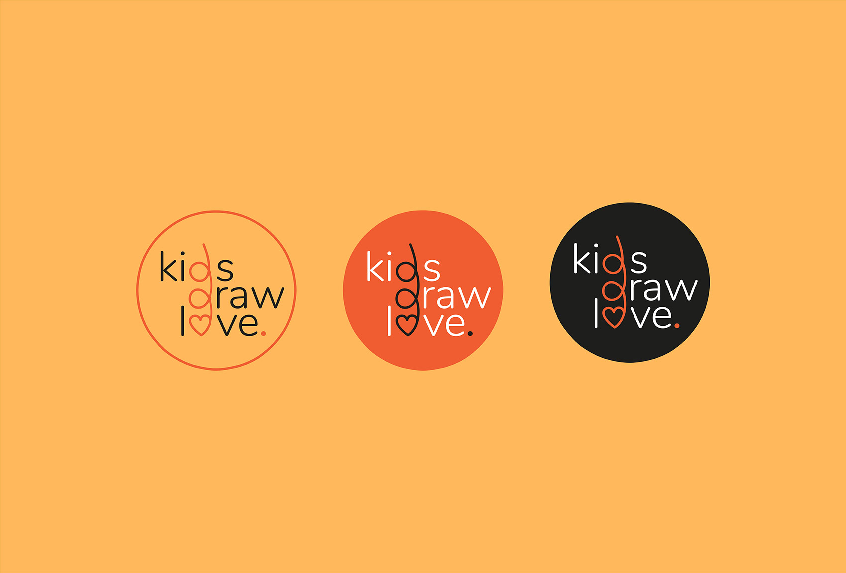
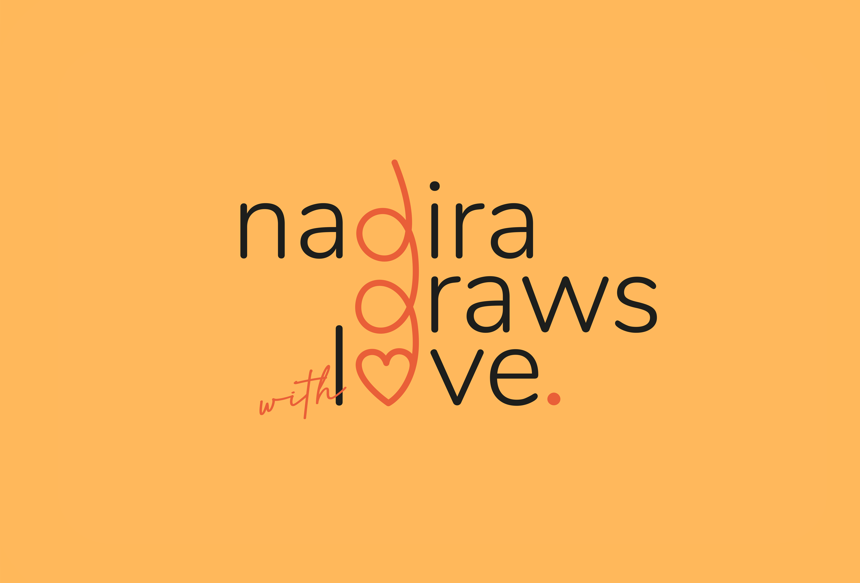
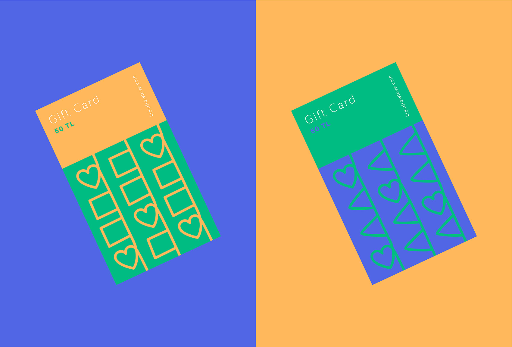
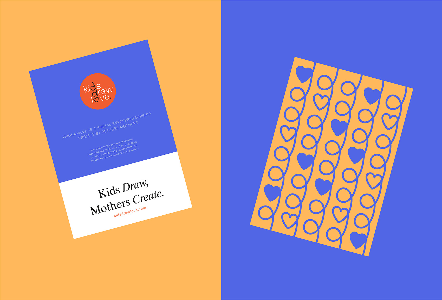
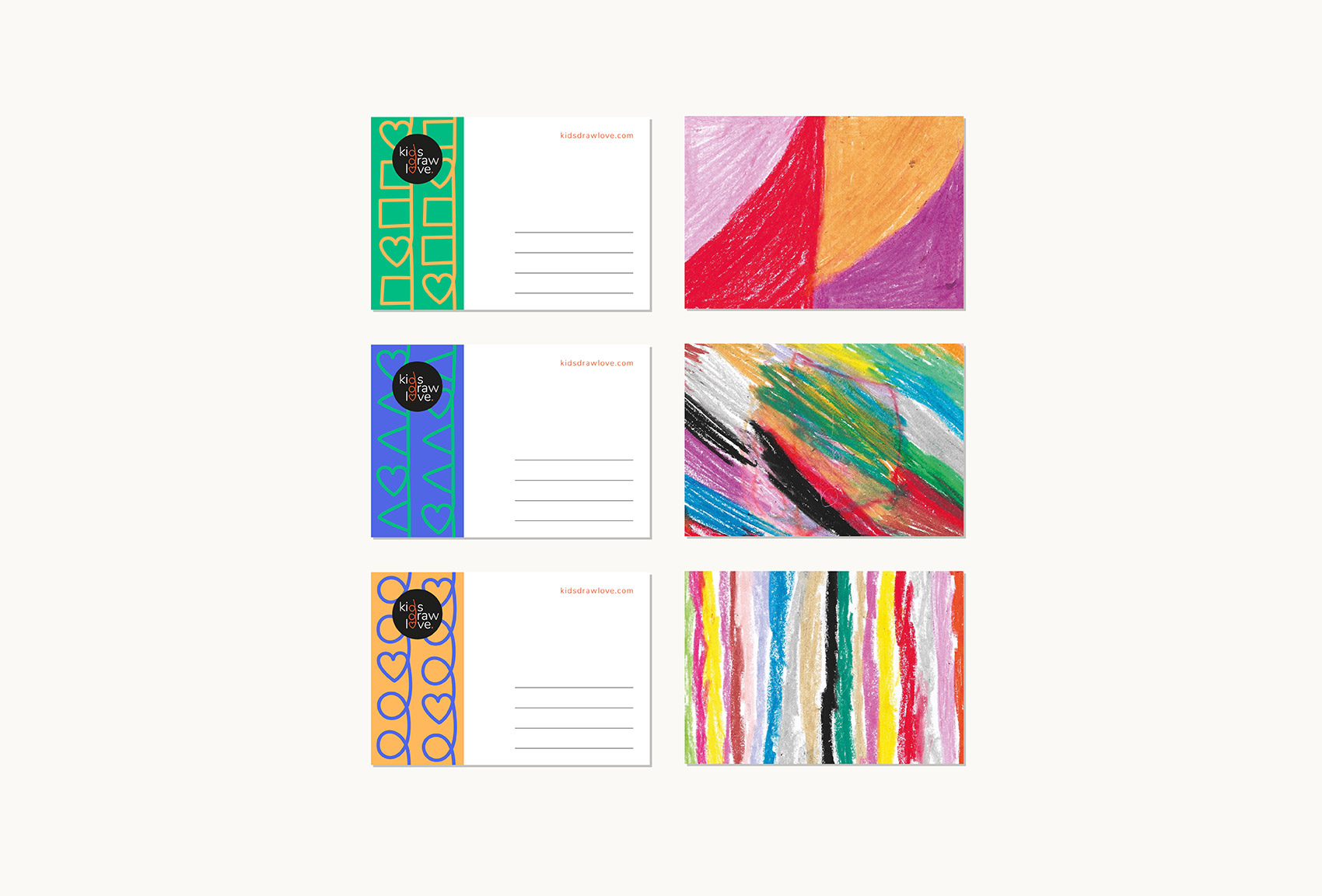
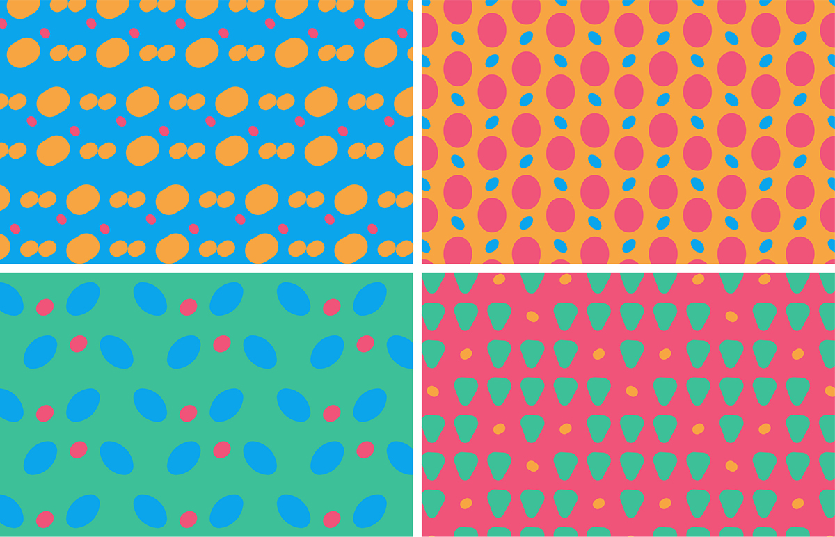
The design of logo symbolizes the participation of children in the process of making handcrafted products and the joint work of themselves and their mothers through the handwritten letterforms 'd' and 'o' and it adds up to the playful and childish qualities that logo has. The letter 'o' in the shape of heart also celebrates the brand name. The color scheme is inspired by the middle-east region from which all the refugee mothers and children are. The identity also uses different versions of hand-drawn patterns inspired by the logo and the drawings of kids as visual elements.
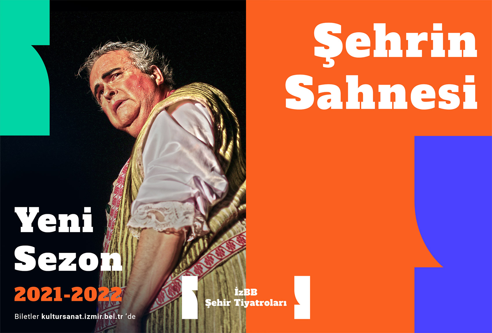
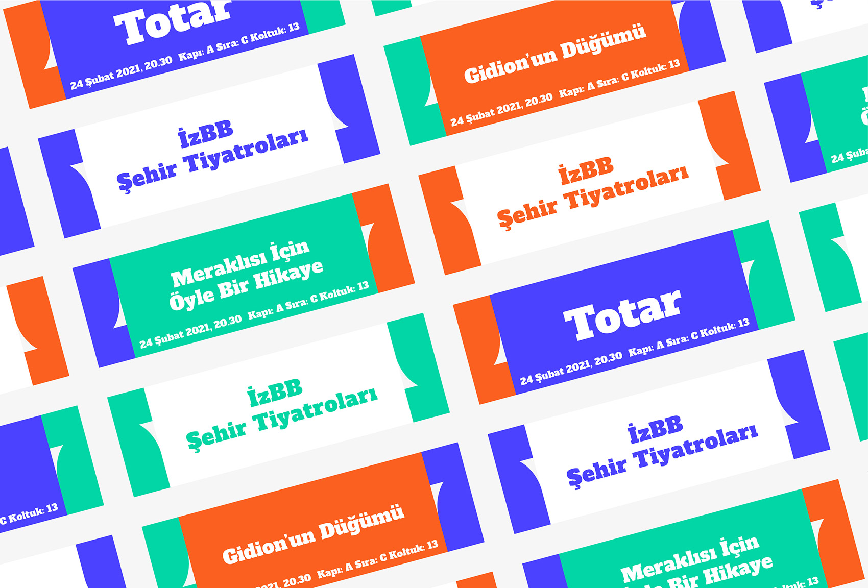
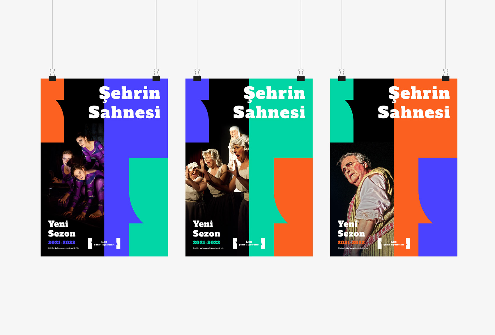
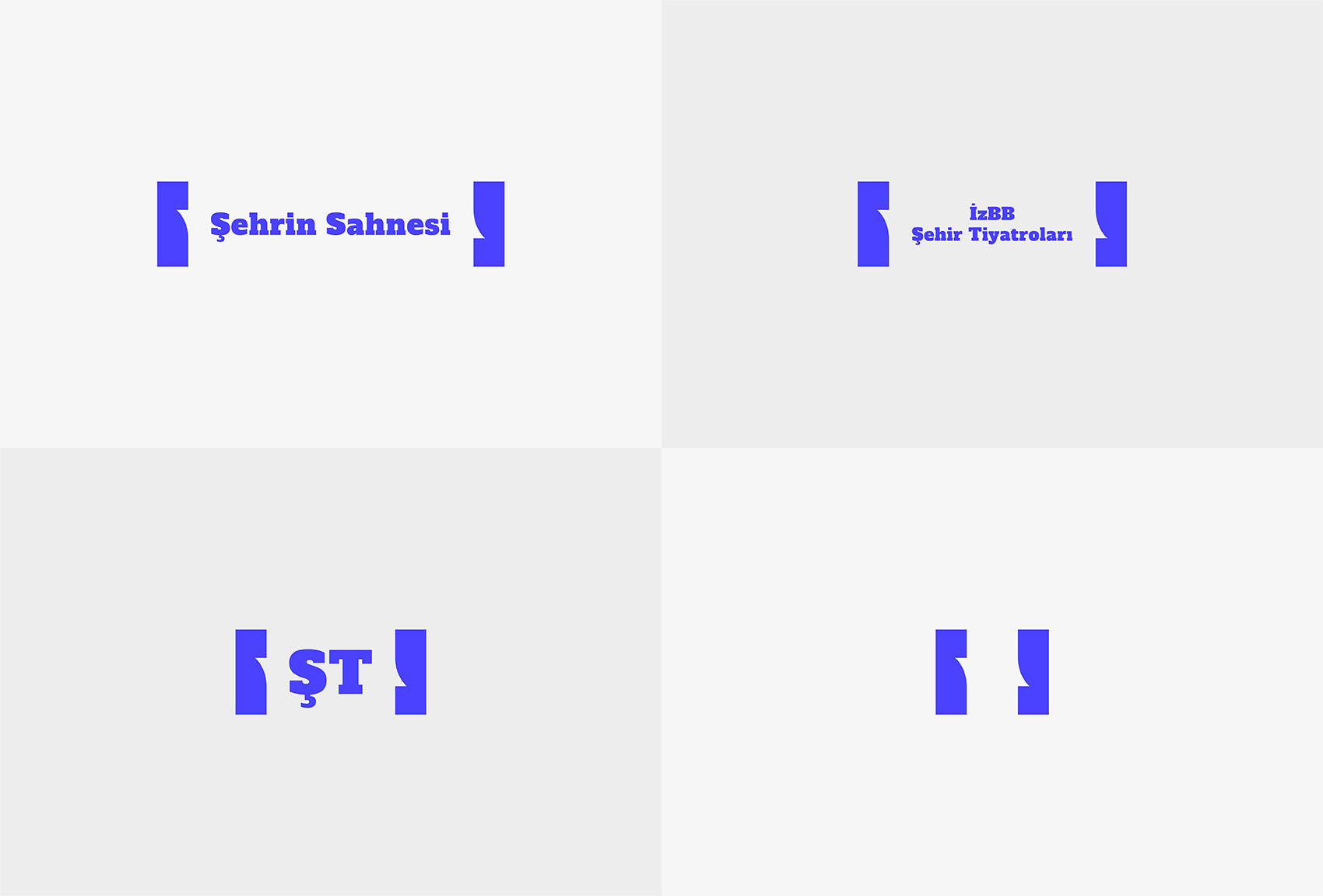
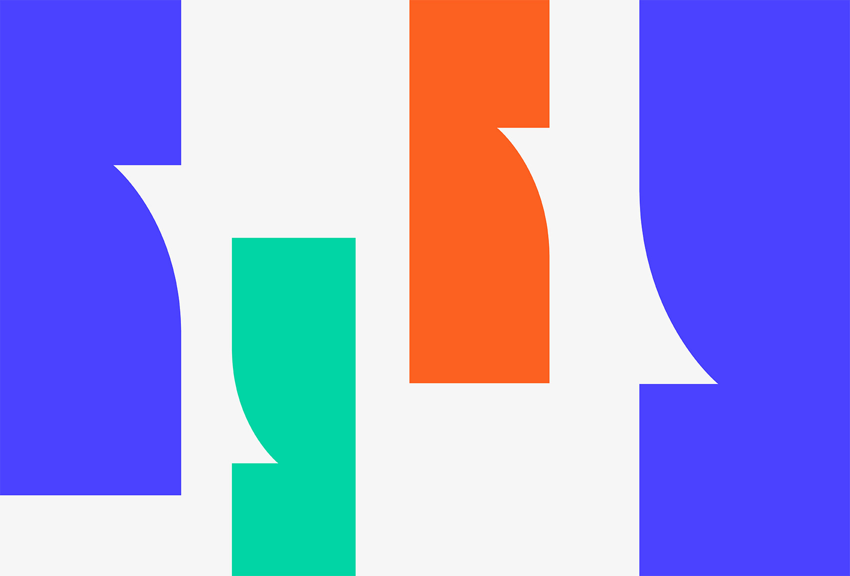
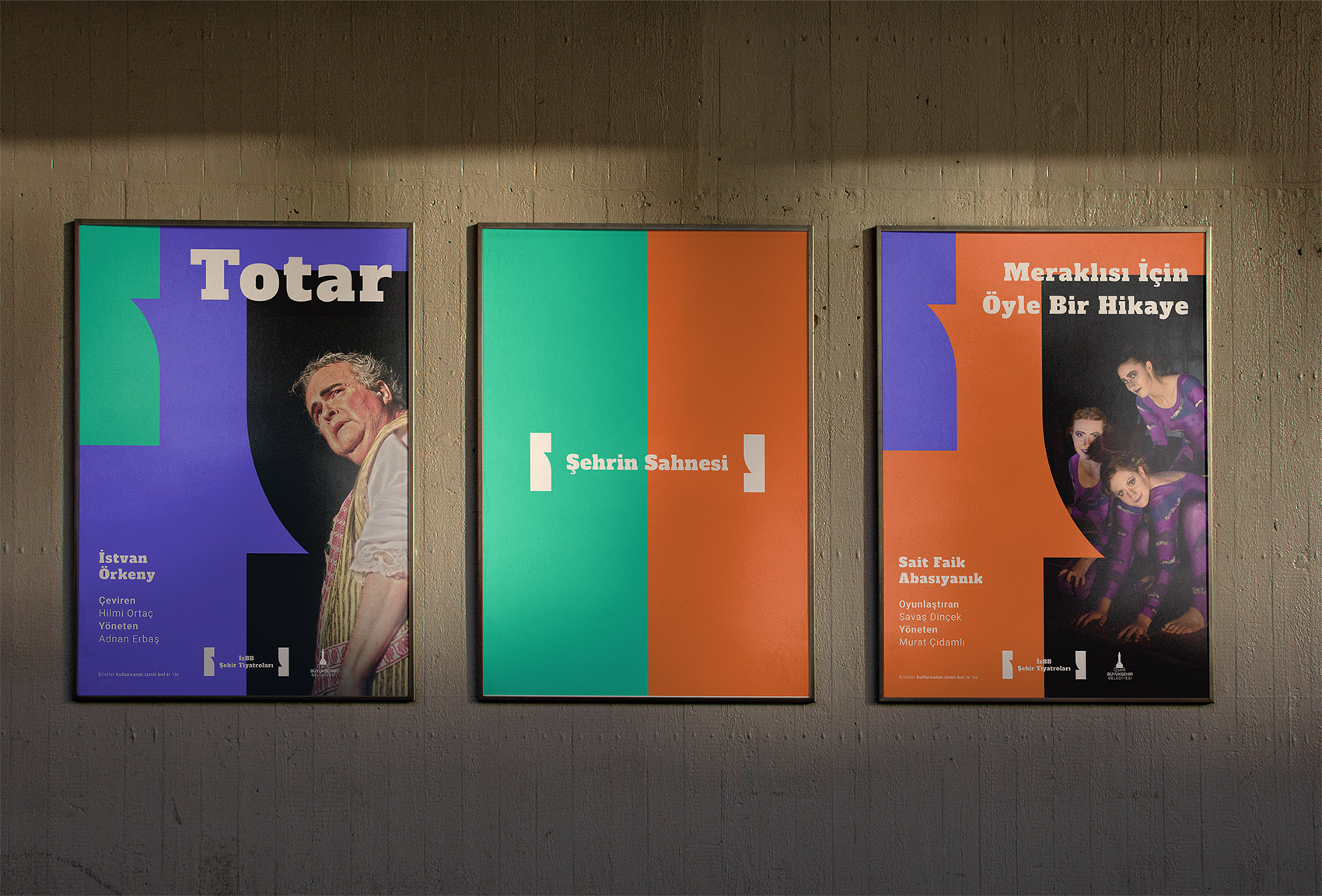

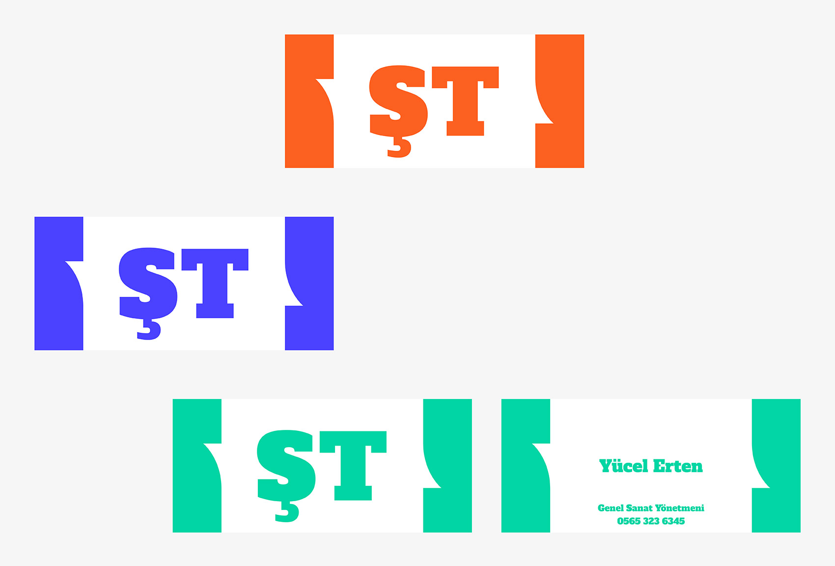
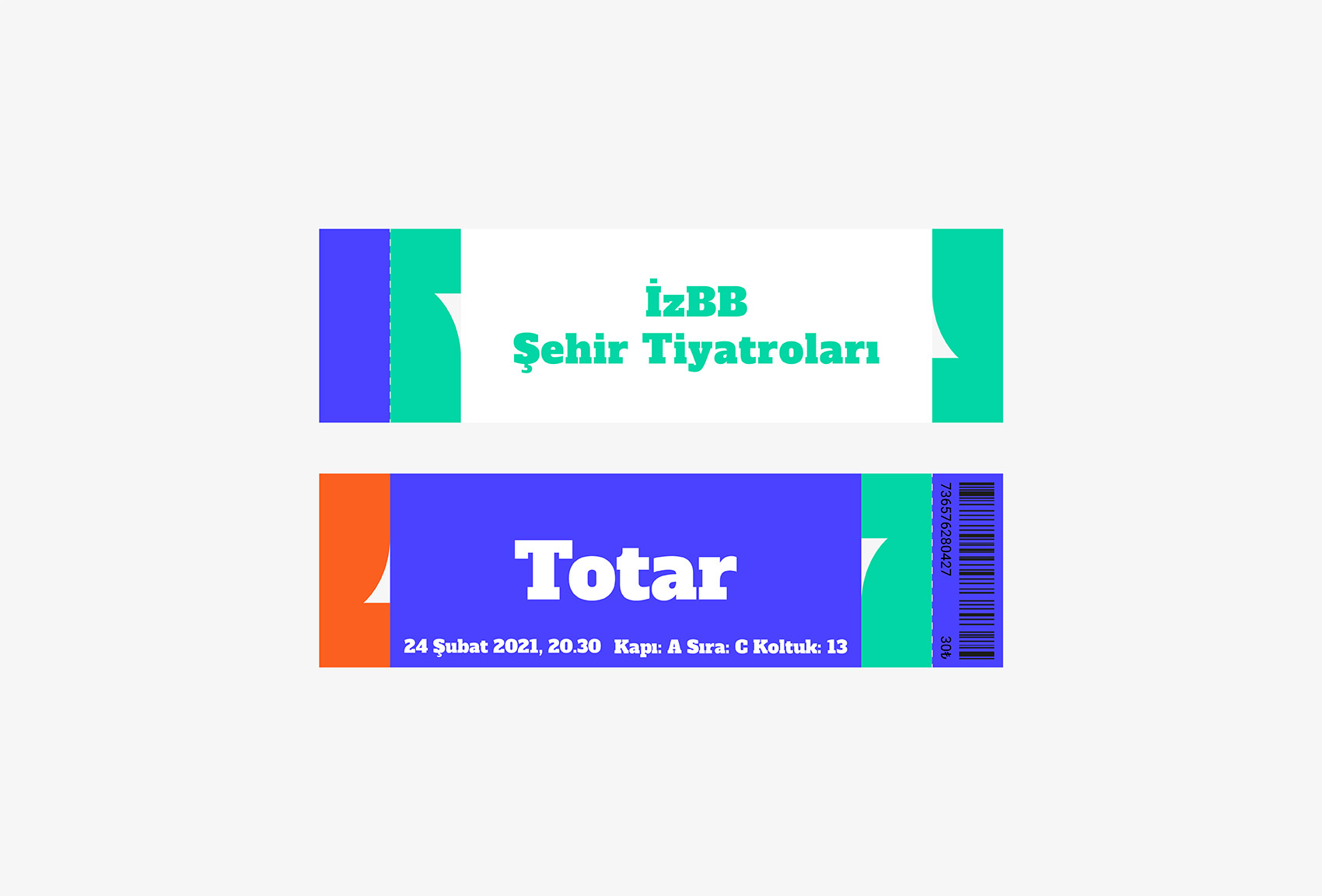
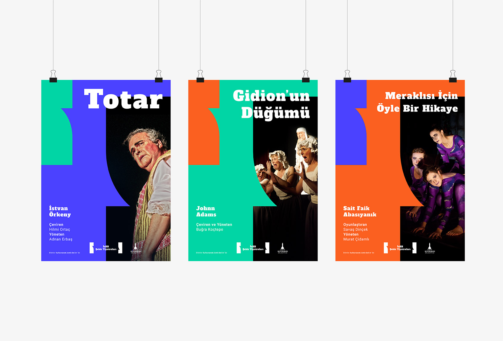
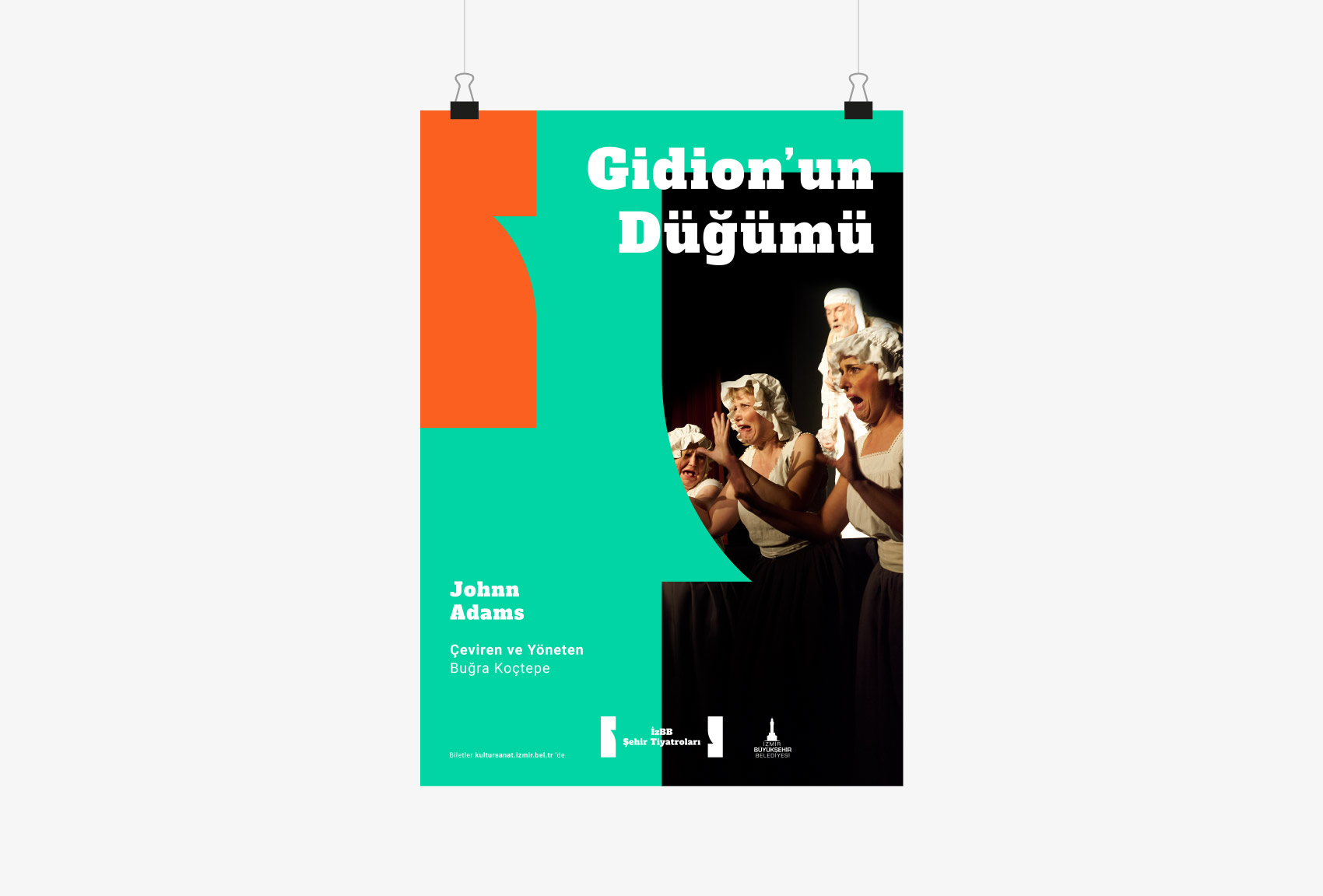
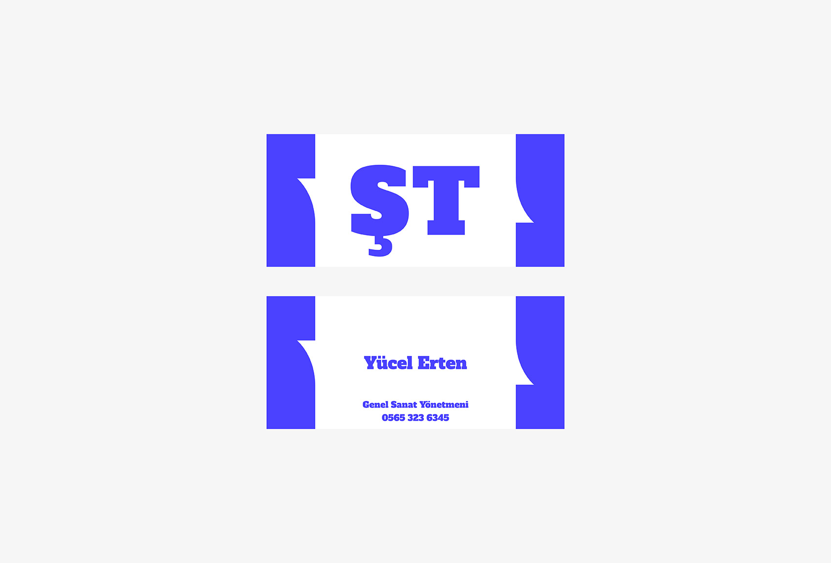
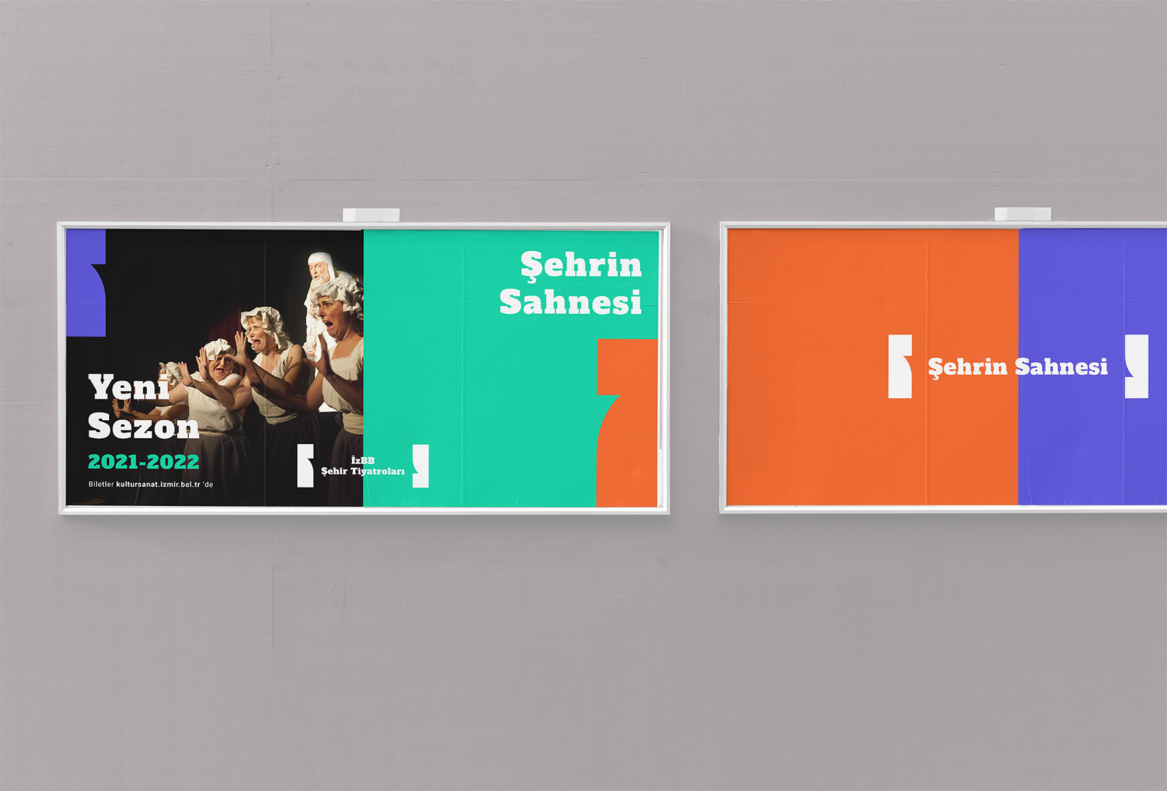
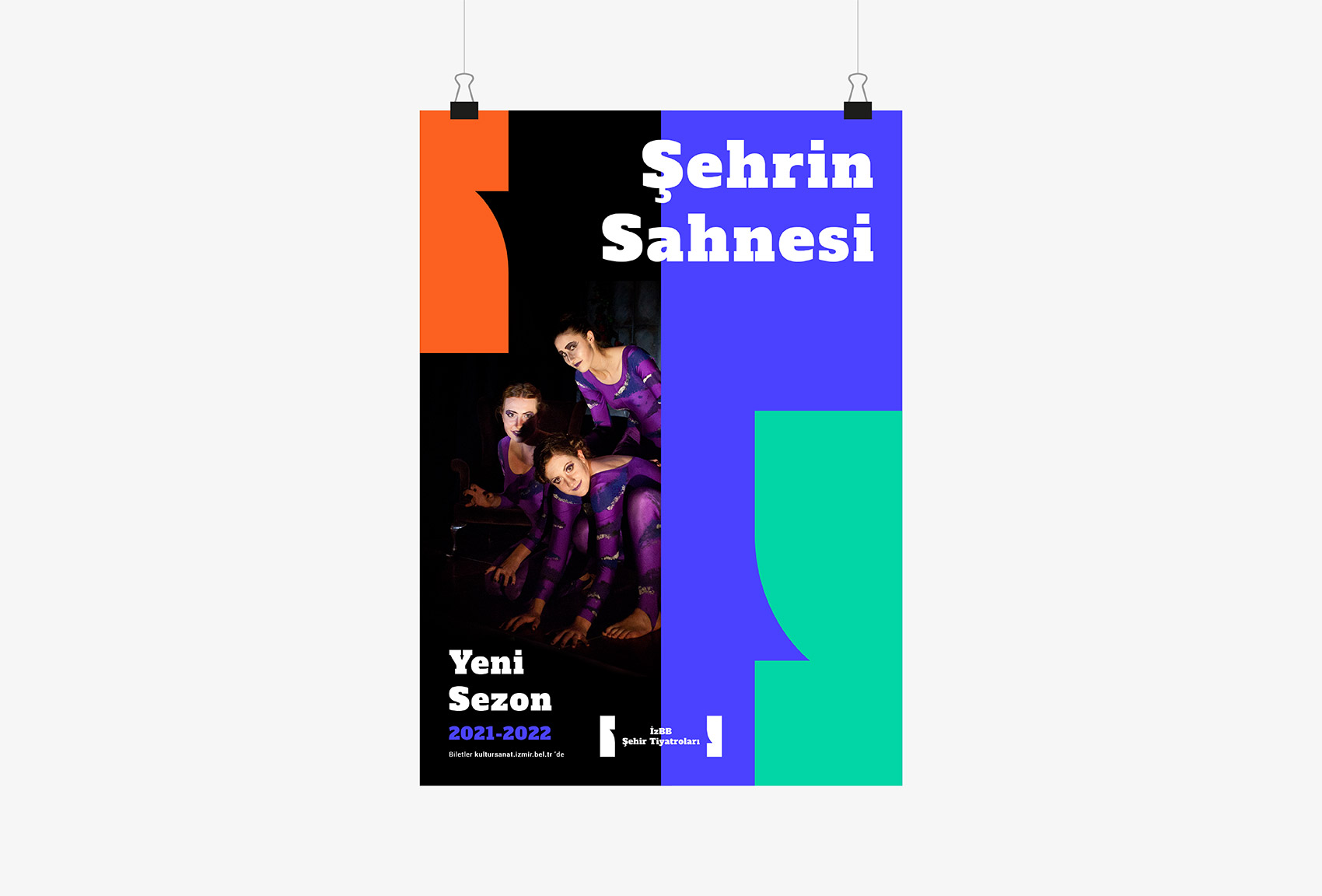
Izmir City Theater
Identity
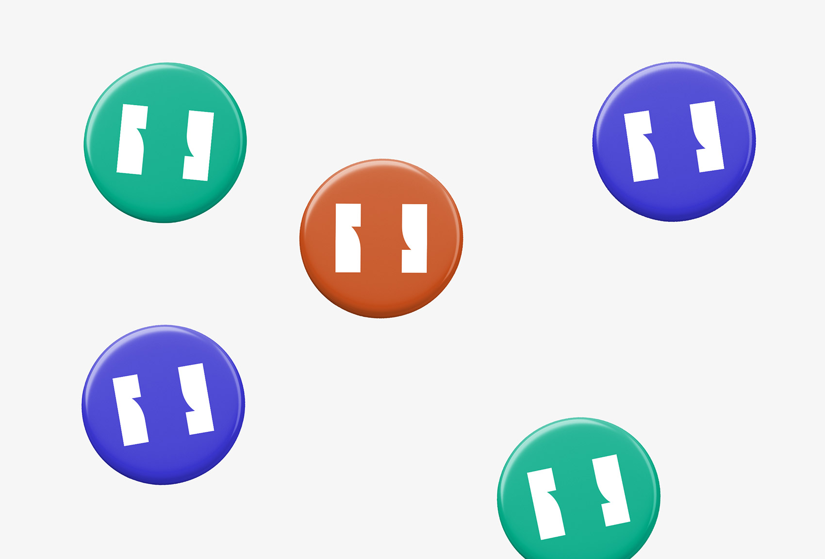
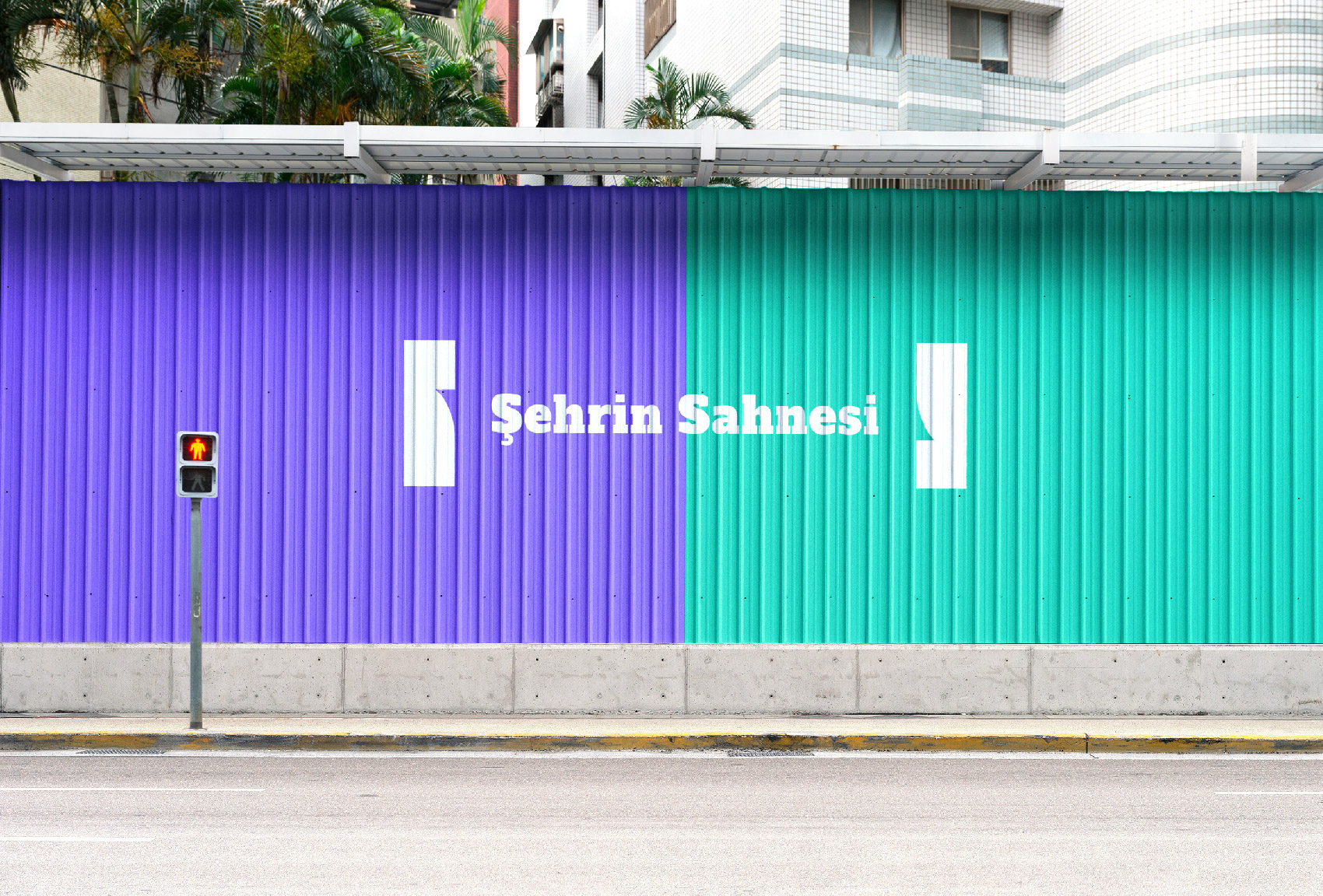
The logo consists of two blocks placed at each end which represents the front curtain. As the curtains are being pulled aside, performers get on the stage ; letter mark, wordmark and the slogan. The block-like shapes also refer to drama masks ; Thalia and Melpomene.
The city "İzmir" landscape is constrained of three main blocks when it reformed to its most abstract state ; sea, forest and the air. They all intersect at the horizon as if they are drawn curtains. To carry the motto " The Stage of the City" in the design, blocks split in half and vibrant colours are used to reflect the city the most simplistic way.
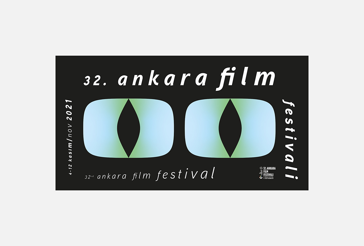
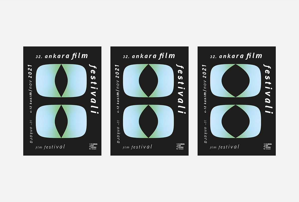
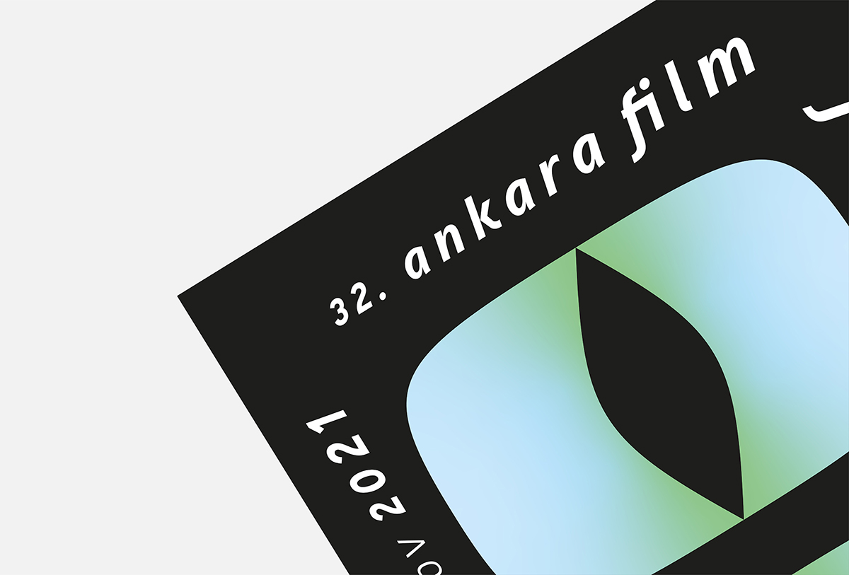
Ankara Film Festival
Poster Design
The series uses a graphic element where a cat iris and projection curtain is combined. The iris refer to the cat breed which is native to Ankara. This Ankara cat is known for having different colored iris; one is blue and the other one is green, both of which are used as the gradient in the design. As the cat watches the city Ankara, its iris grows bigger with wonder.
Also, the letters increase in size to reflect the feeling of wonder and it mimics the cat's facial expressions. The other representation of the main graphic element used in the design is the projection curtain and as the residents of Ankara see the poster, metaphorically they watch a movie in the cinema projection where cats are the main characters.
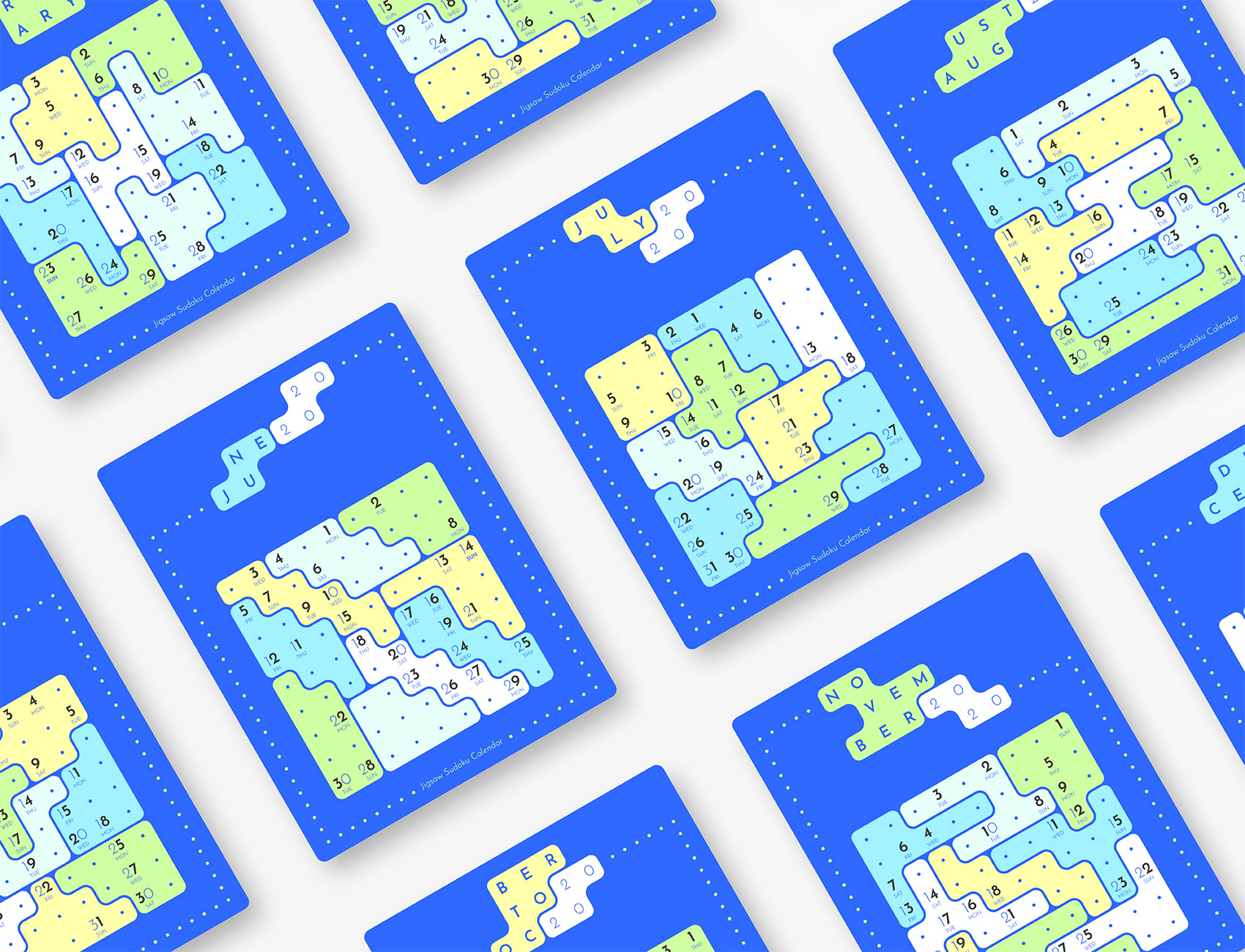
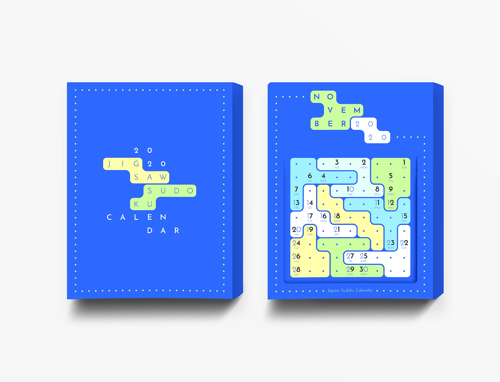
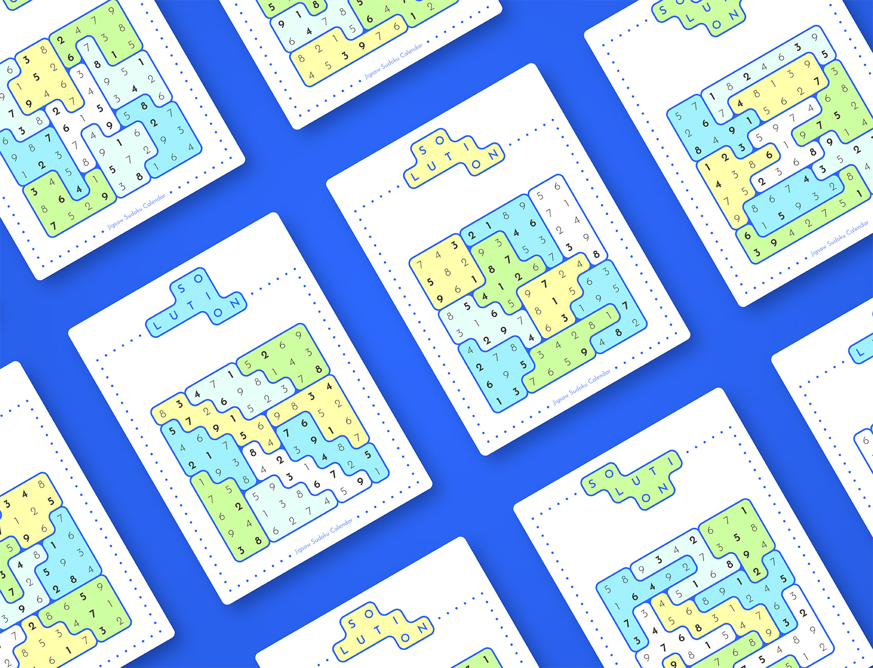
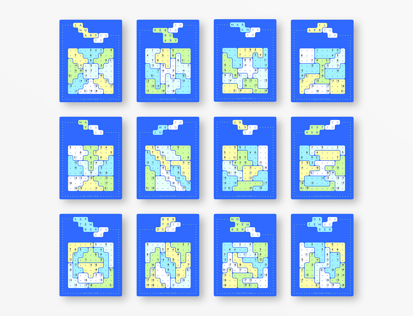
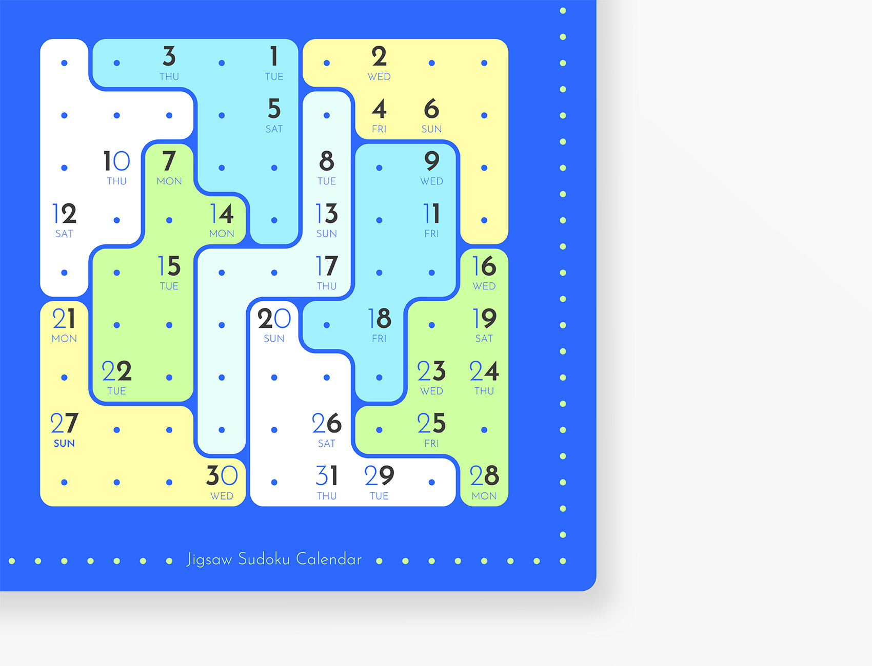
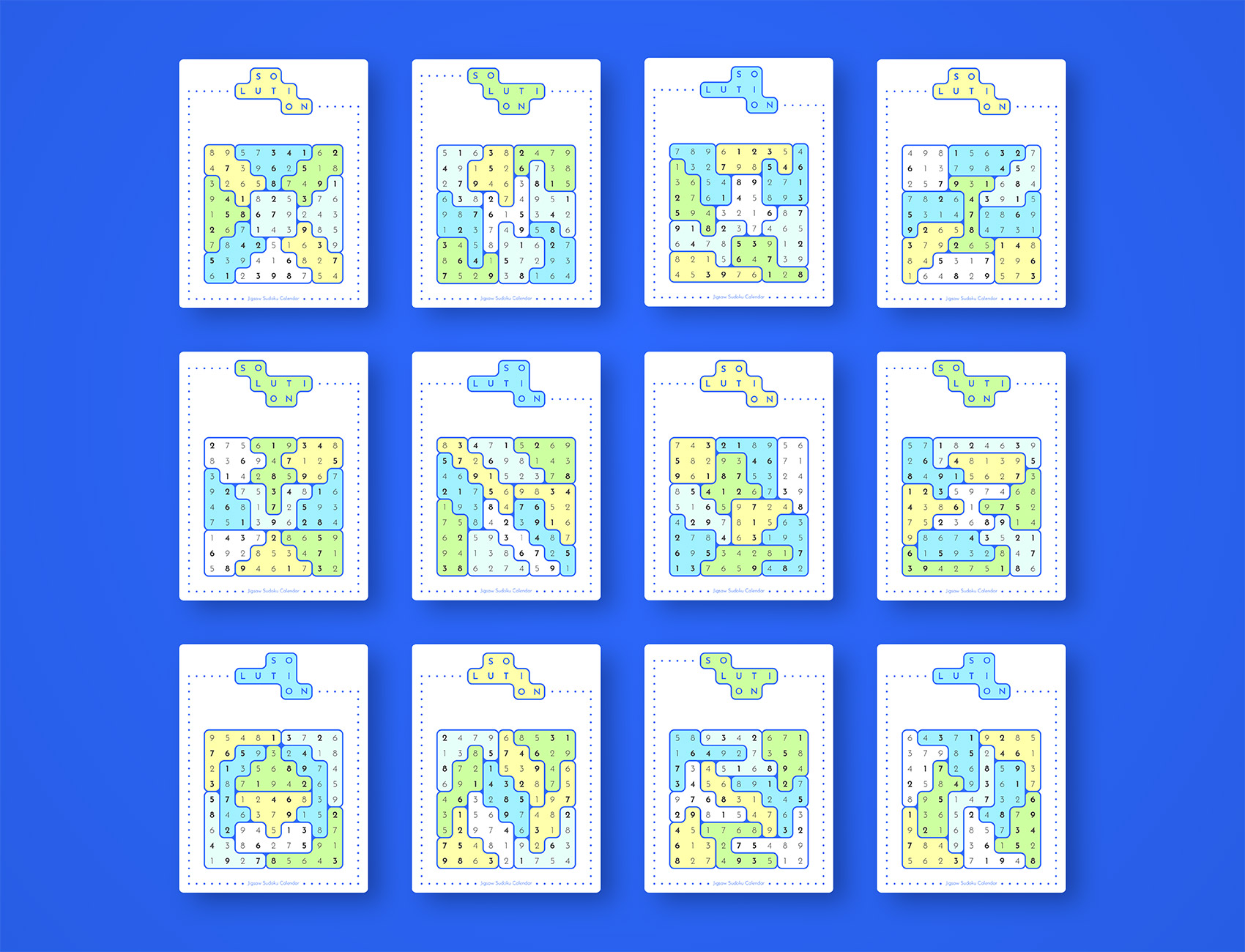
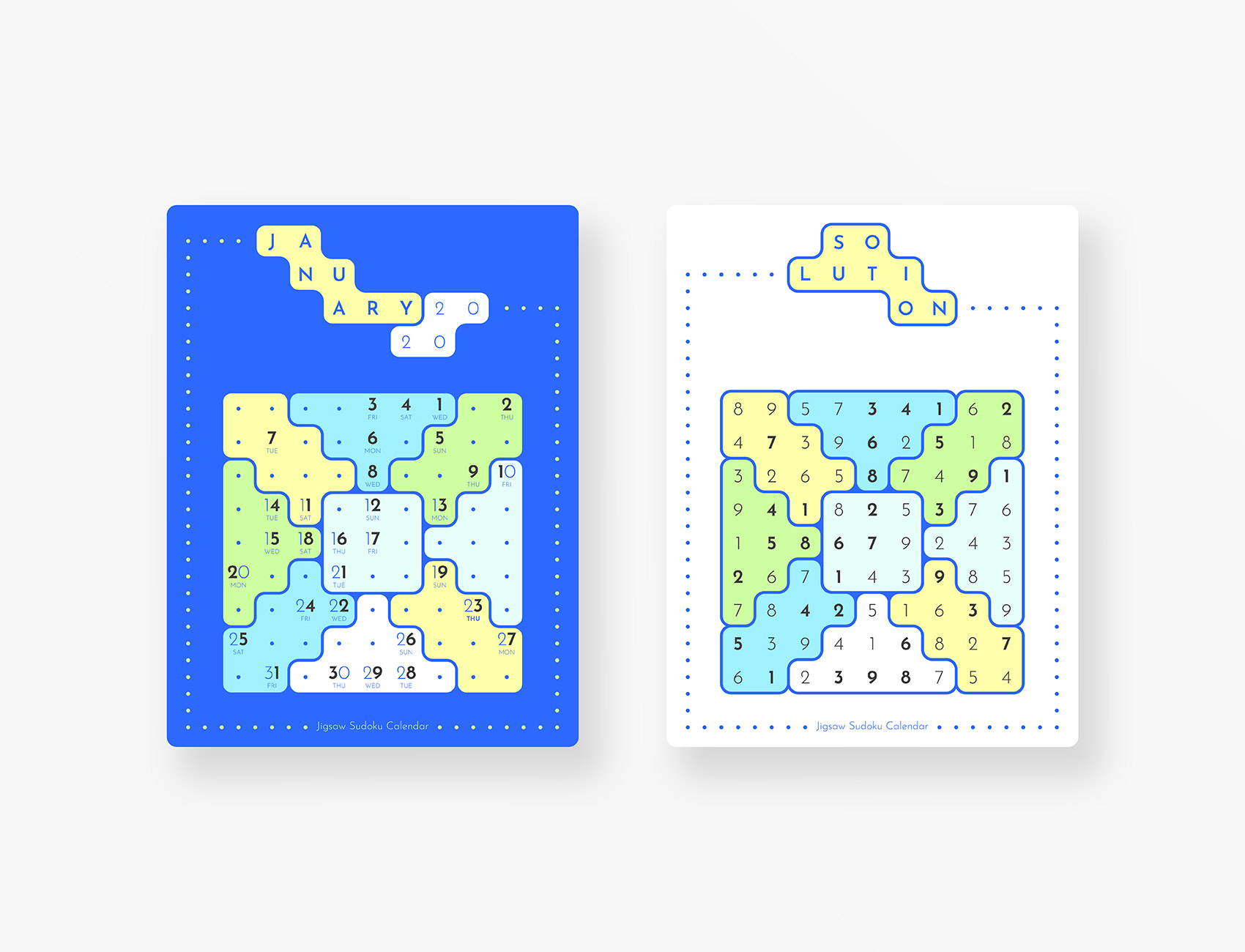
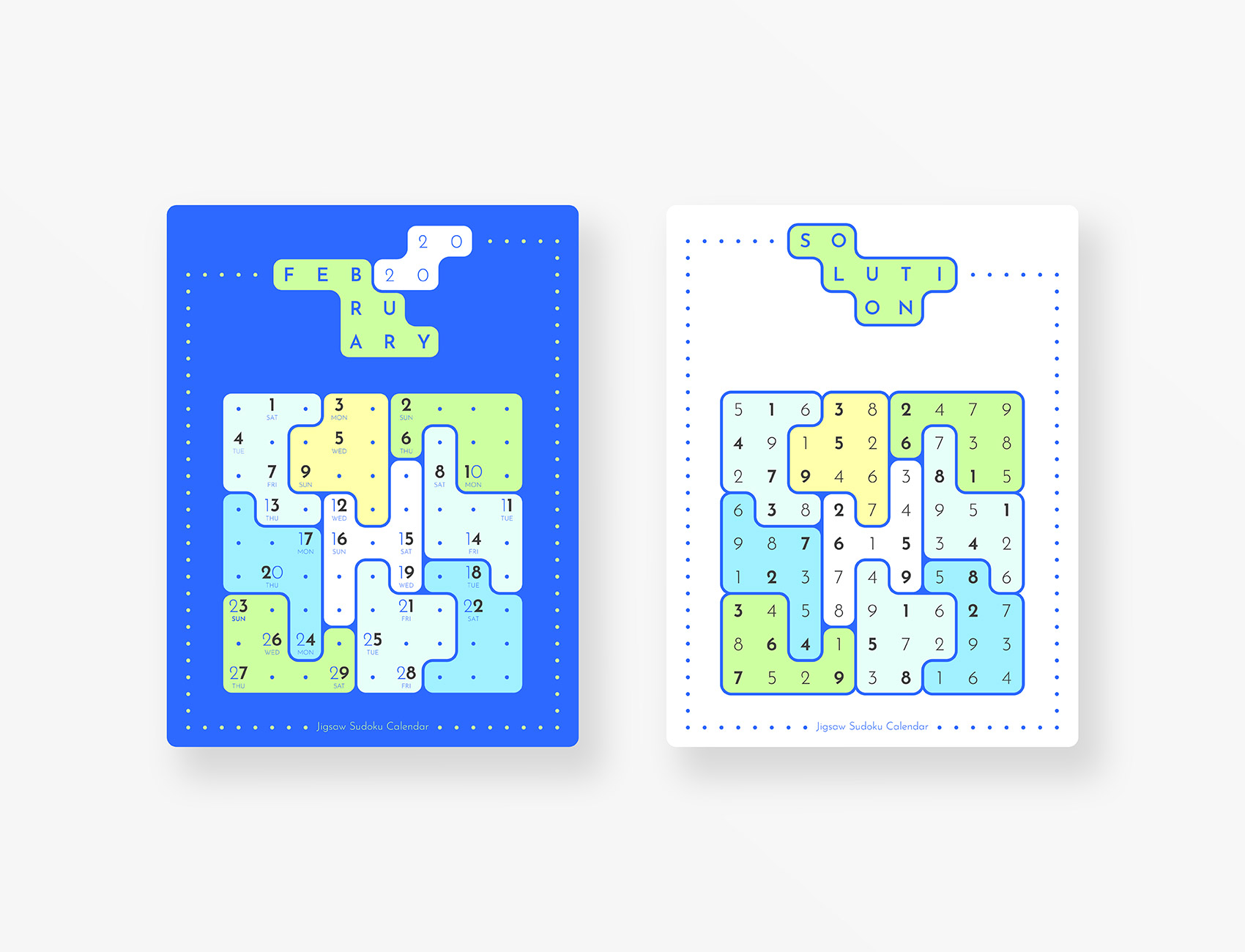
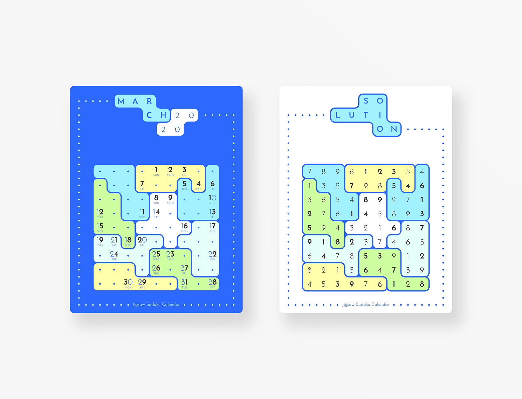
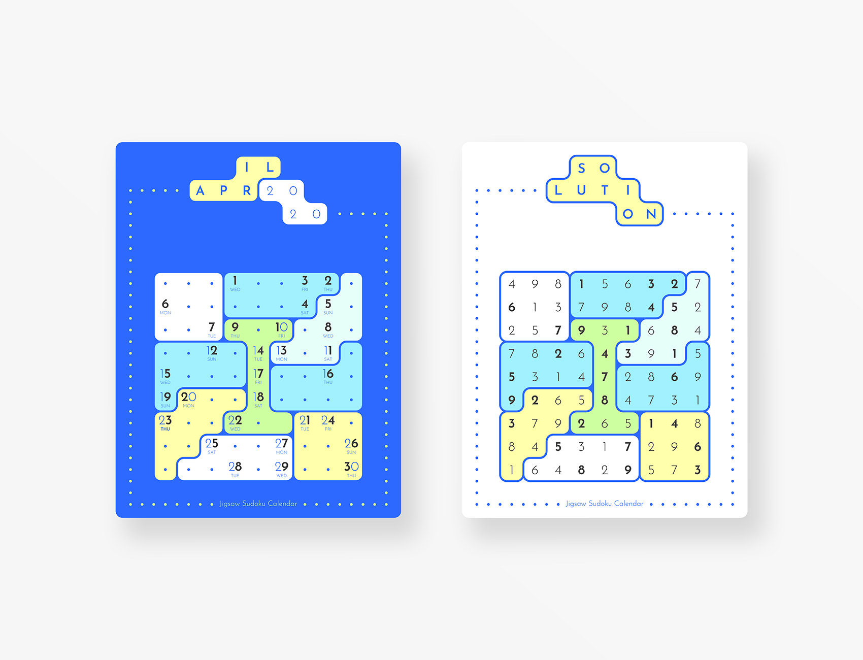
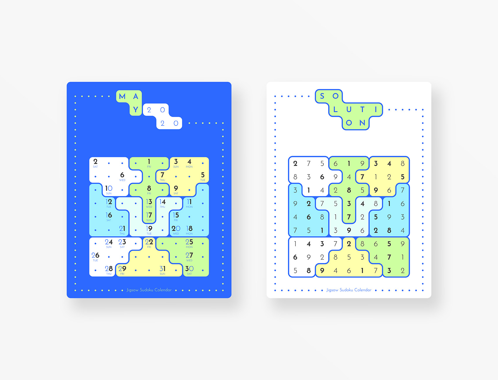
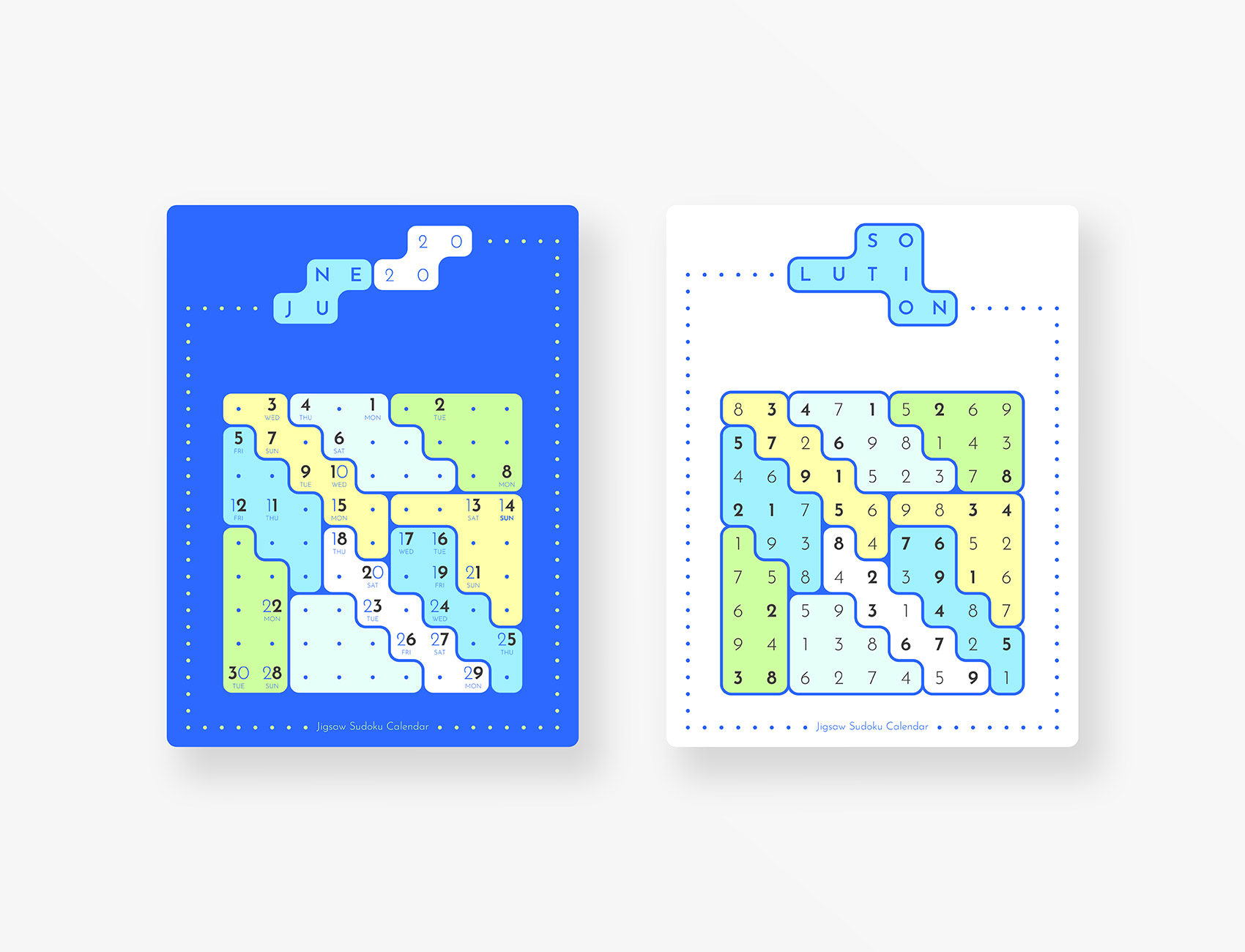
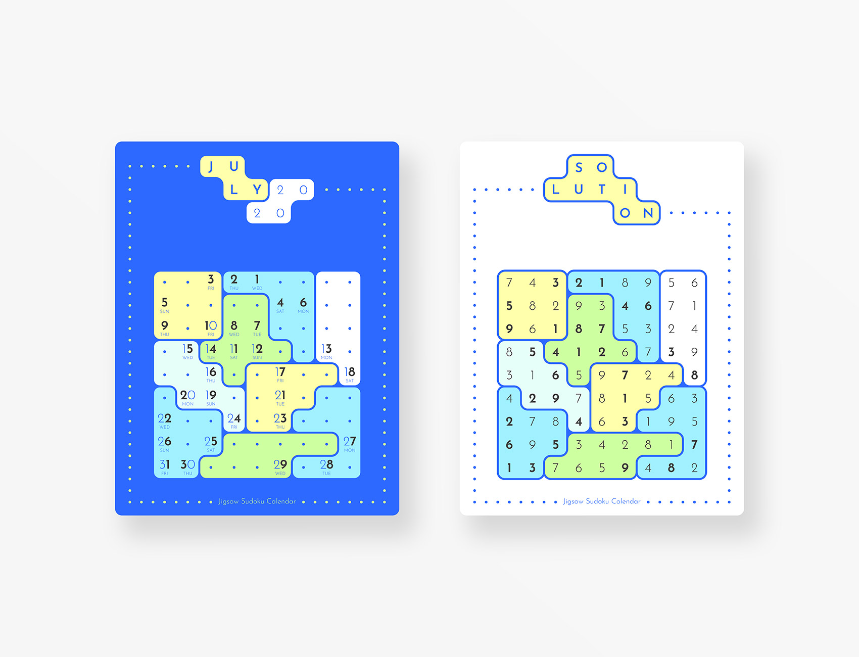
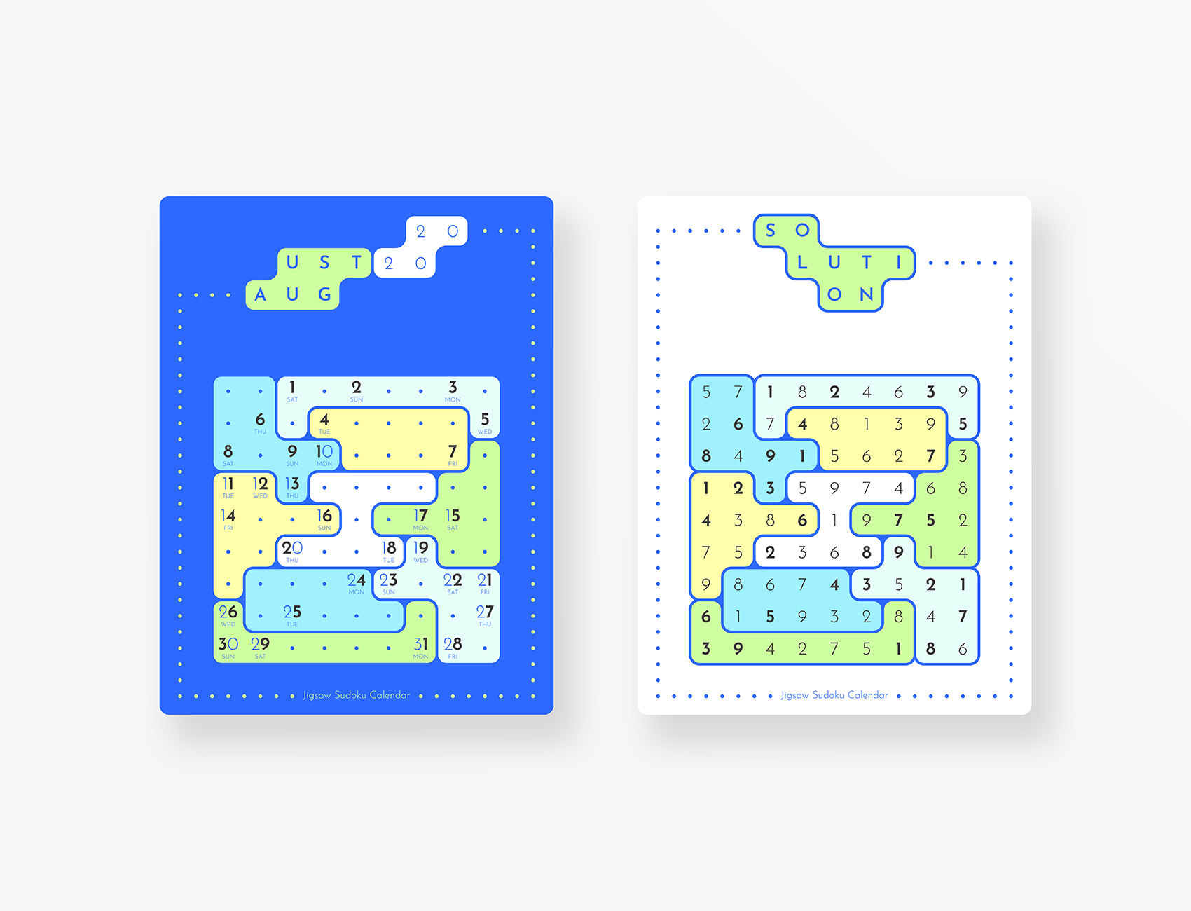
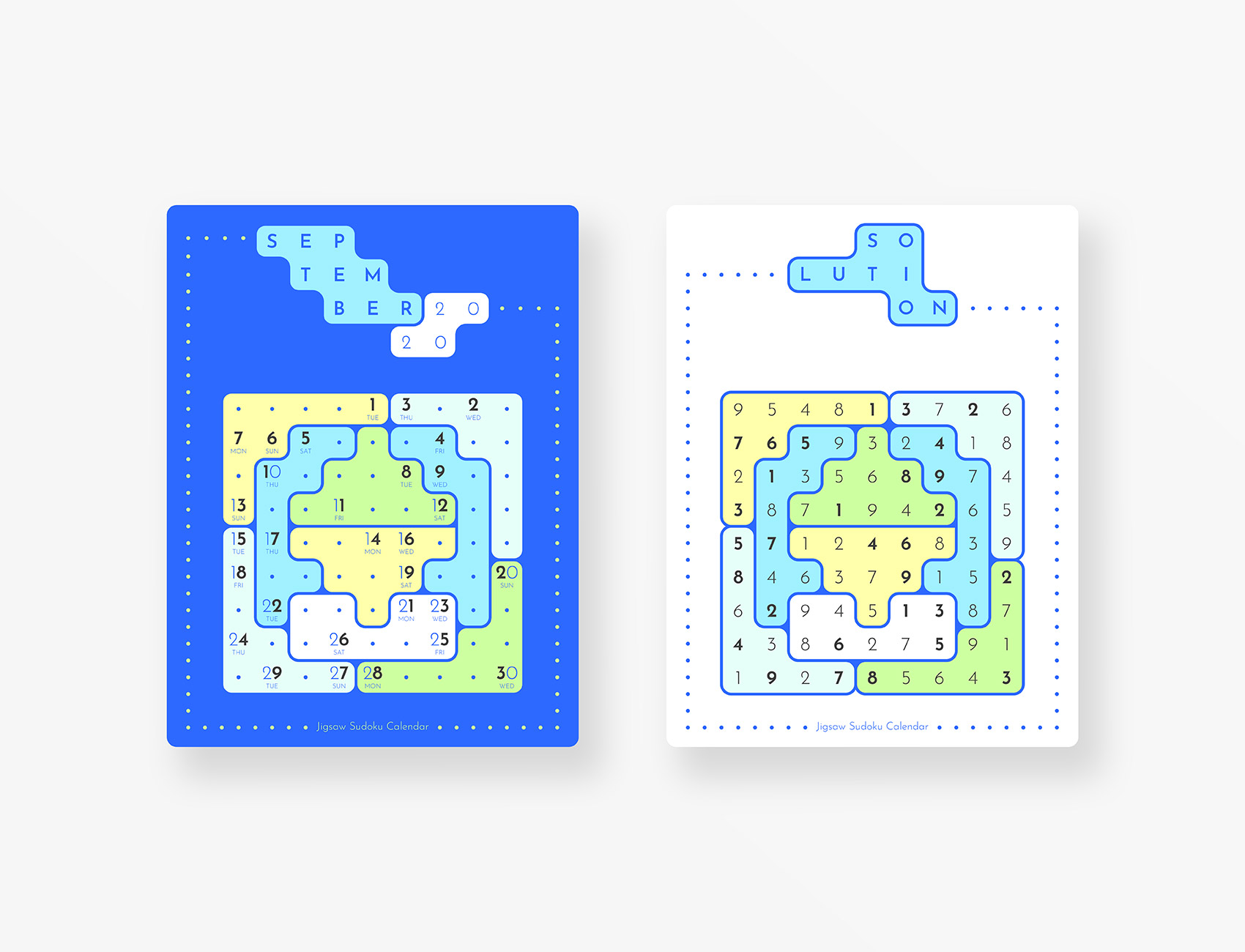
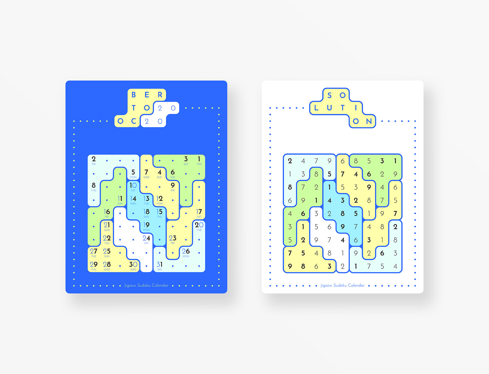
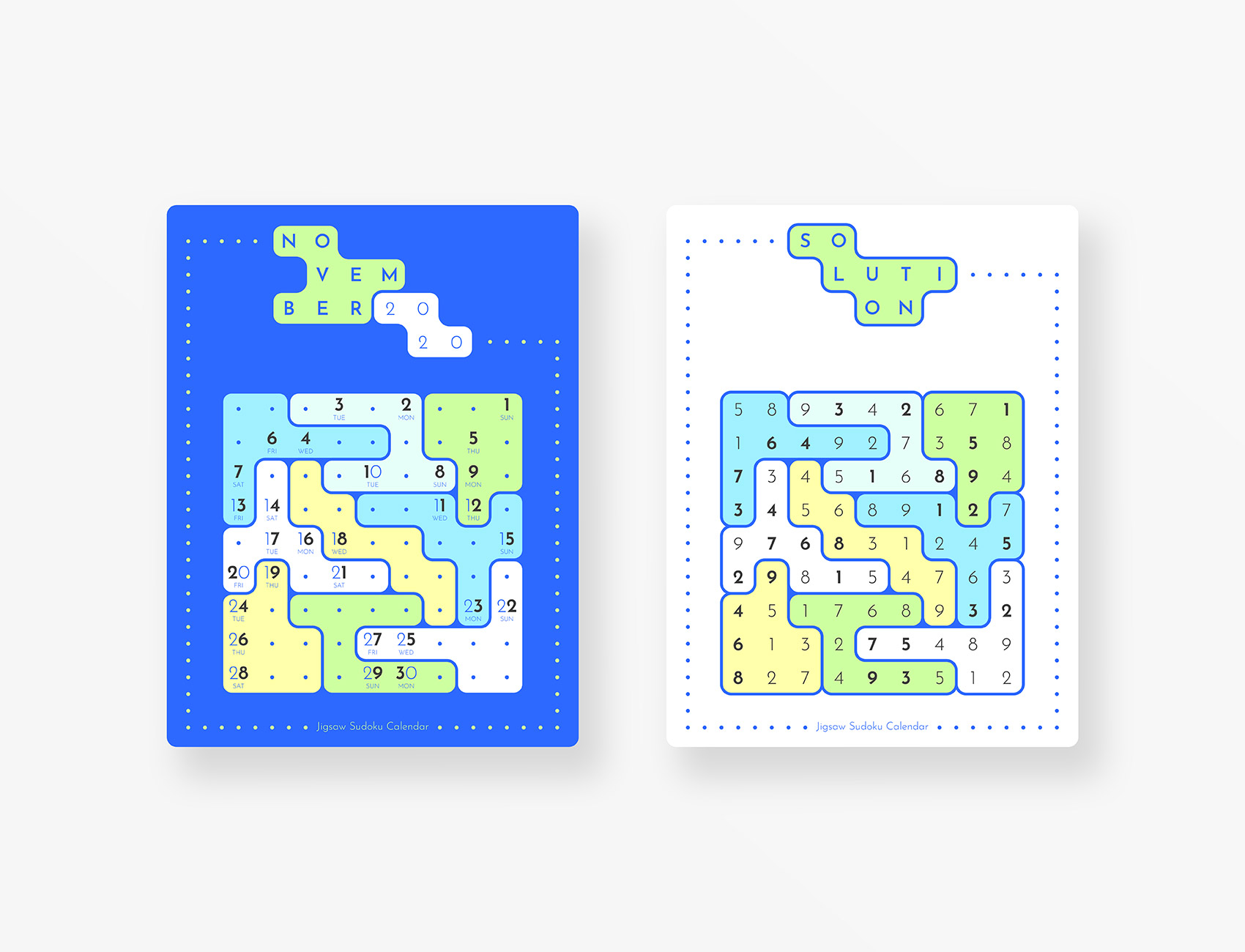
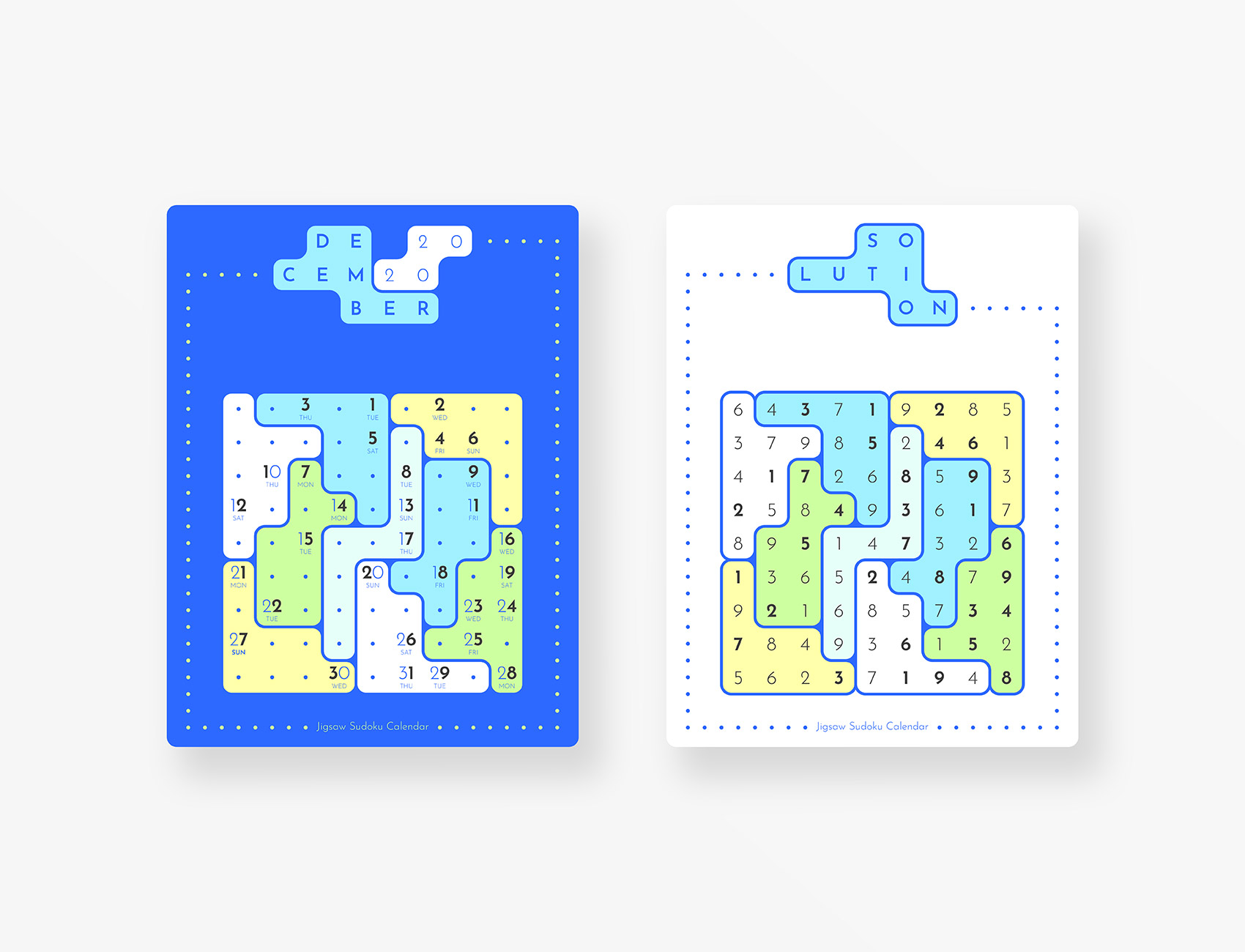
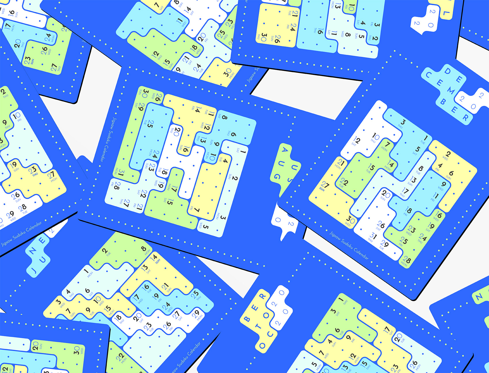
Jigsaw Sudoku Calendar 2020
Calendar Design
Jigsaw Sudokus (also known as Irregular, or Geometric Sudoku) are very similar to regular Sudoku puzzles, but instead of 3x3 blocks, they are divided into irregular jigsaw-like shapes. Each row, column and jigsaw shape contains all of the digits 1 through 9.
This jigsaw sudoku-inspired calendar helps its users to further improve their tracking abilities which is a must have skill in solving sudoku. Users' ability to track a seemingly random array of numbers in the correct order develops more and more as user traces the calendar embedded in different jigsaw sudoku puzzles featured in each month that user can solve while tracing the calendar.
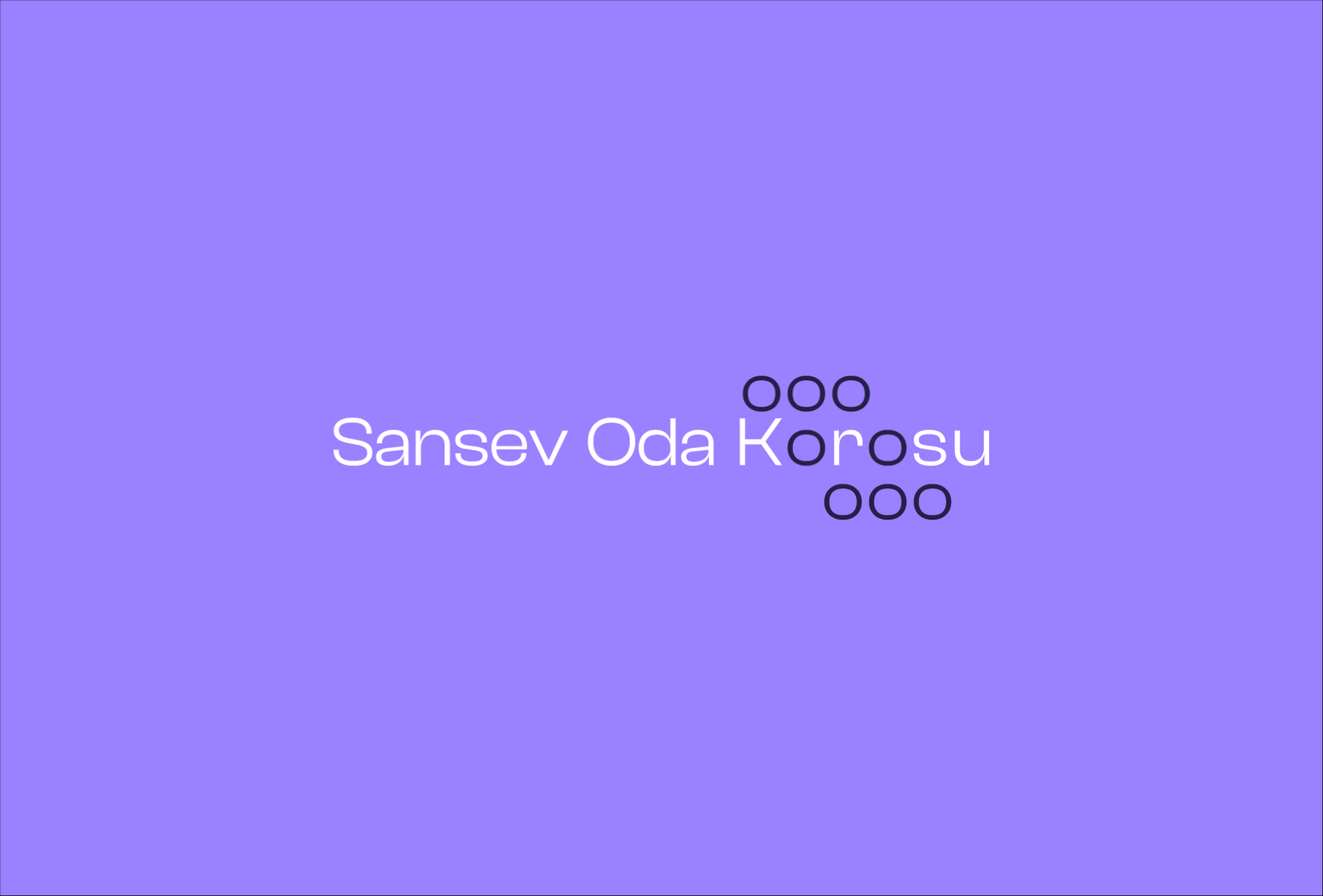
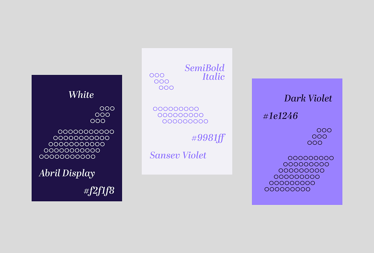
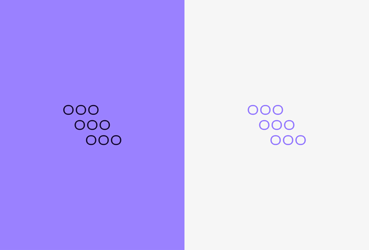
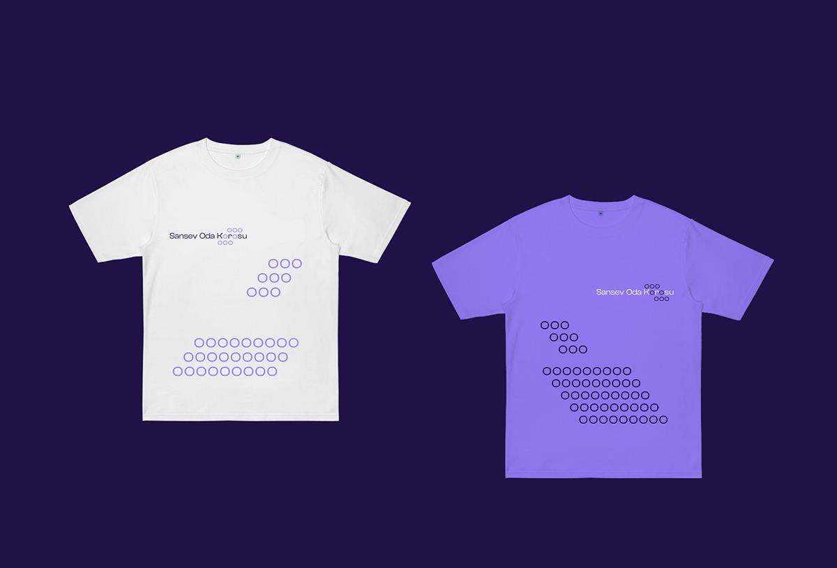
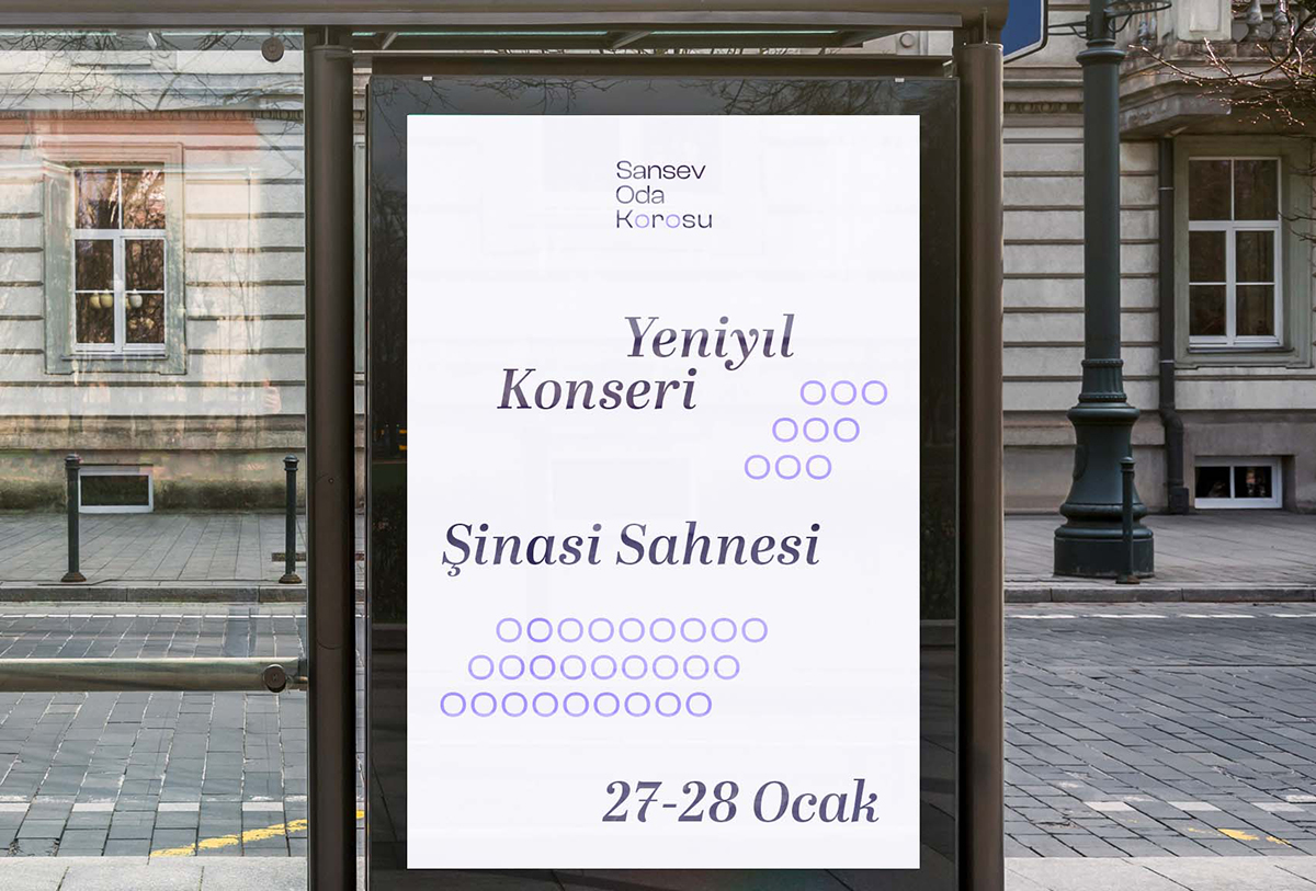
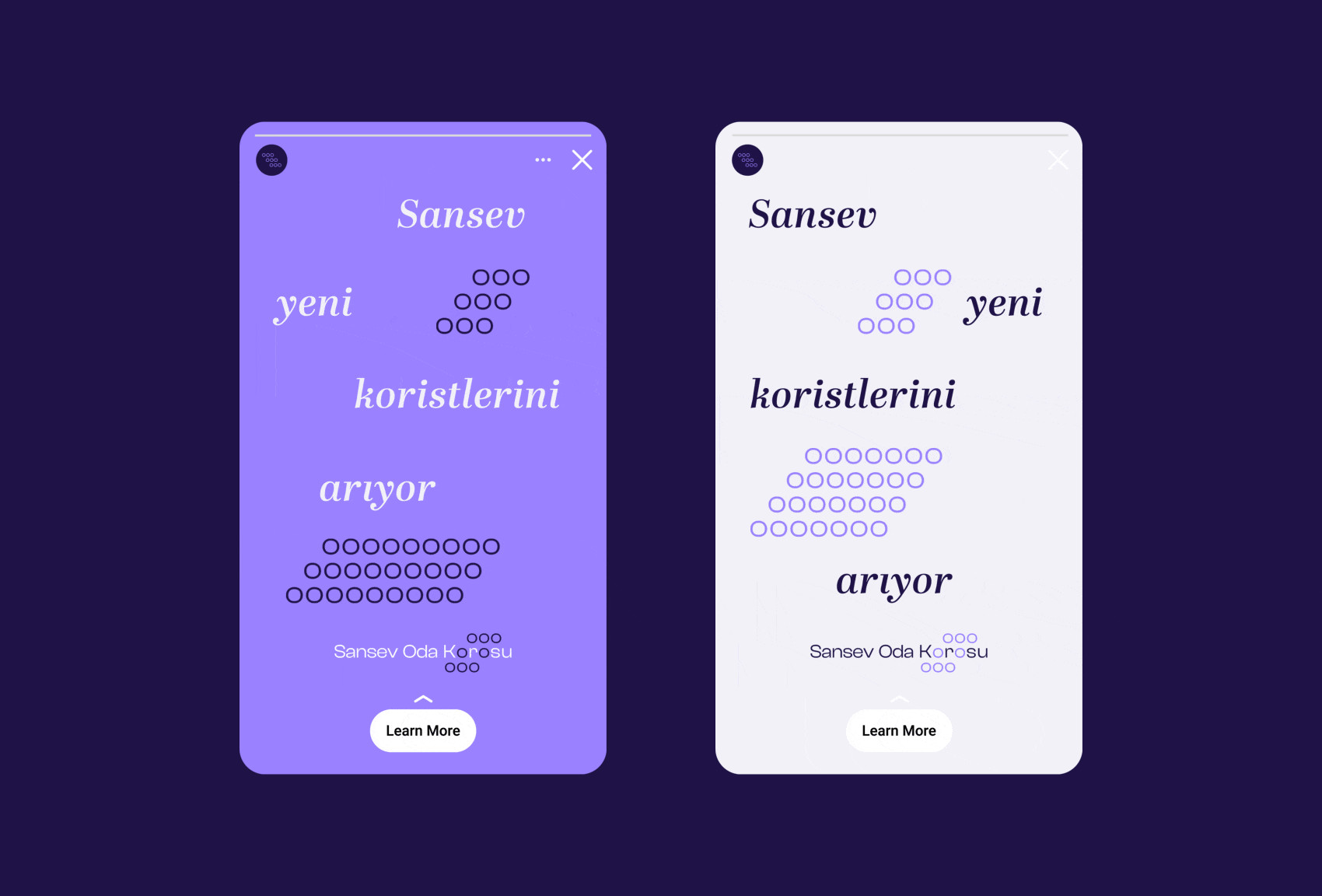
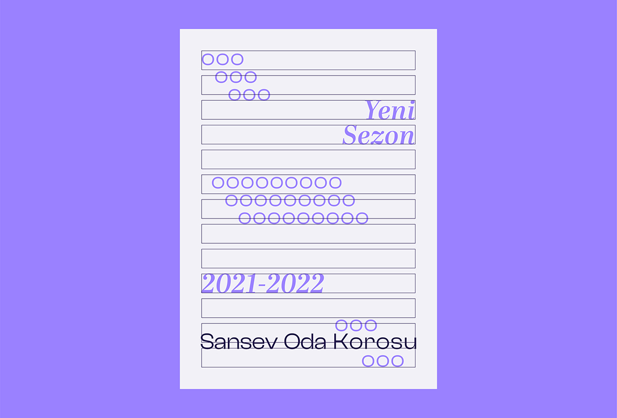
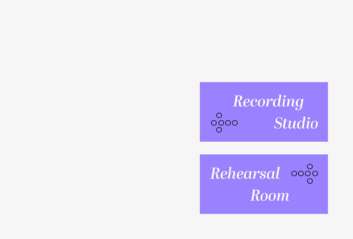
Sansev Oda Choir
Identity
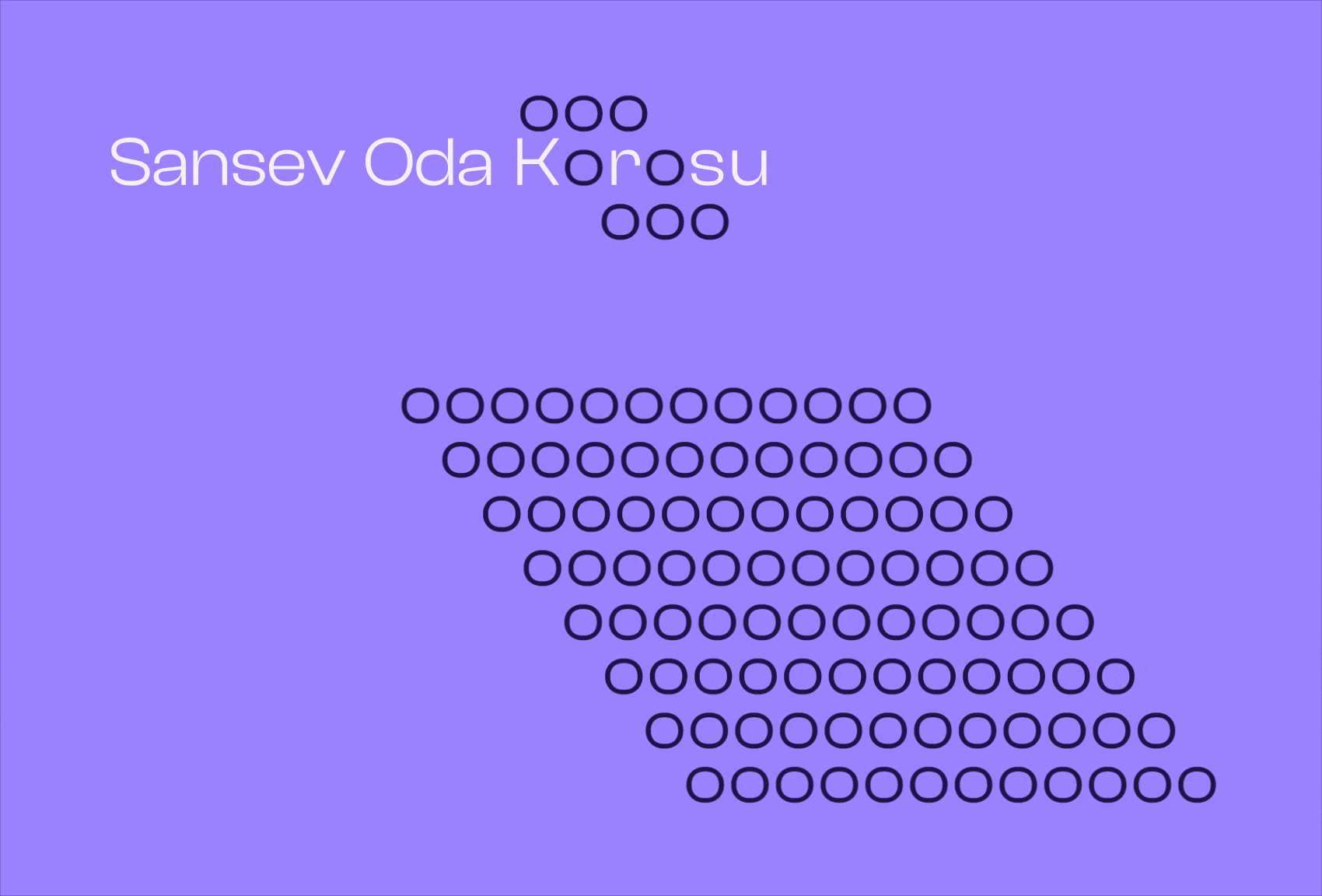
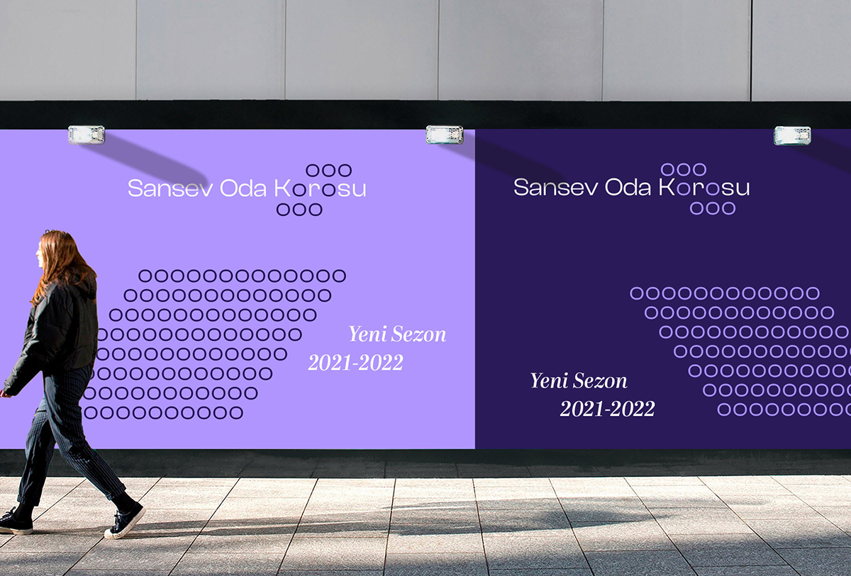
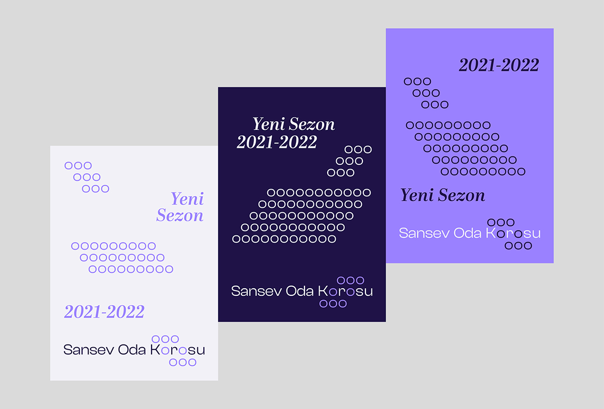
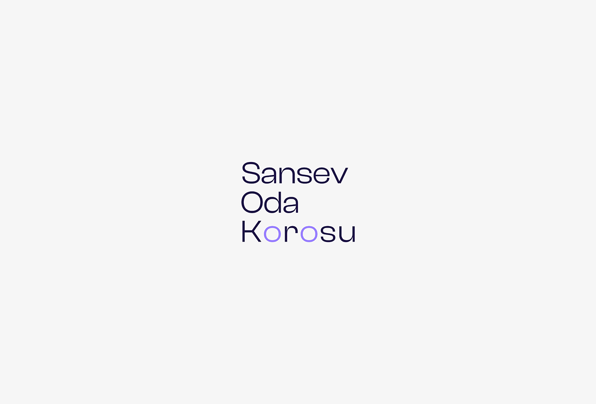
Sansev Oda Korosu is a choir residing in Istanbul whose members are of all ages and occupations. The visual identity for Sansev Oda Korusu reflects and uses the array of chorists and listeners represented as lower-case o's as the main graphic elements.
The logo and overall design aim to make the viewer see the choir in a sitting position to enhance indulgence in the design. Italic serif font is used to further contribute to displaying the choir scene created by lowercase o's. Texts are also set in a way that imitates it on each format it is used.
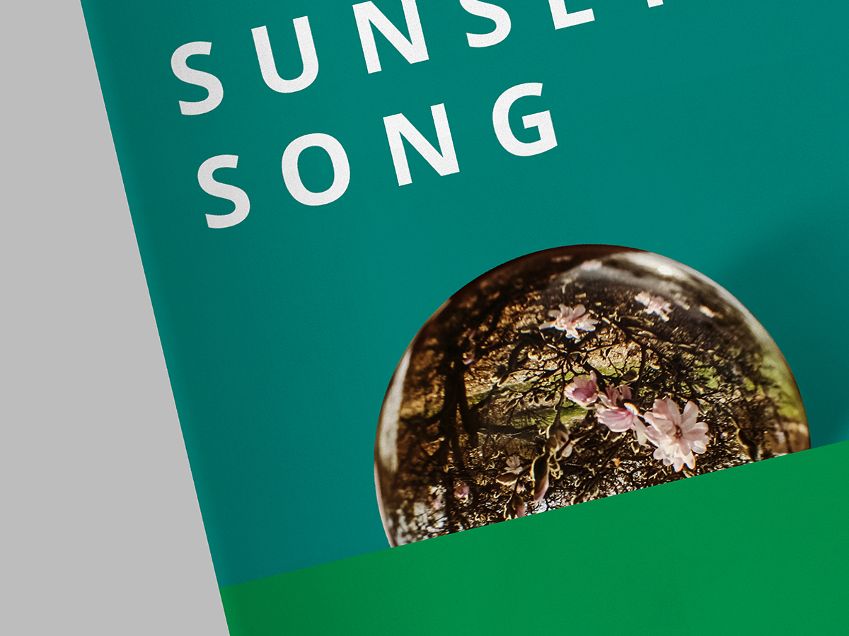
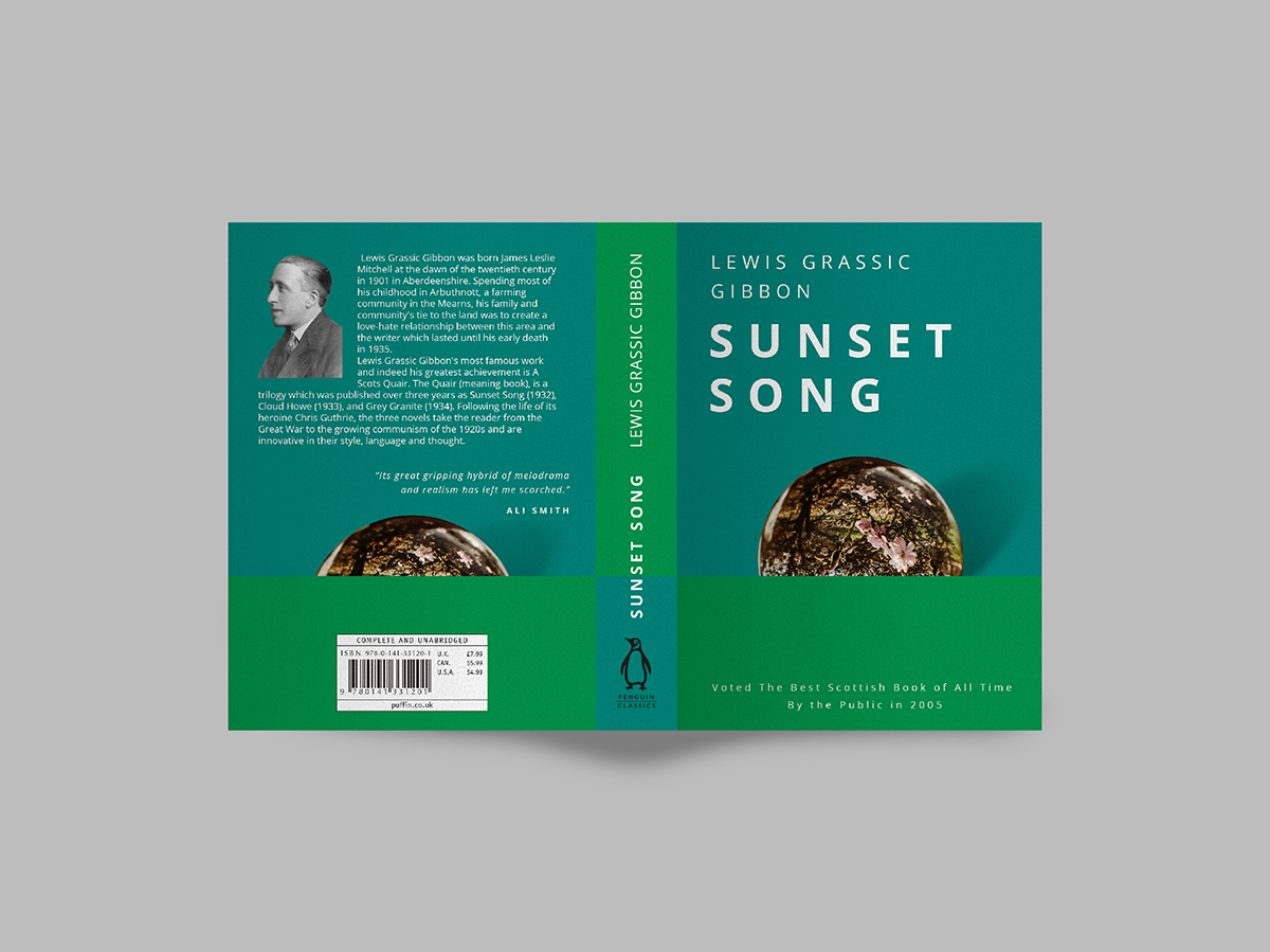
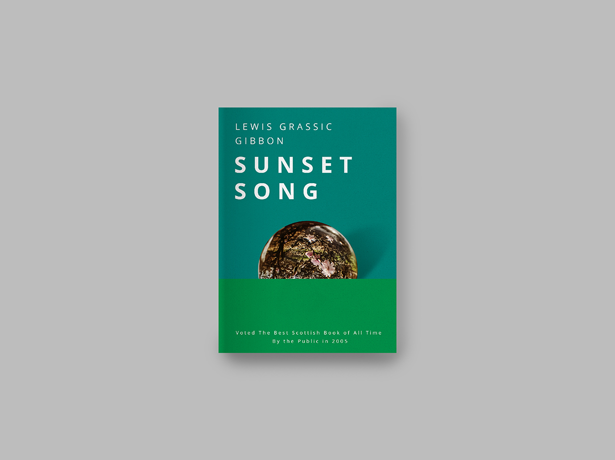
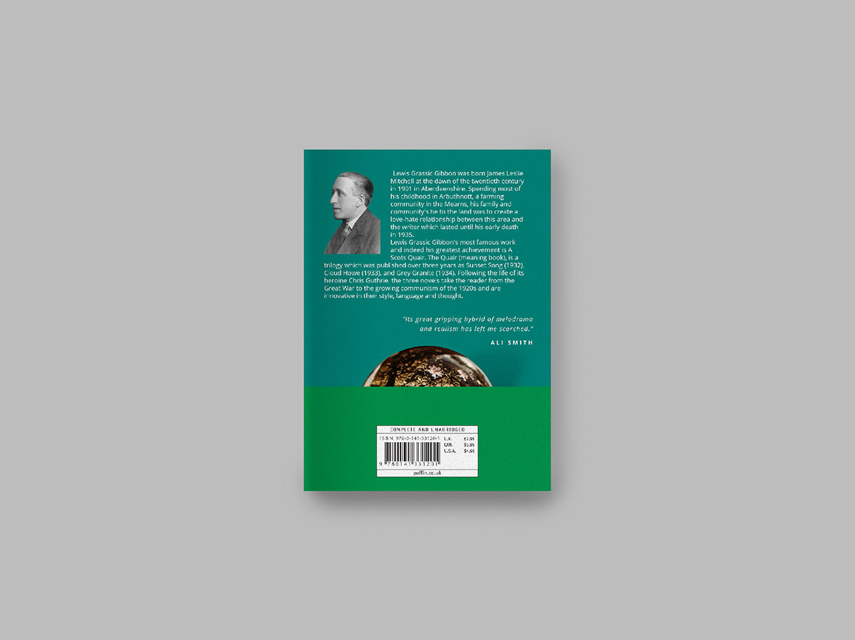
Sunset Song
Book Cover
The book cover is a direct reference to how the plot of the book had been ended, setting sun above the farmland while the Scottish folk tune “Flowers of the Forest” being sung. The opaque sun reflecting the farmlands of Scotland placed on the horizon formed by solid color blocks of green utilized on the cover with the purpose of giving the viewers a glimpse of where the story was set overall.
The setting sun has another meaning that is also being carried in the title ; bringing an end to their way of life, the lives of the characters in the narrative.
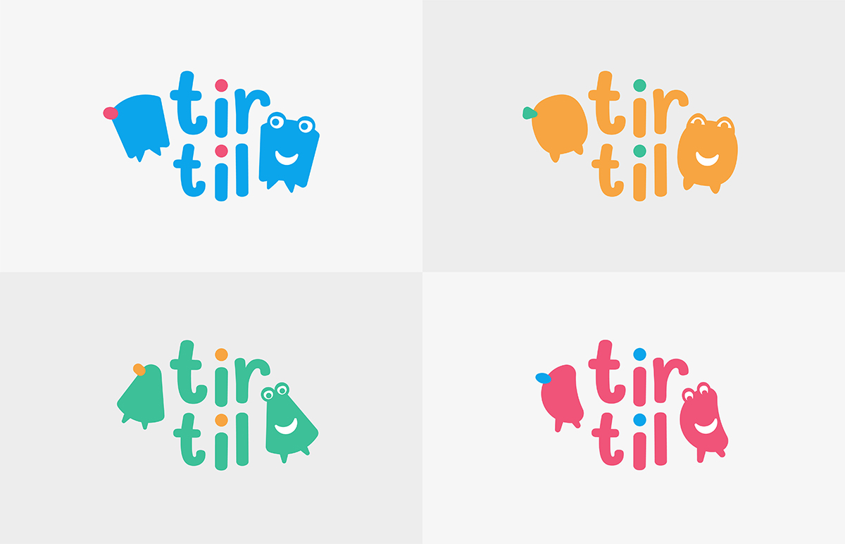
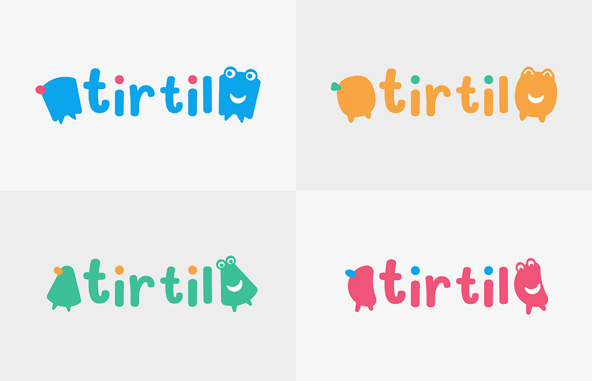
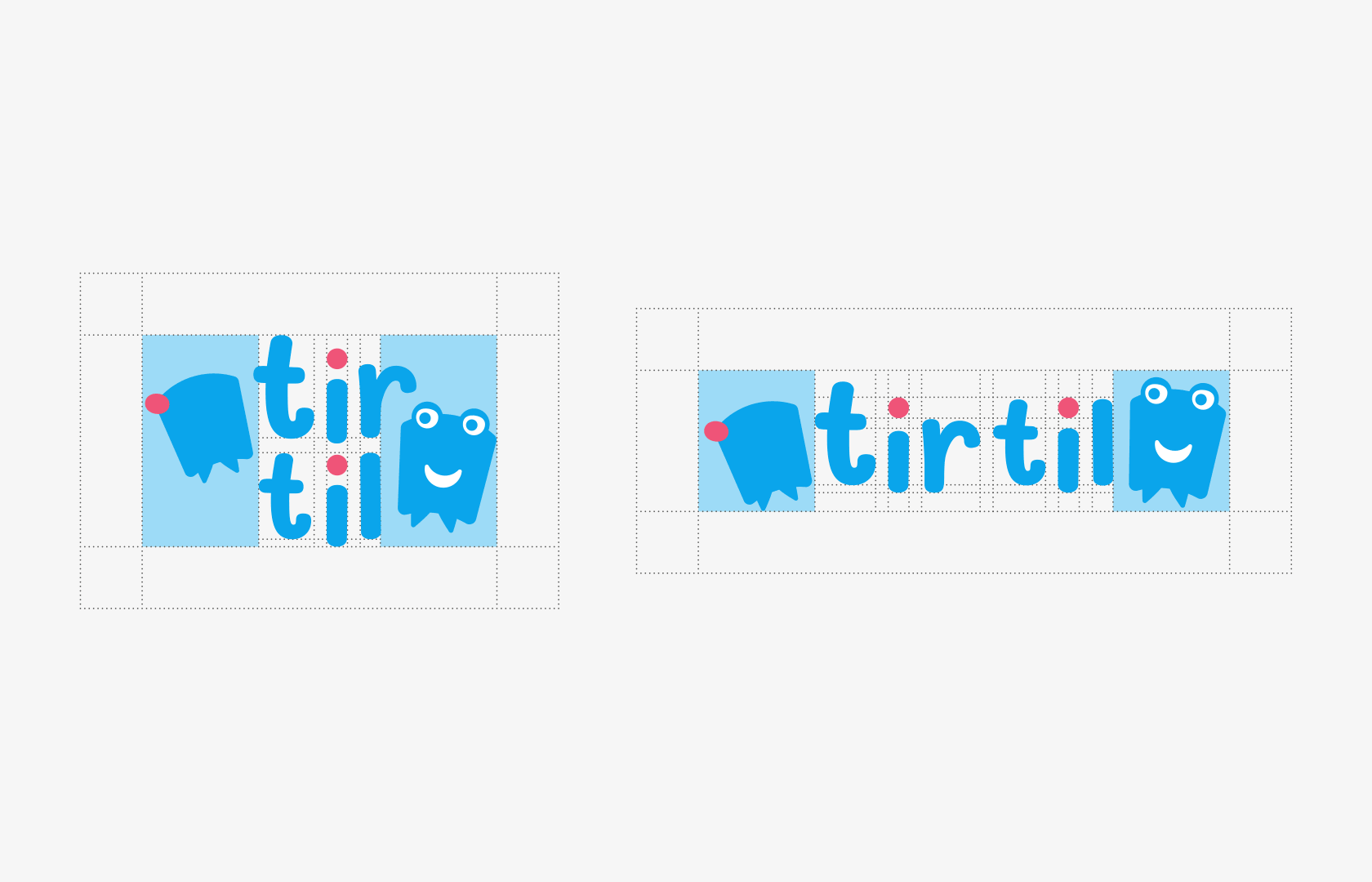
Tirtil
Identity
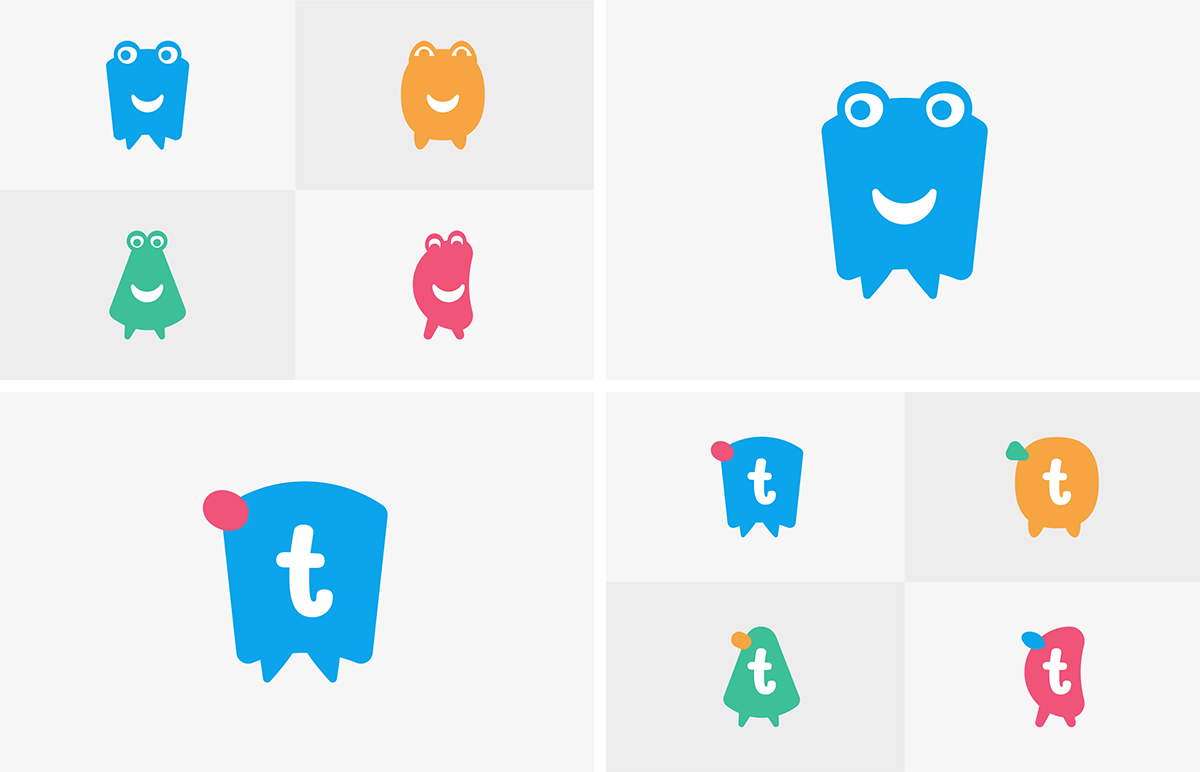
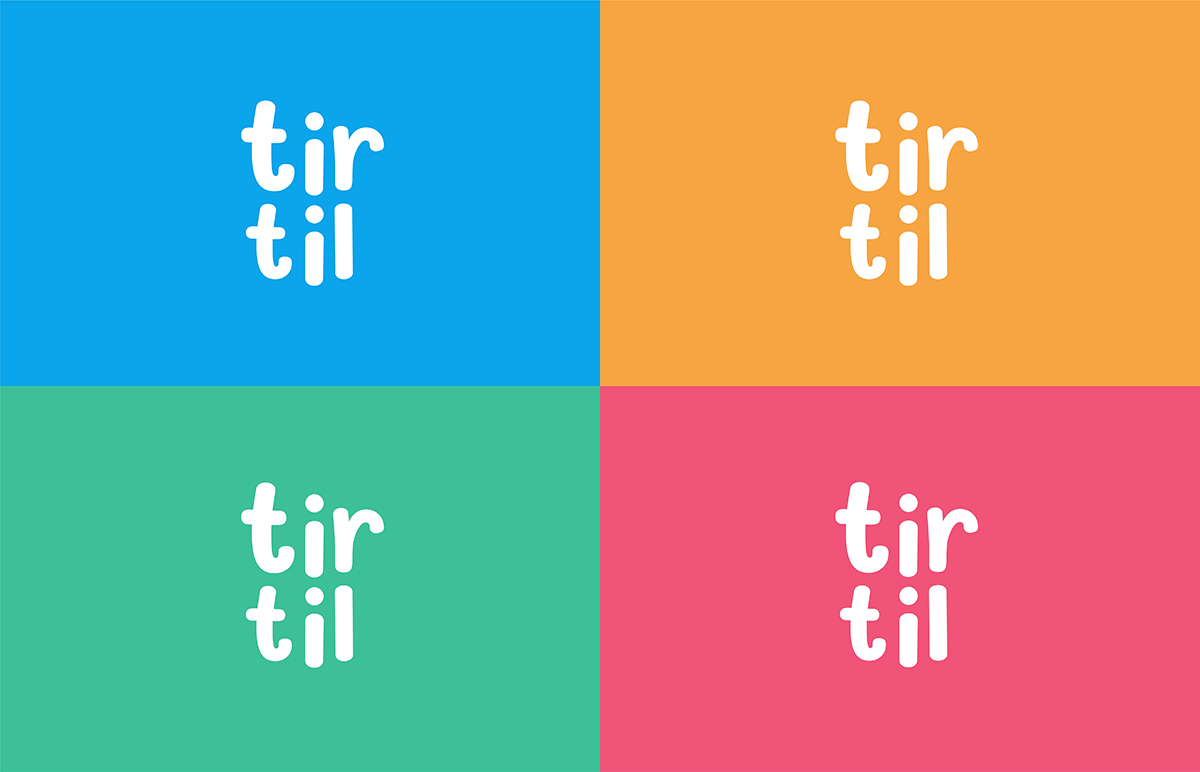
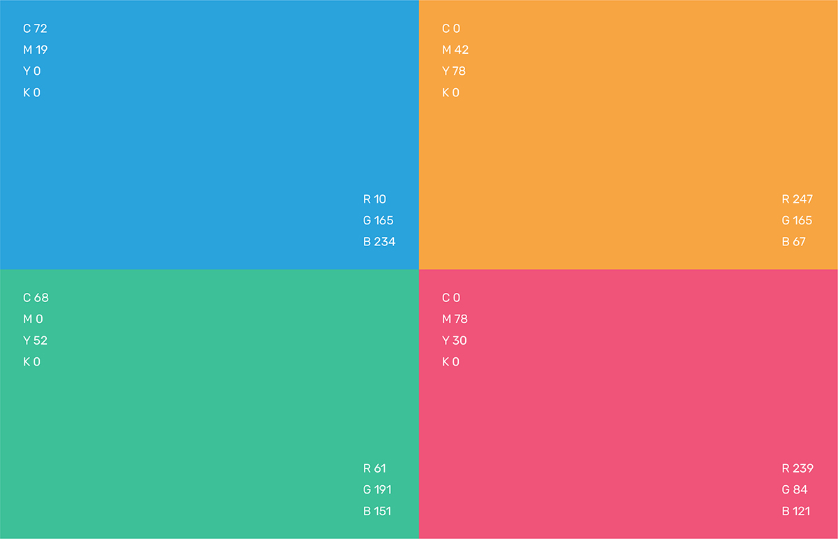
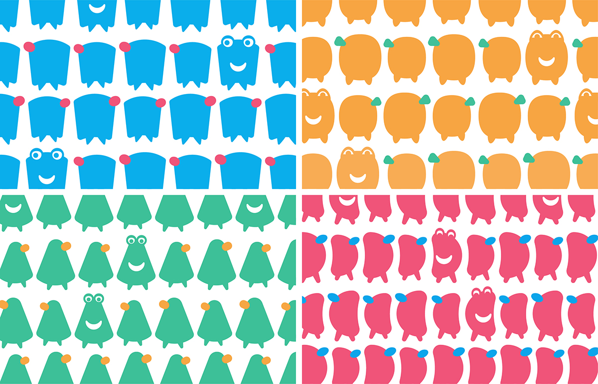
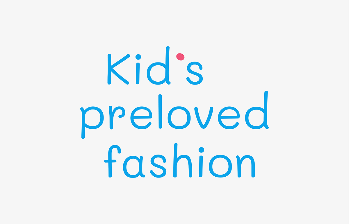
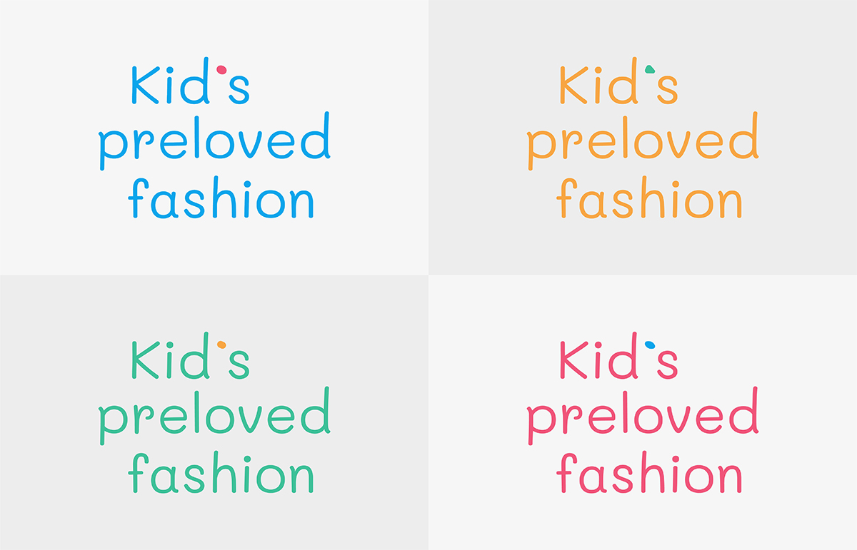
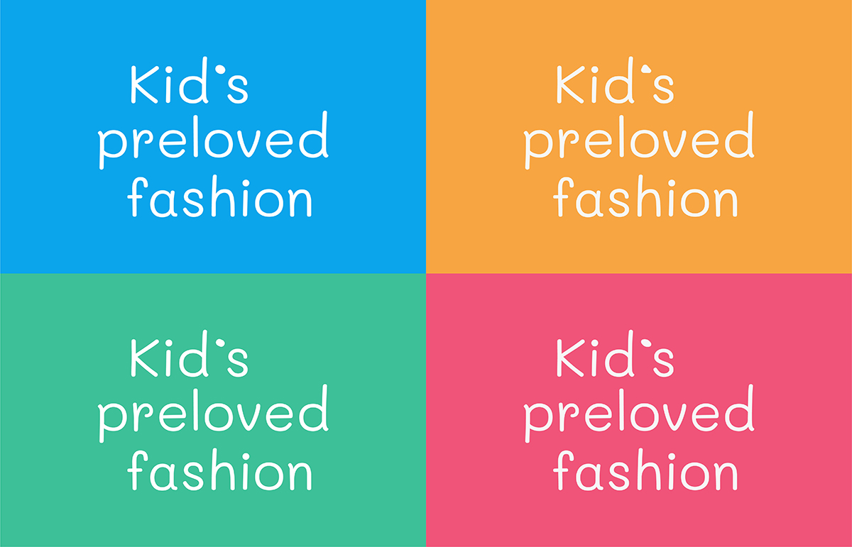
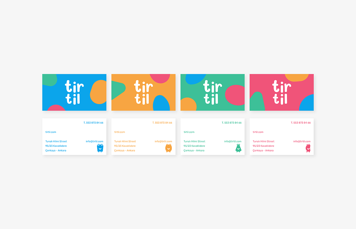
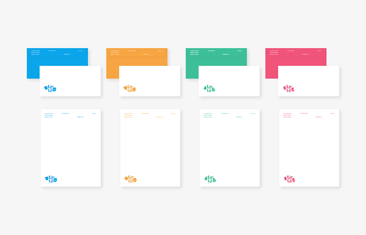
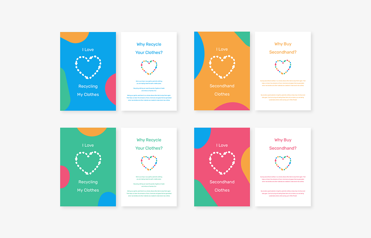
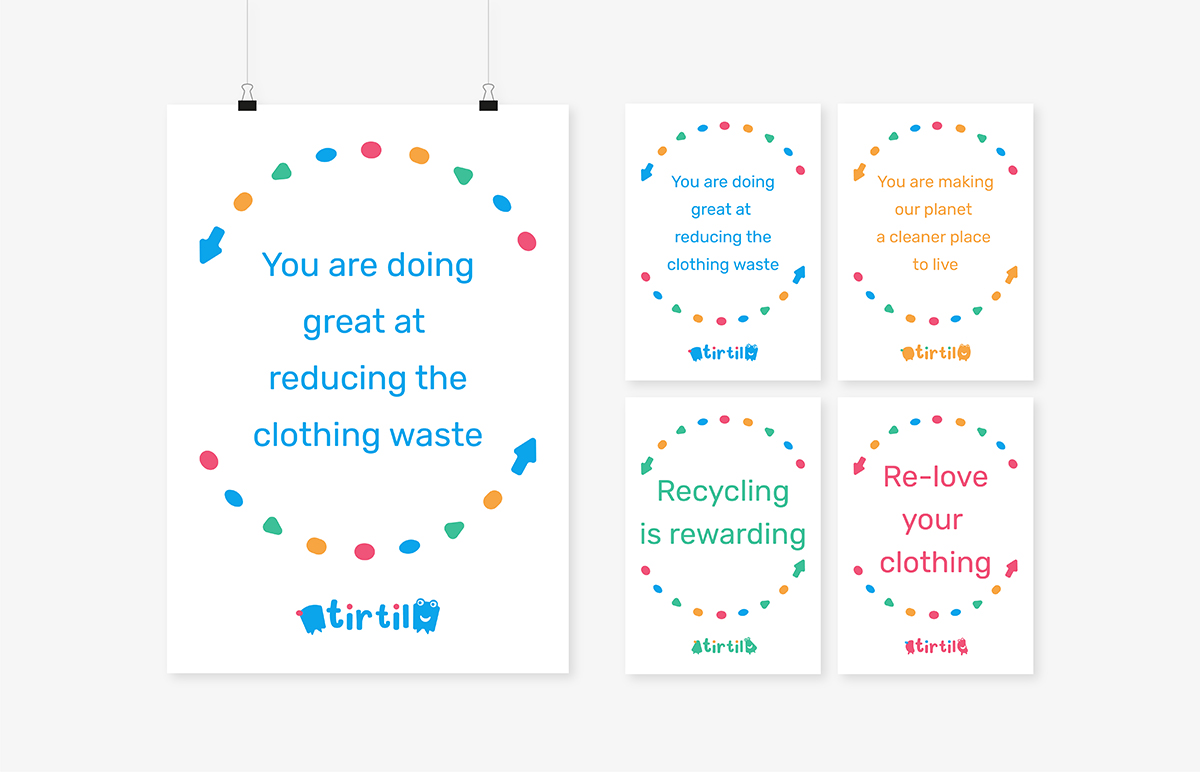
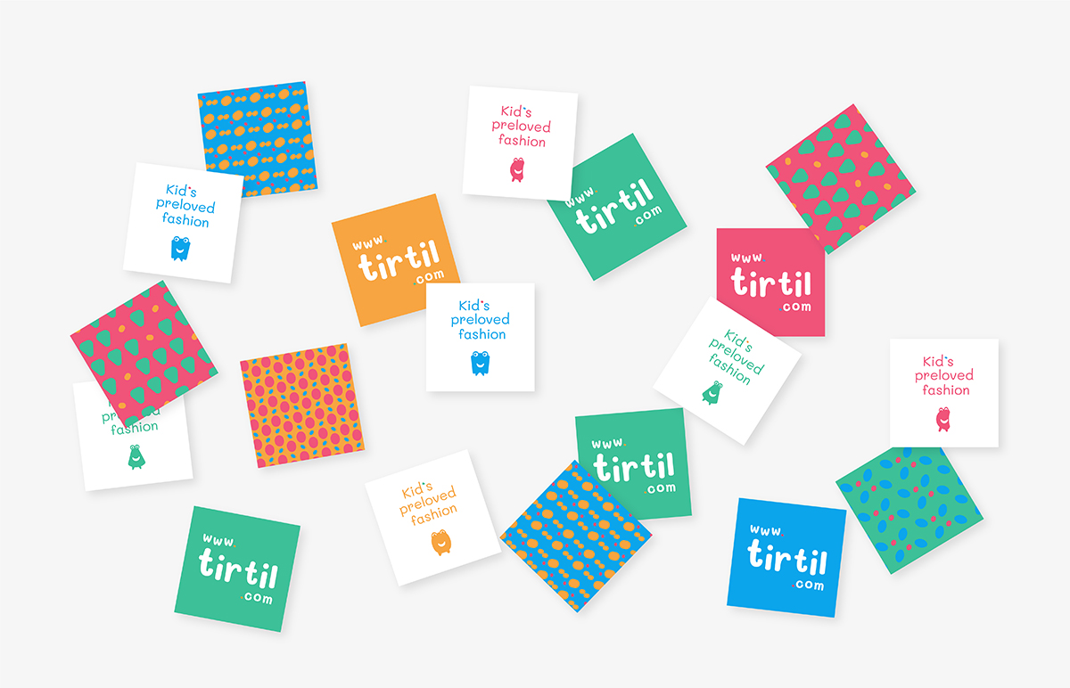
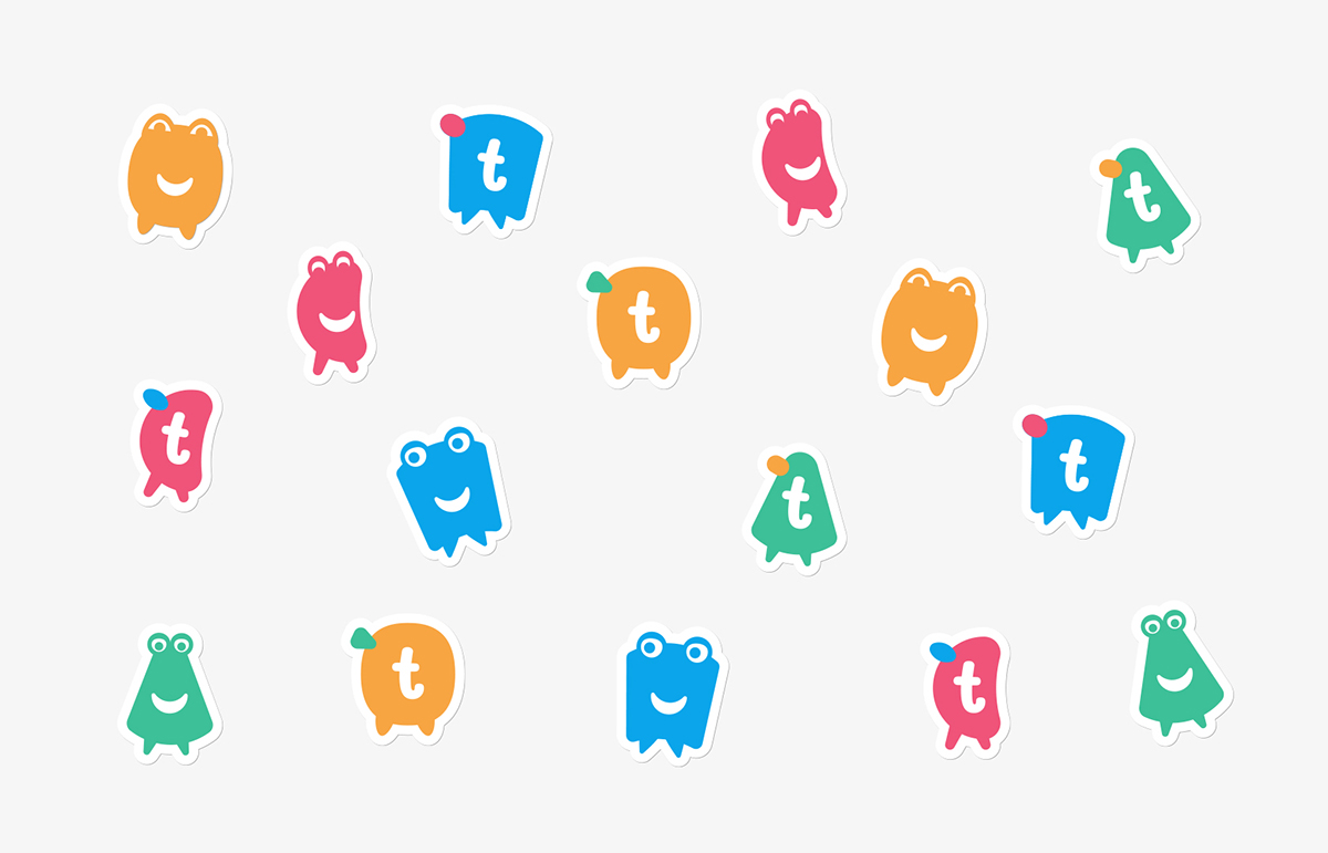
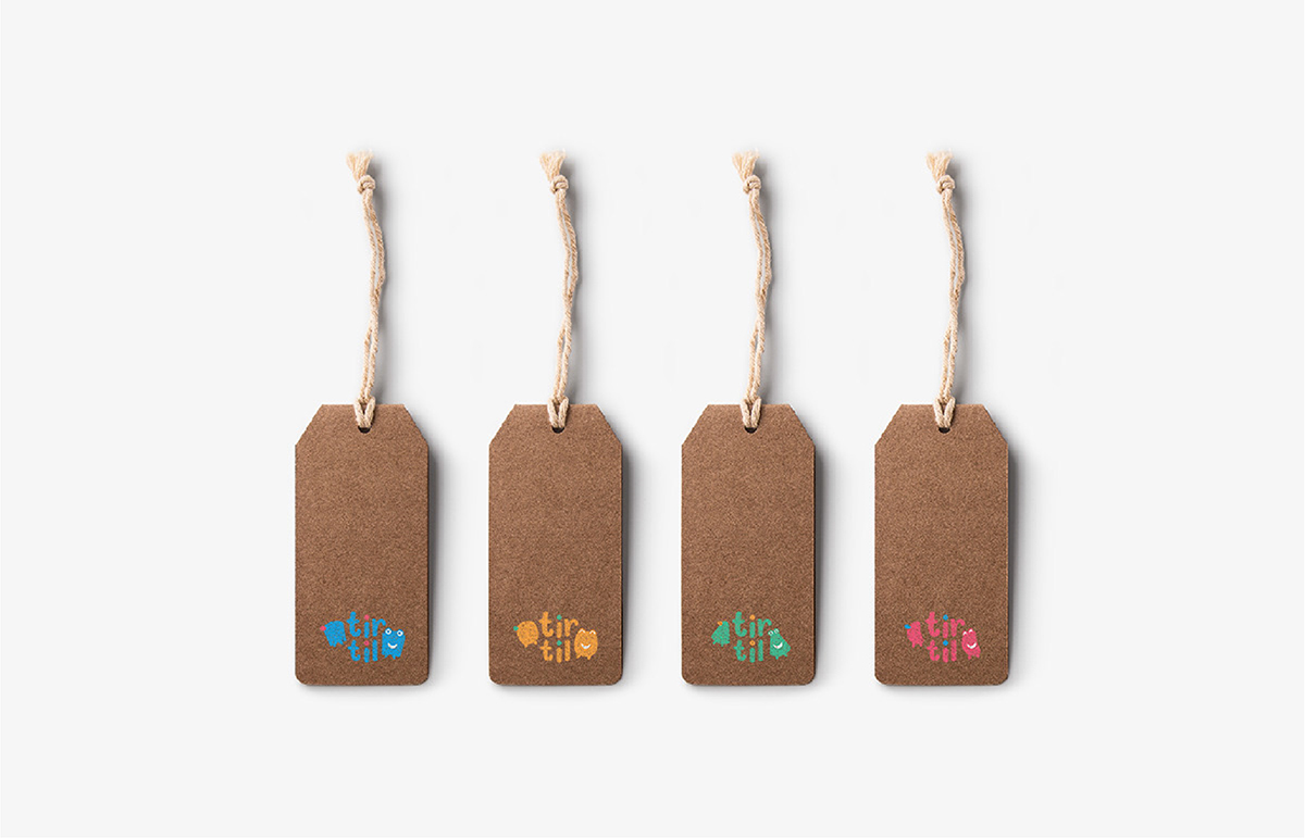
Tirtil is an Ankara-based secondhand kid clothing resale brand that sells and buys used kids' clothes through its stores located across the country. Tirtil’s aim is to prevent children clothing waste, create consciousness among children and their parents about recycling clothes, and promote a sustainable lifestyle via the brand vision
Tirtil is a Turkish word that means caterpillar in English. As caterpillars go through metamorphosis, their body structure changes so fast as well as children who physically develop really quick when they grow up into teenagers.
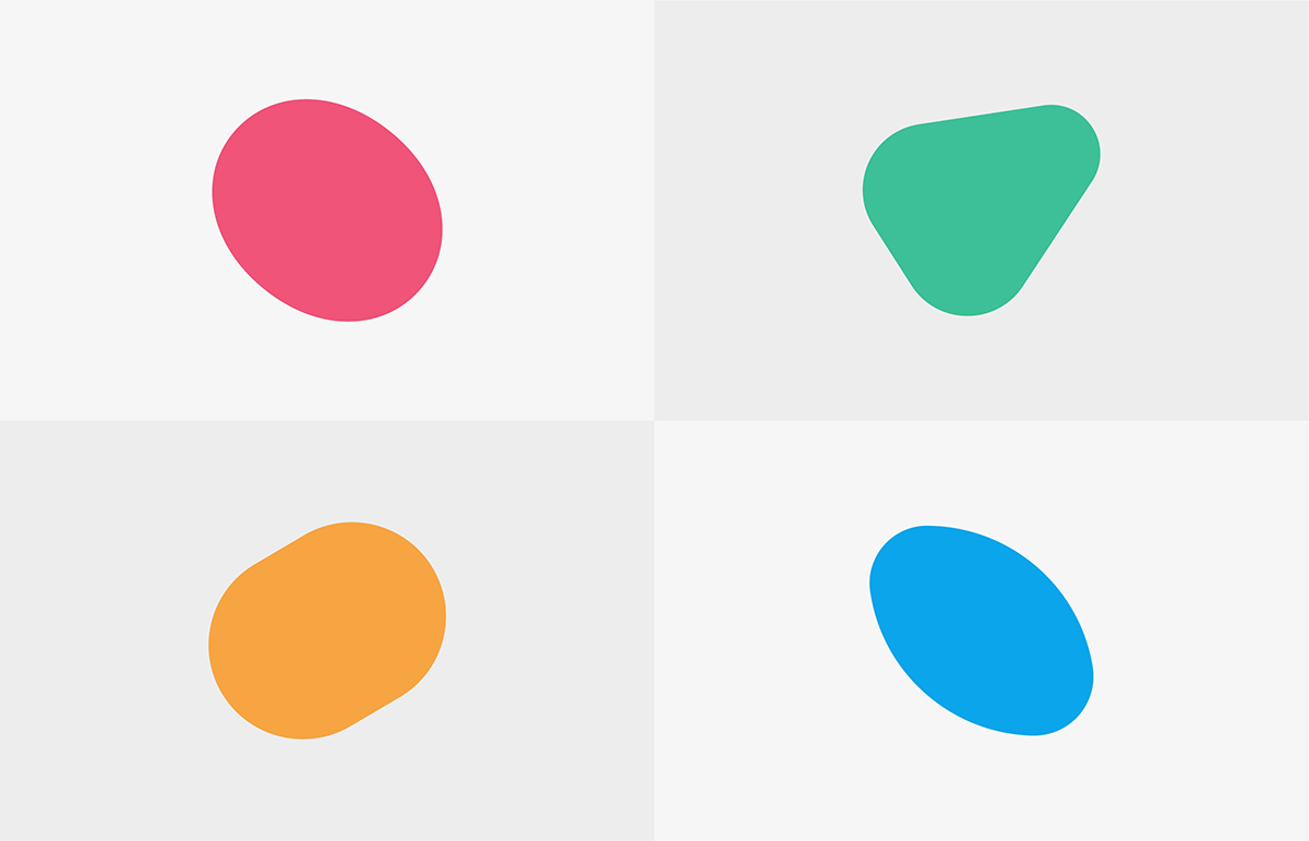
The brand vision is reflected upon its logo which is a combination of different caterpillar symbols changing in each logo placed at each end of the logotype referring to "metamorphosis" of both children and clothing. The happy caterpillar symbol projects the joy that children experience in both their growth and contribution to lessening the clothing waste.
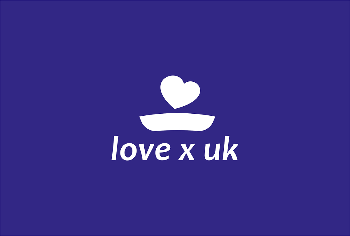
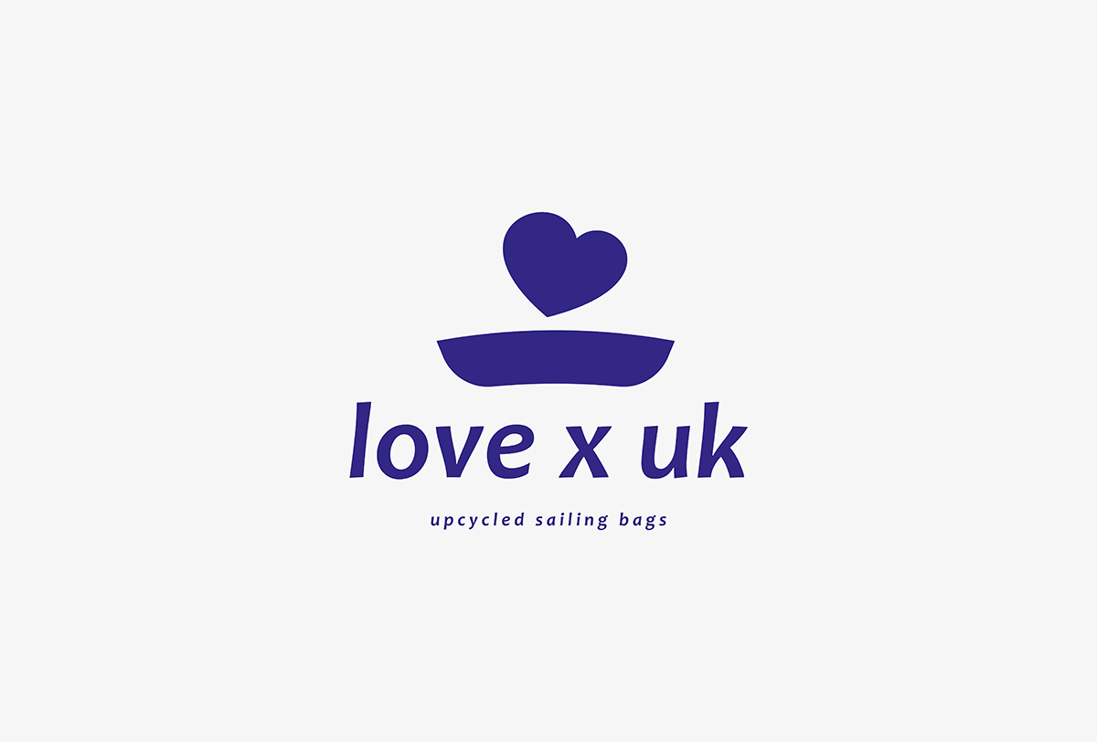

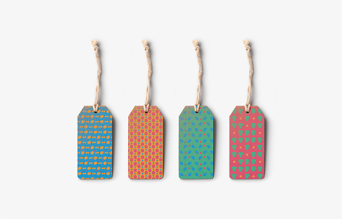
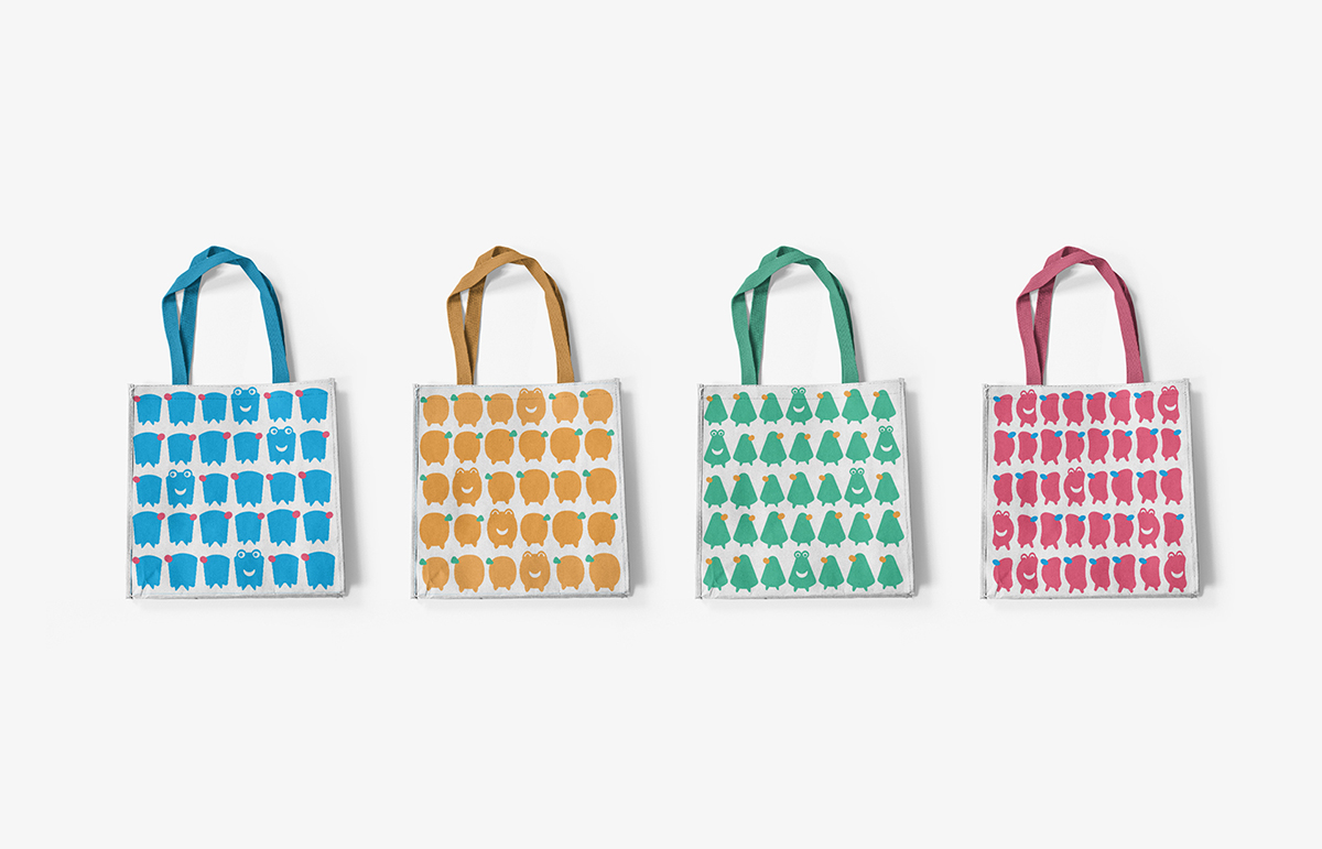
Love X UK
Identity
Love x UK is a sub-brand of UK Sailmakers company, one of the oldest groups of sail lofts in North America. The company has a wide global reach with 50 lofts and service centres around the world.
Love x UK designs and creates a variety of handmade bags using remnants of cloth from sail manufacturing. As sailcloths are made to be highly durable, the up-cycled bags last through decades of use, stand up to harsh environments, do not stretch under load, and are low in cost.
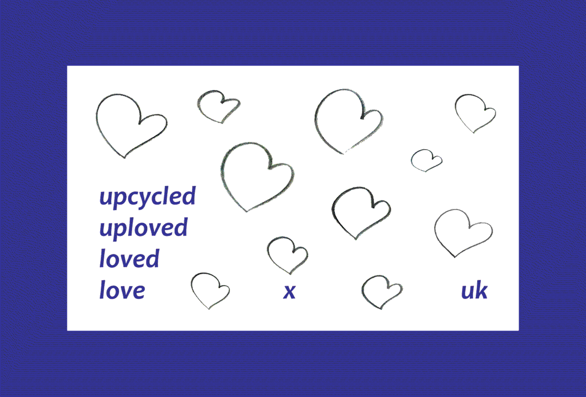
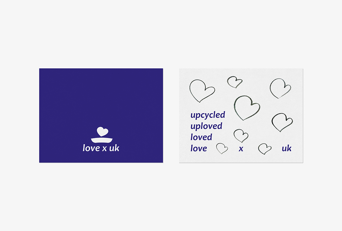
The design of the logo is a boat whose sail is represented by a heart blowing in the wind, referring to the brand name "love." The deep-blue colour scheme and overall logo branding are inspired by the open seas and wind. The curvy quality of the italic logotype symbolises wind blowing through a sail, and the widespread typographic placement uses a lot of negative space to represent the vastness of the sea.
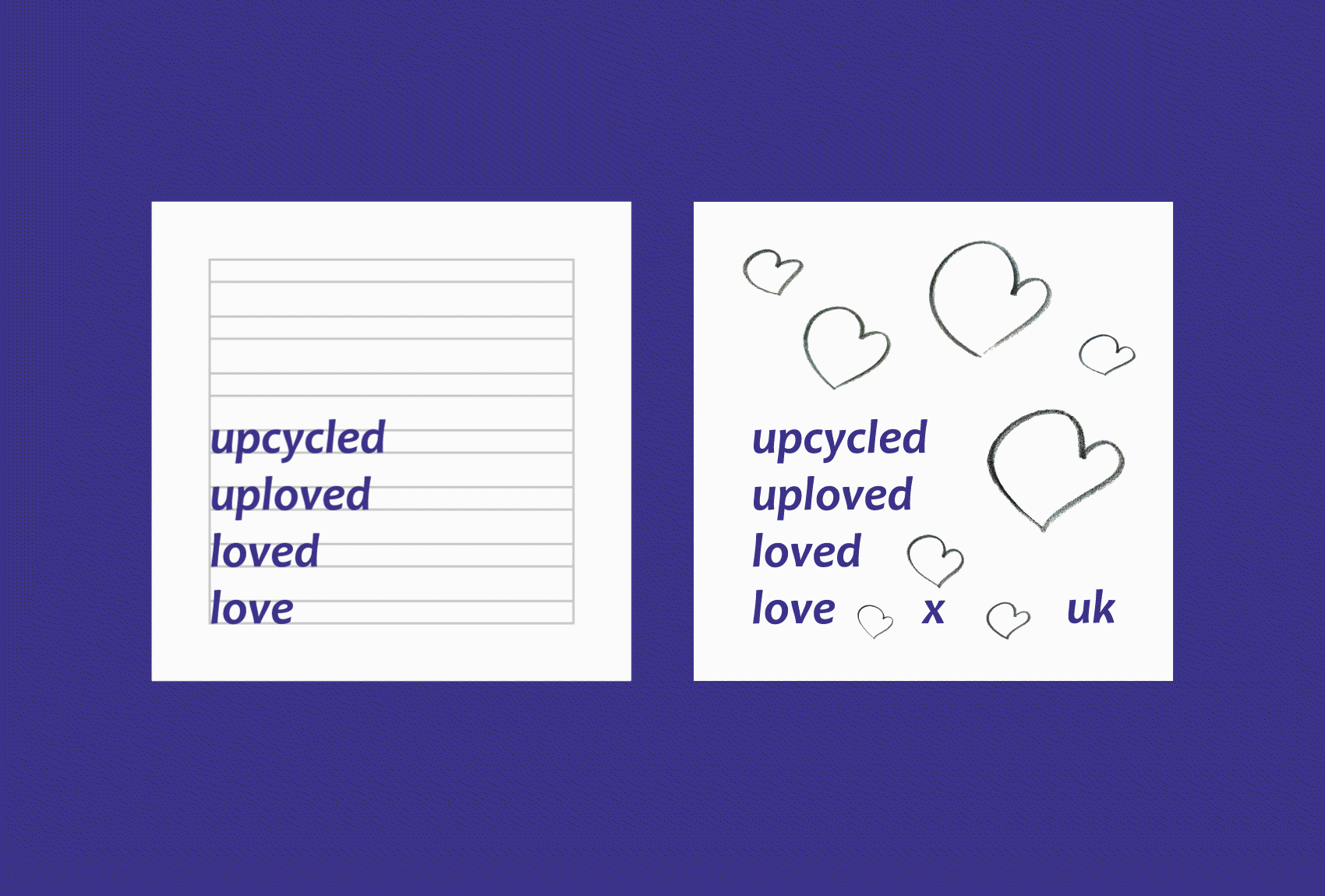
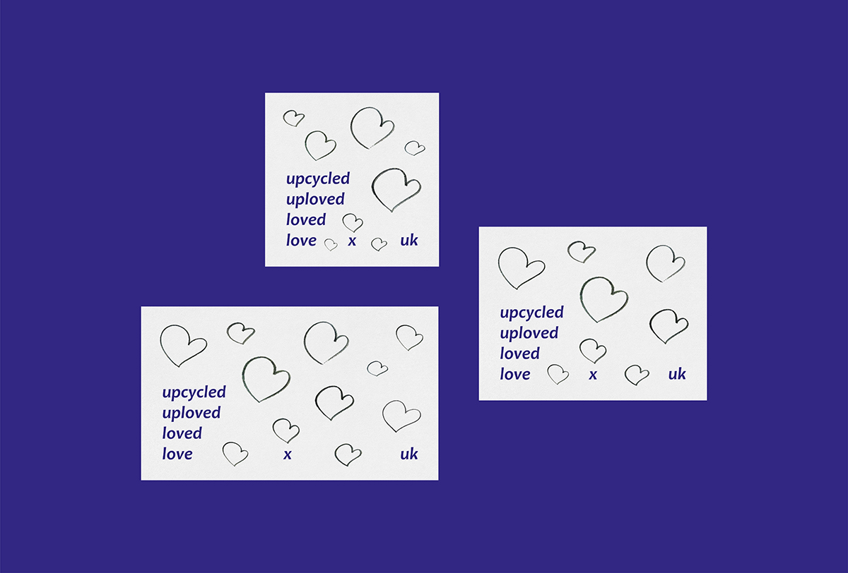
The logo also celebrates the handmade nature to the bags, using a collage of sketches of the logo's heart drawn during the creative process as its graphic elements.
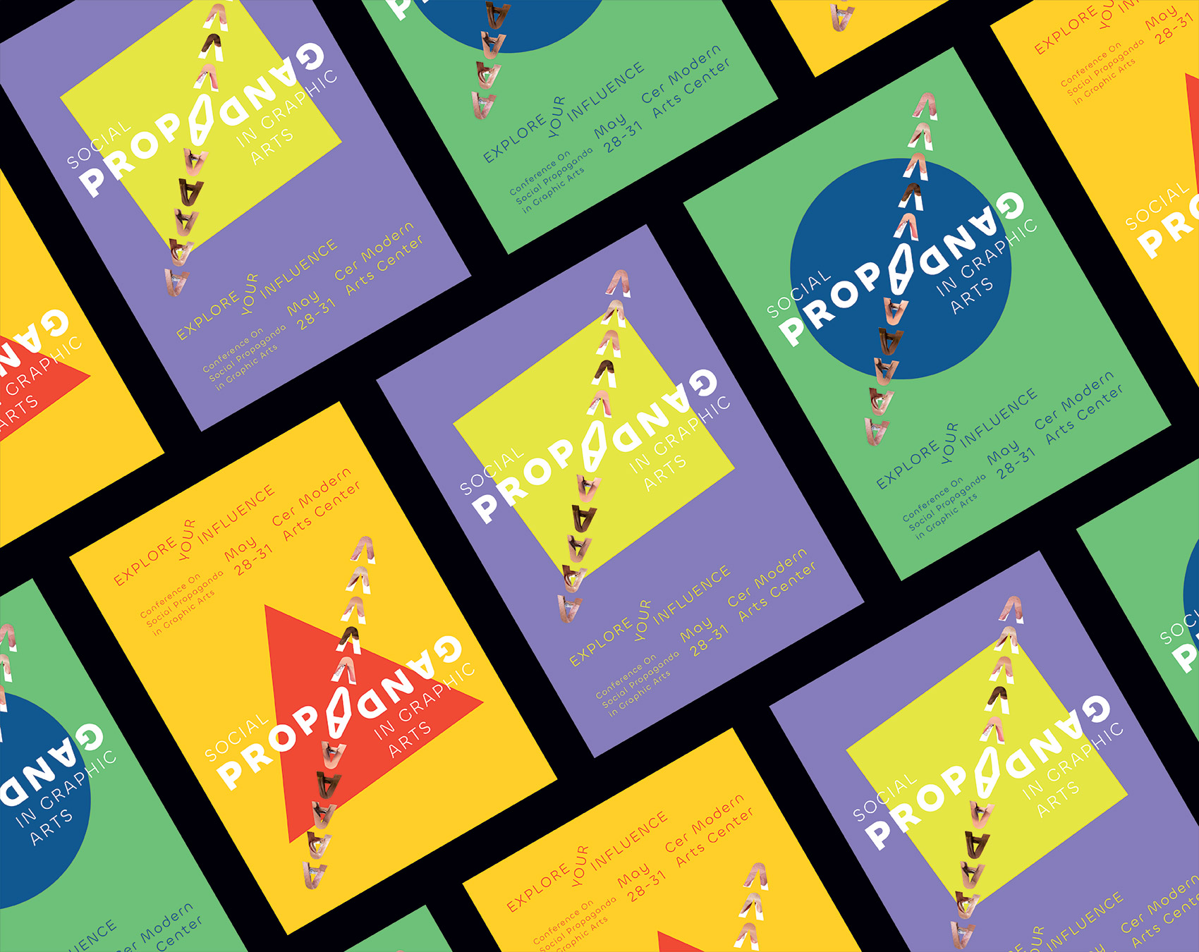
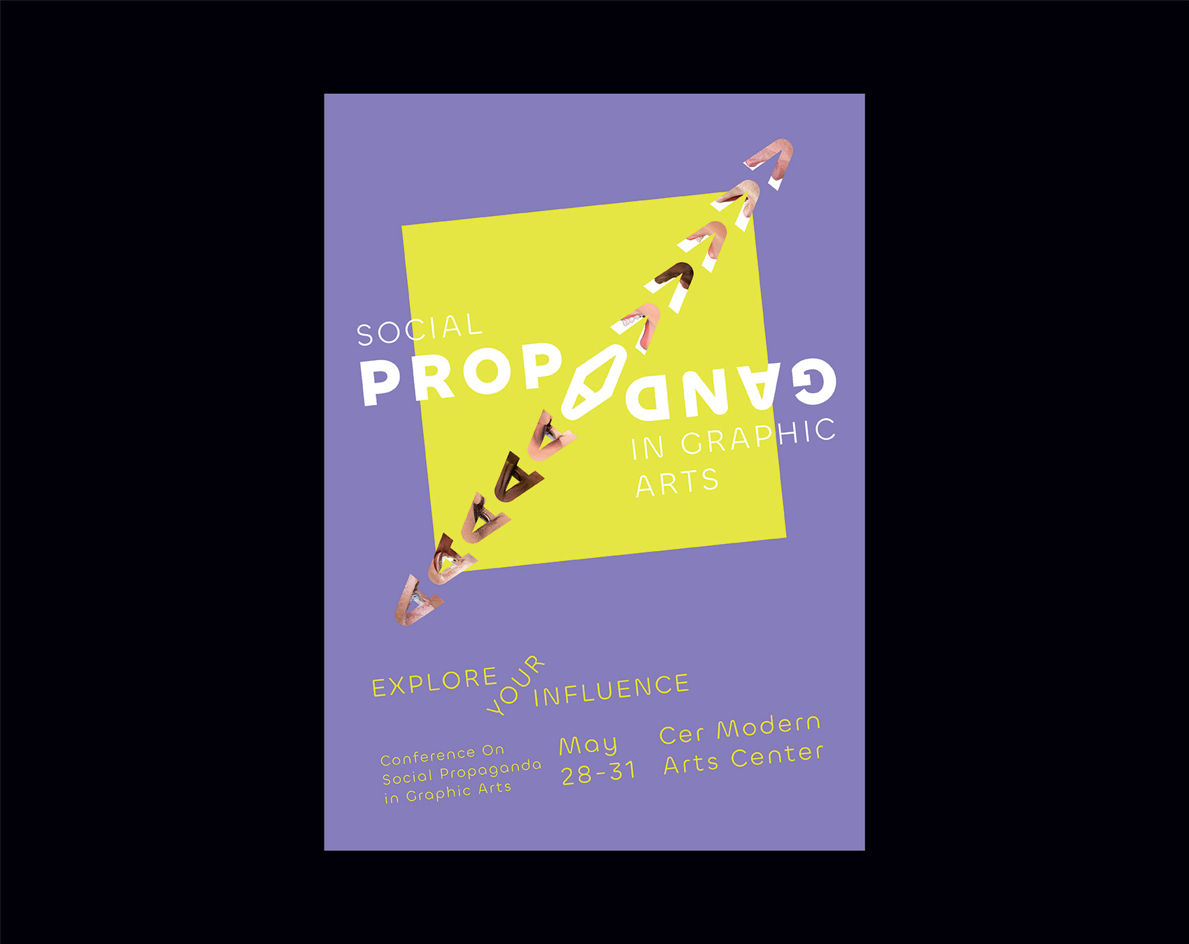
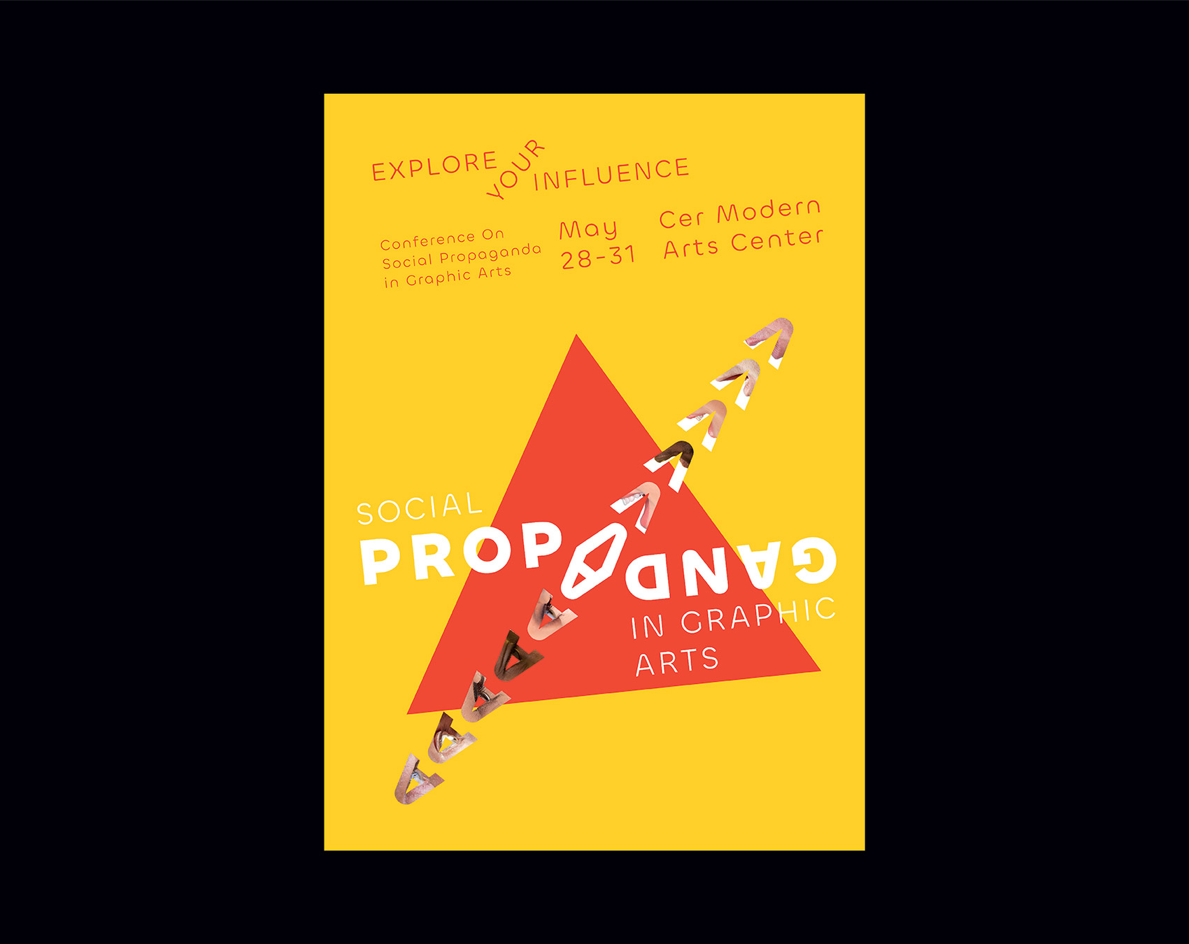
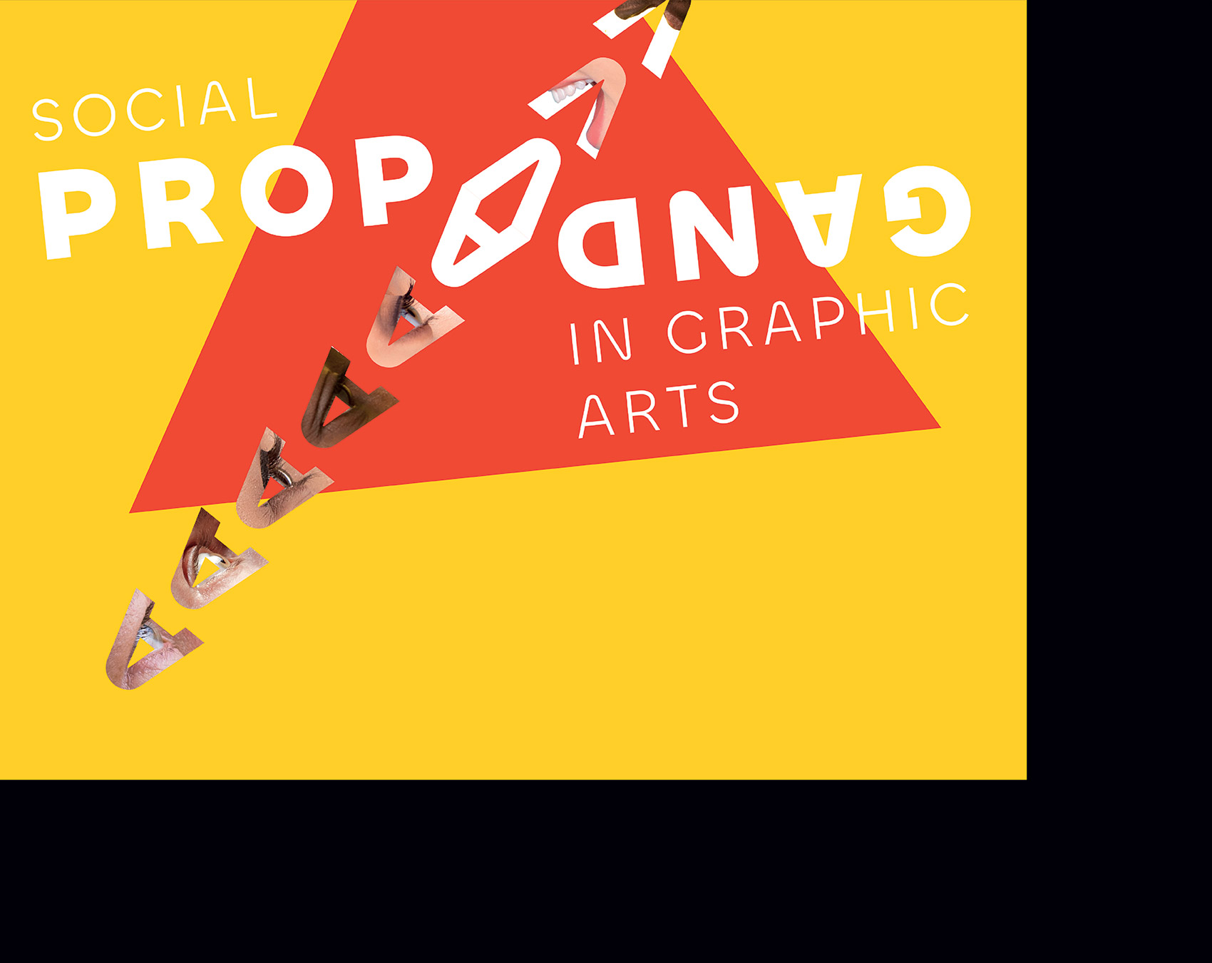
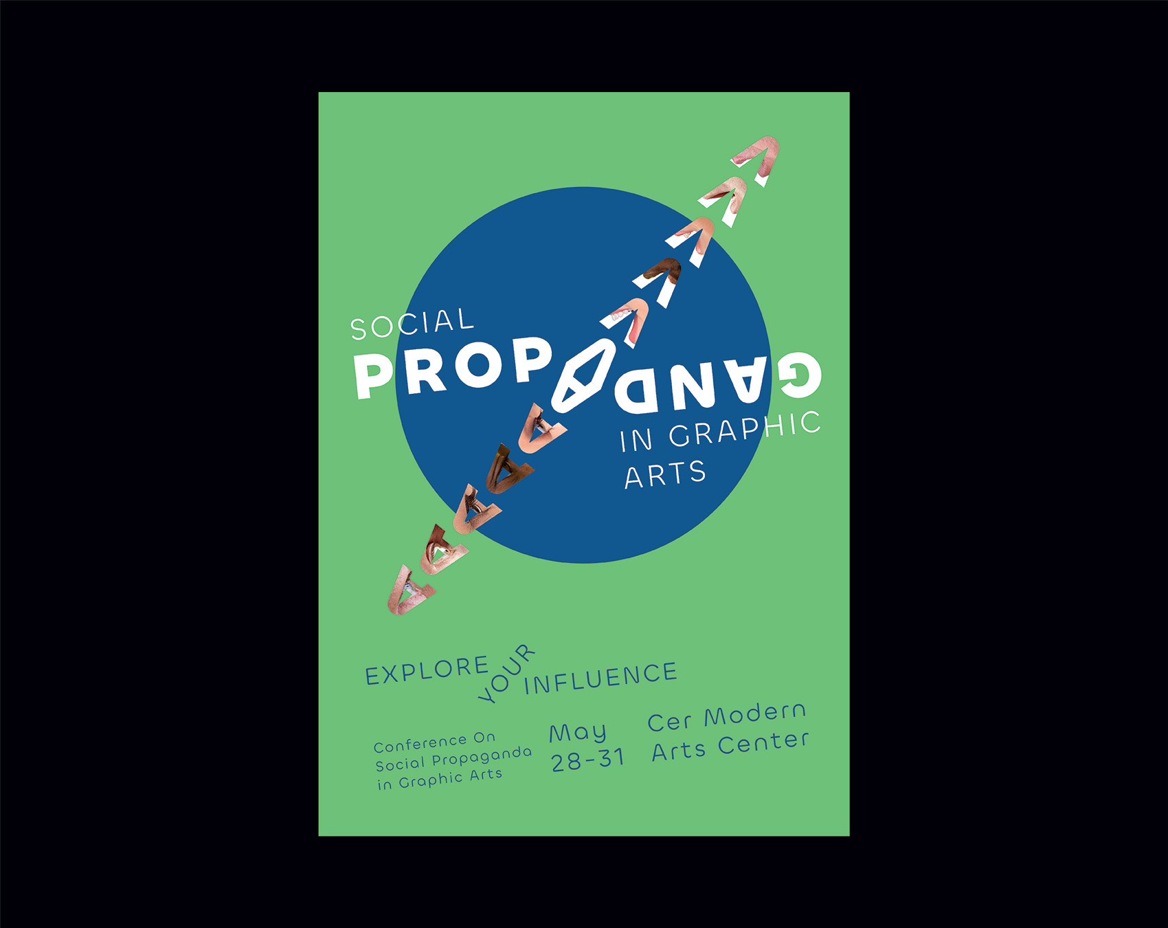
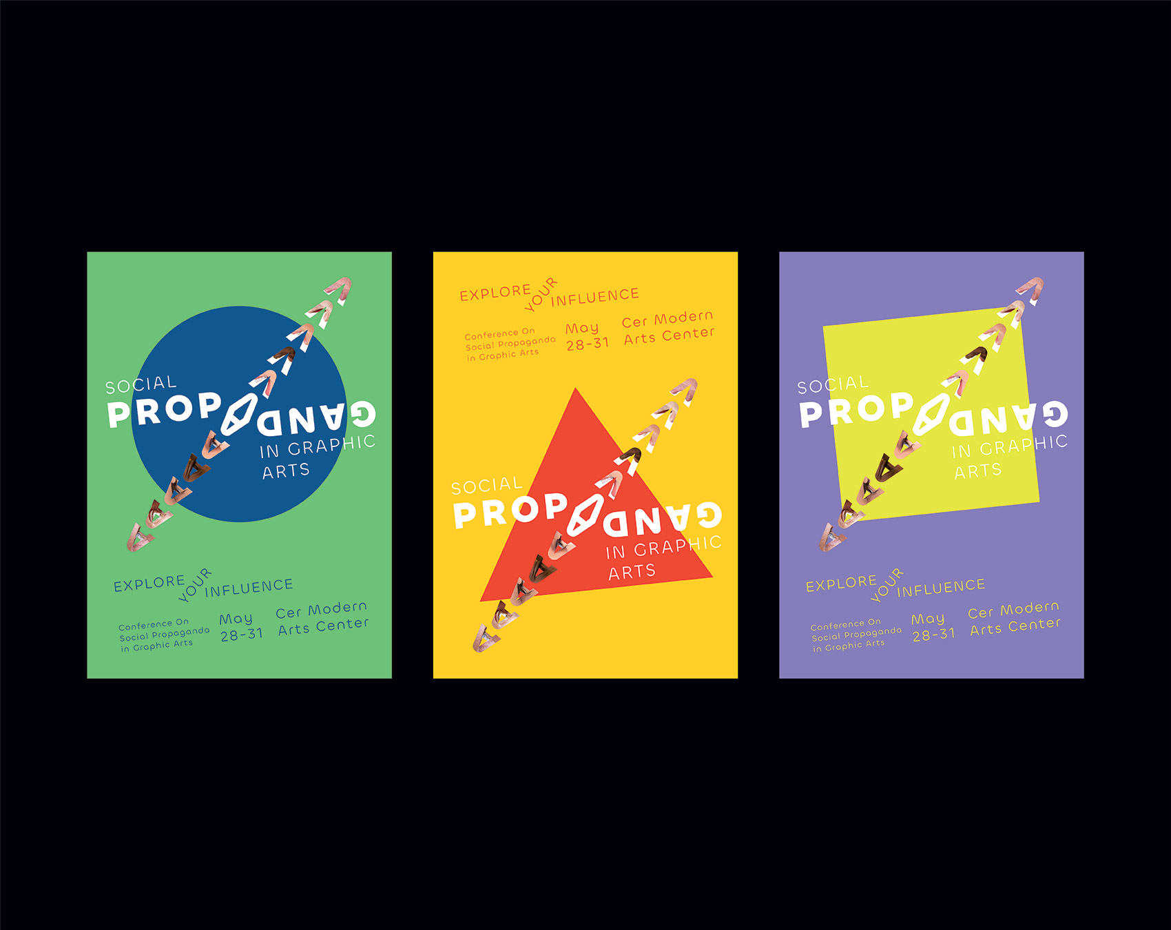
Social Propaganda in Graphic Arts
Poster Design
This series of posters for the event ‘Conference on Social Propaganda In Graphic Arts’ mirrors the act of propagating and being propagated. The word ‘propaganda itself is visually and verbally propagated. This is achieved by two ways; the one is the manipulation of words, meaning being propagated. The other one is that graphics derived from capital 'A' representing the eye and mouth and the images fit in those graphics manipulates the word which refers to the visual and verbal propagation.
Behind the typography is utilized three main graphic elements square, triangle, and circle as a reference to Graphic Arts and it also aims to create a focal point for the viewer.
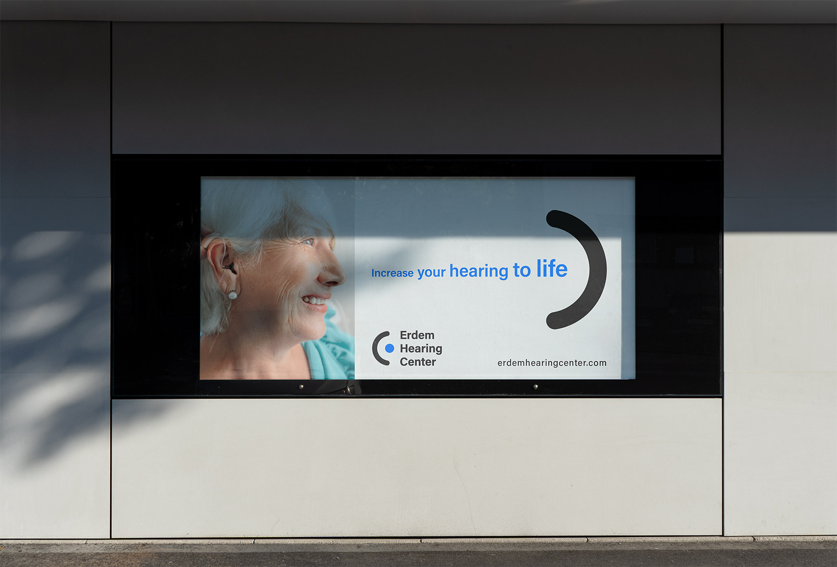

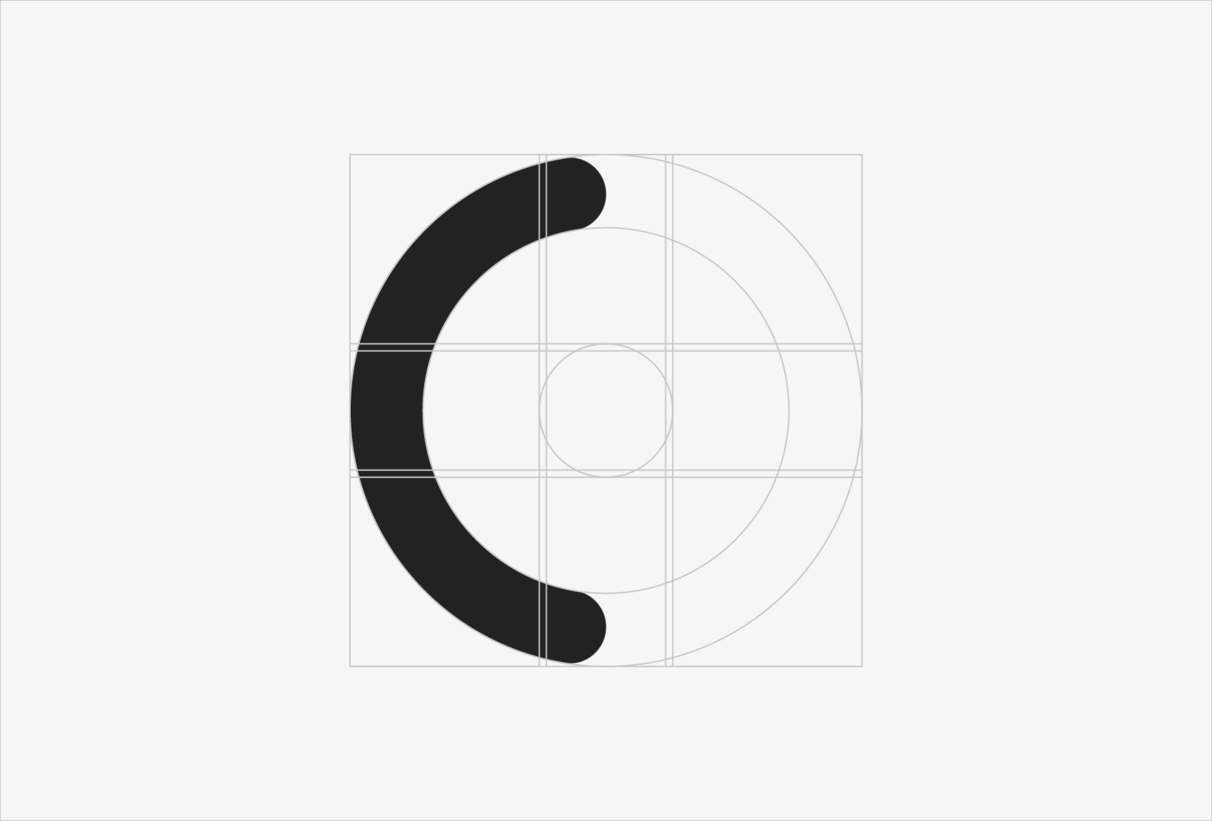
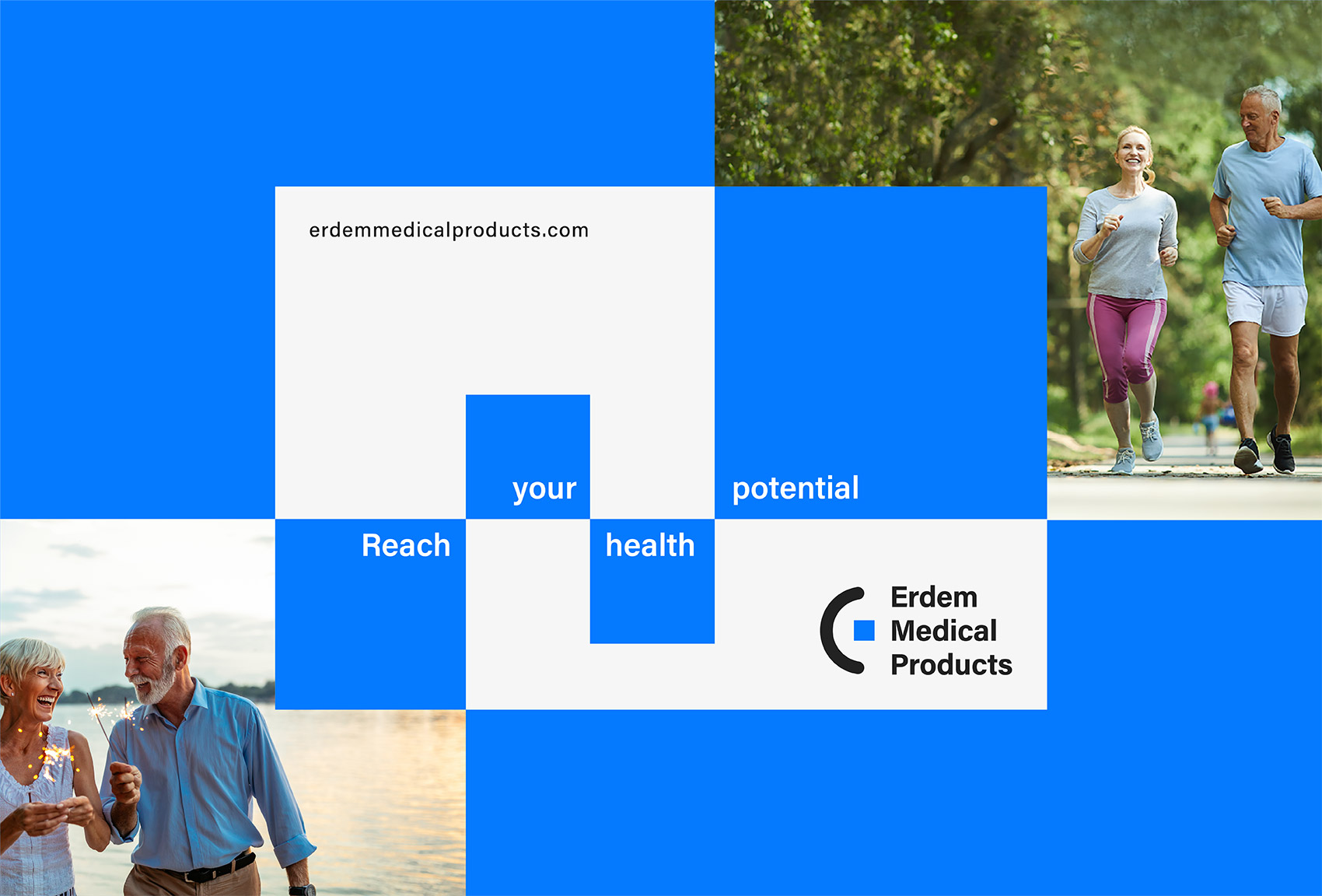
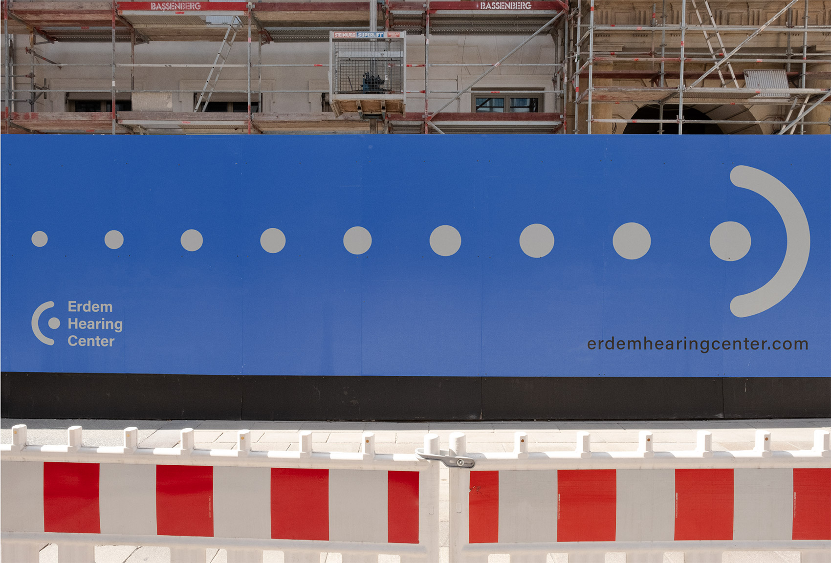
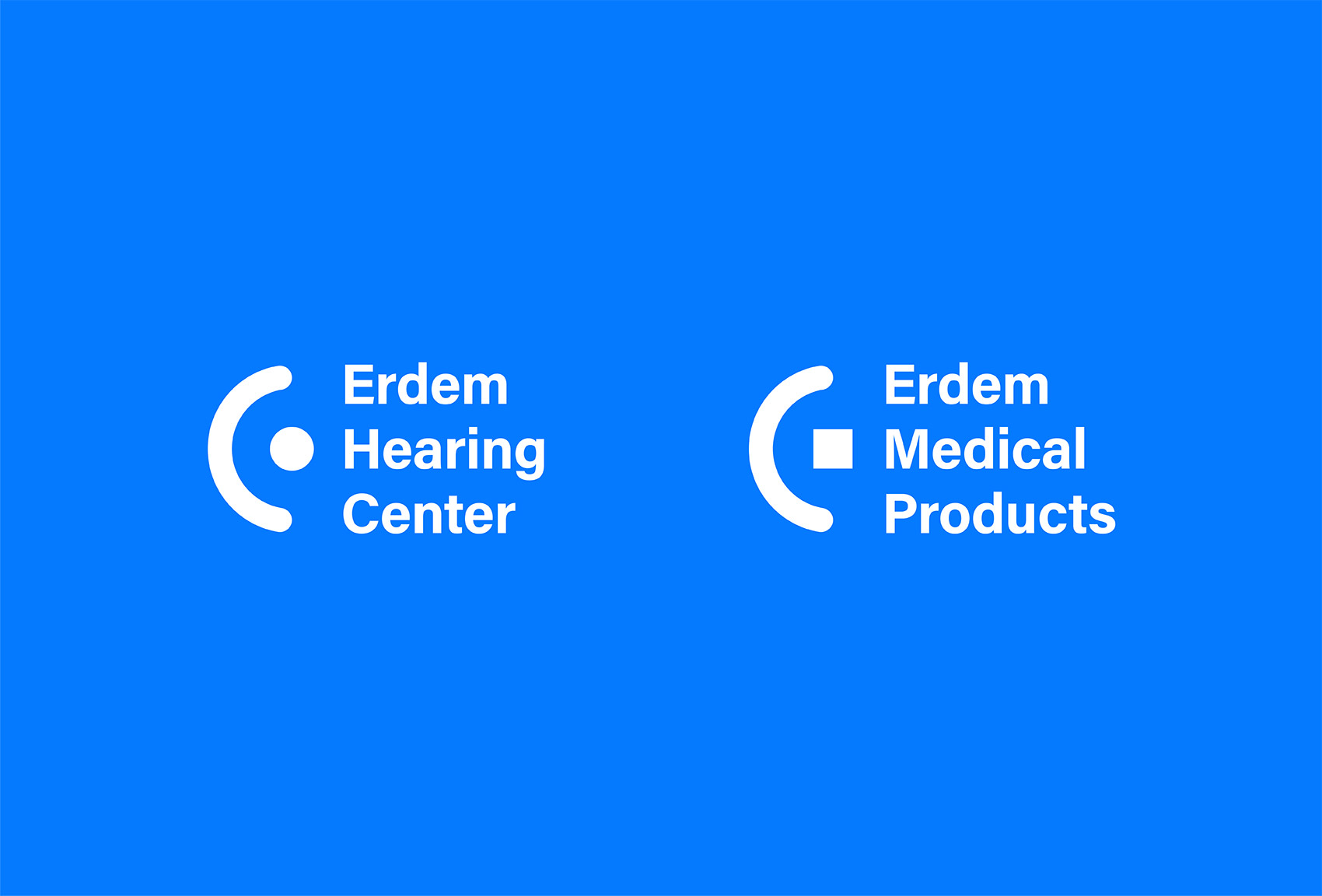
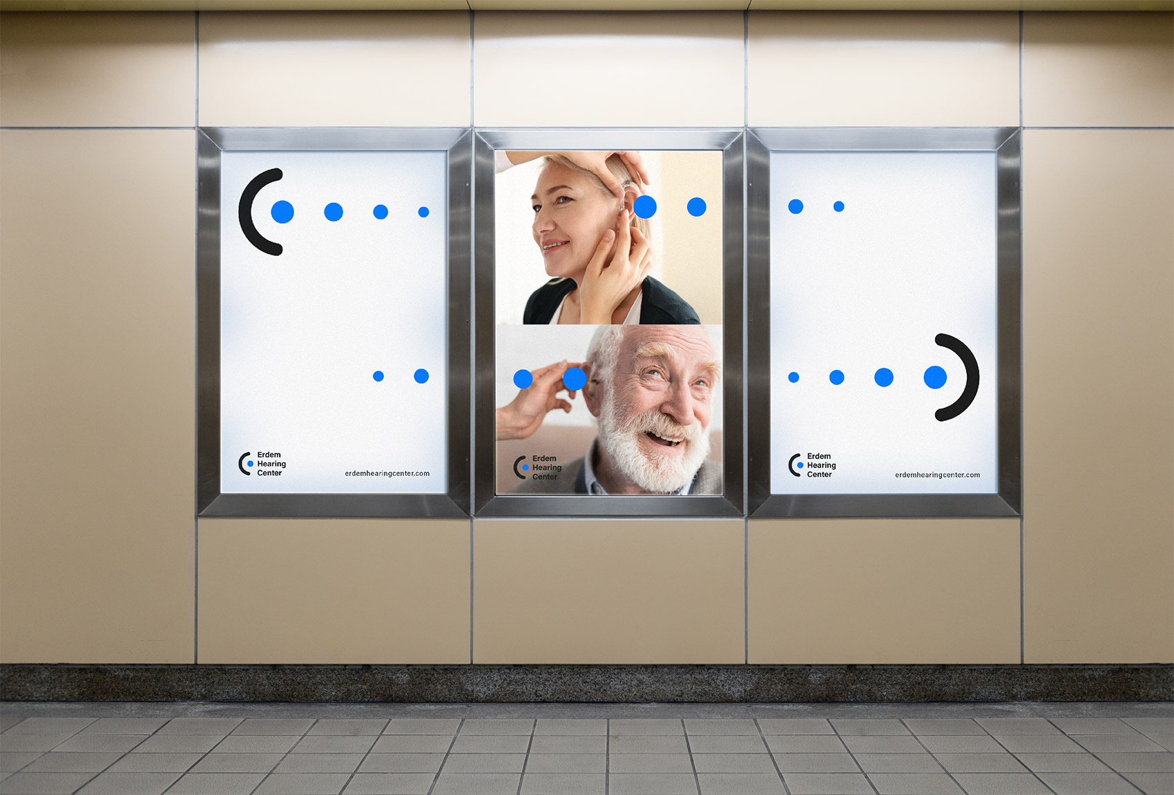
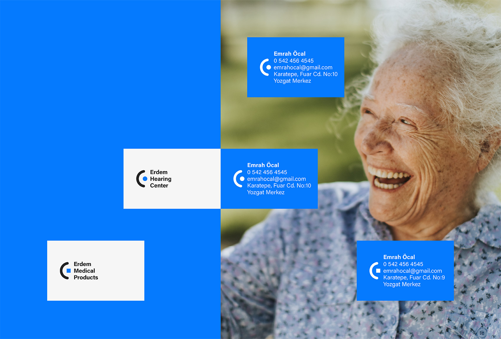
Erdem Hearing Center & Medical Products
Identity
...
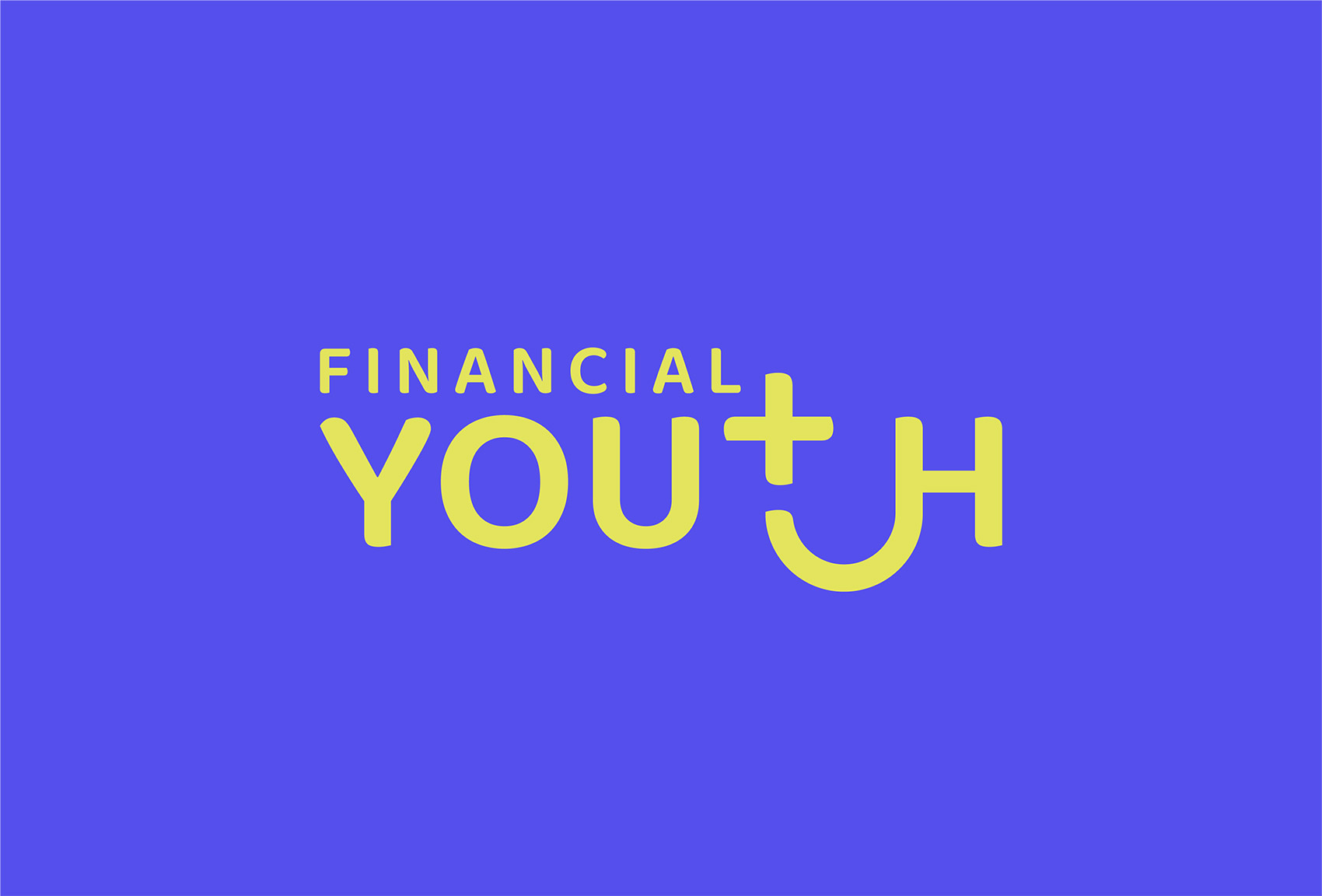
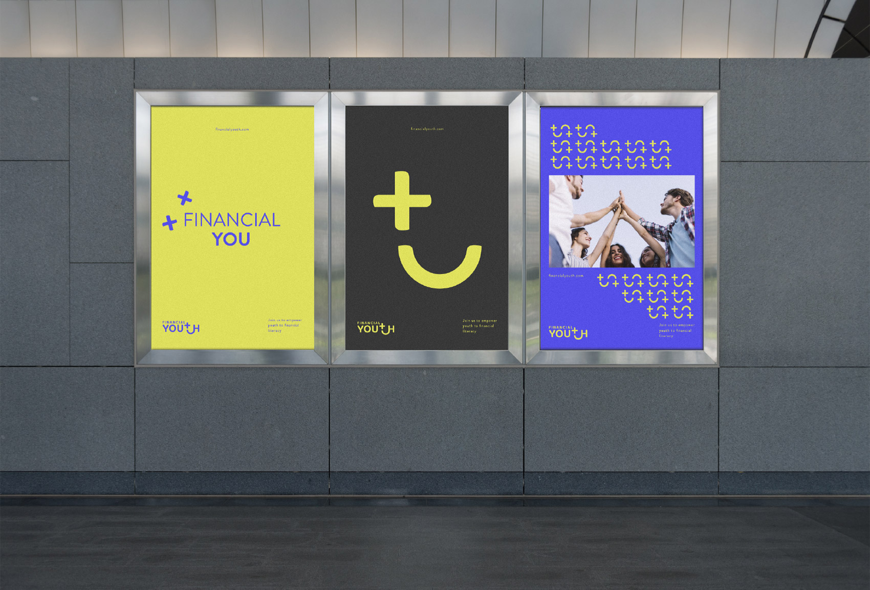
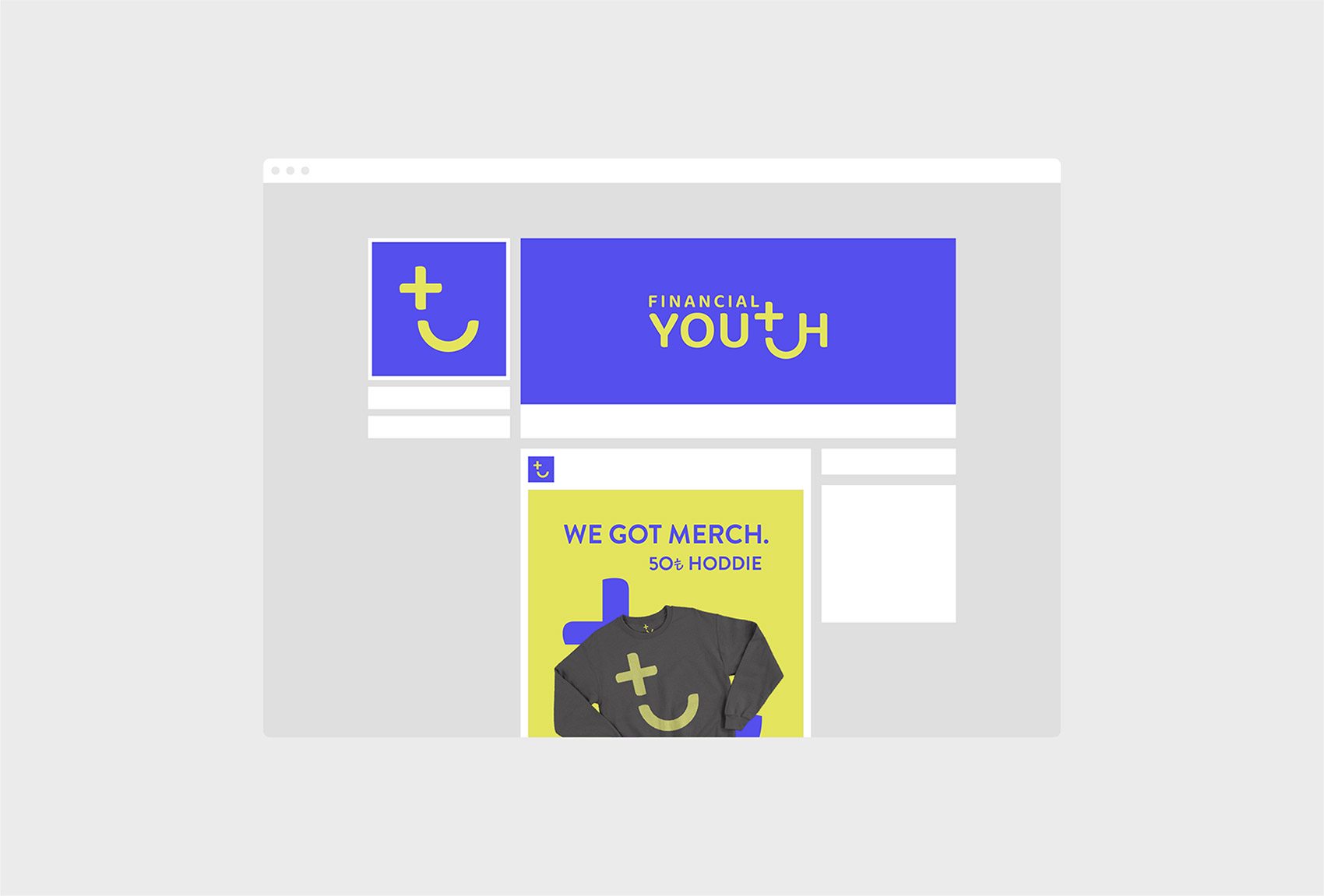
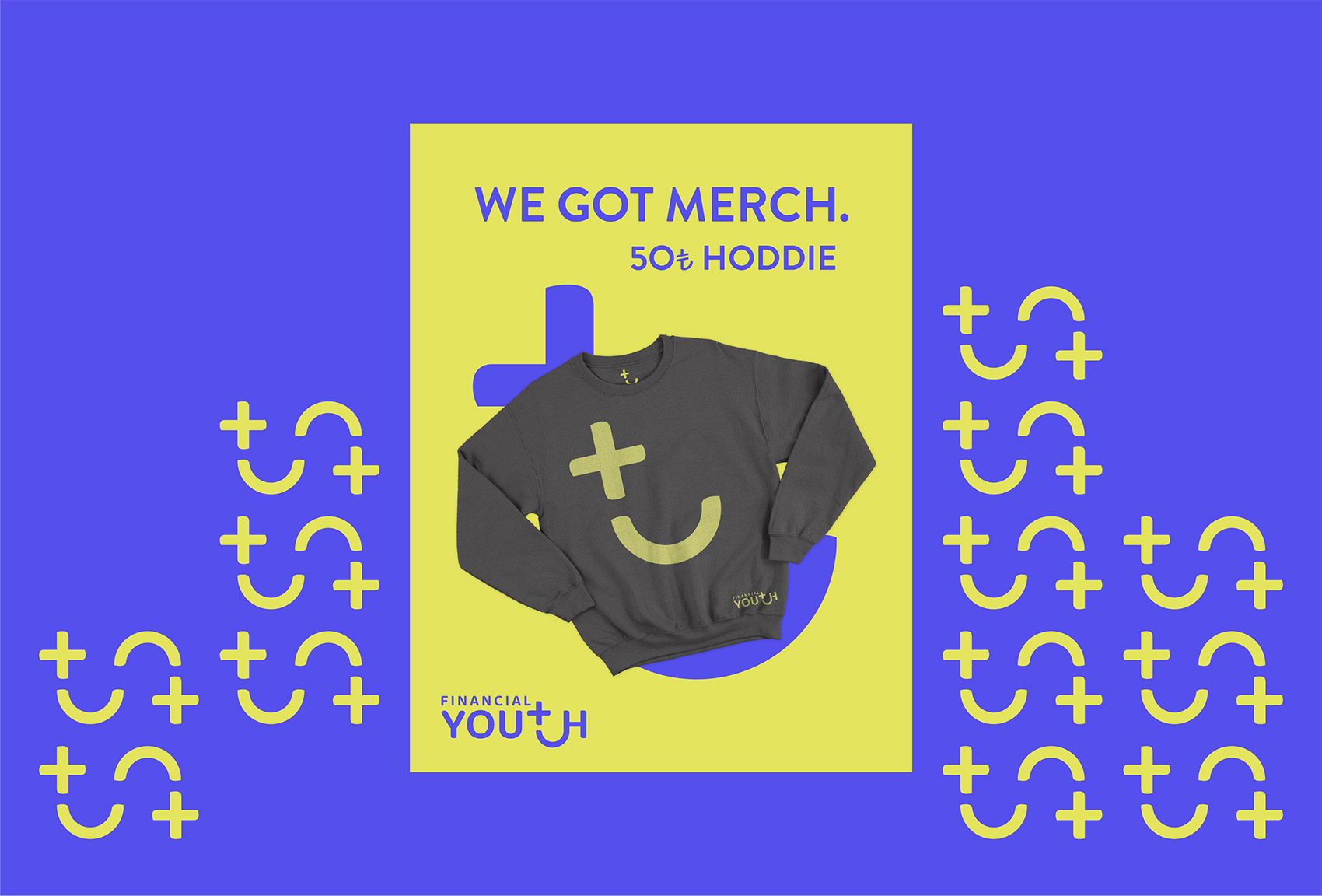
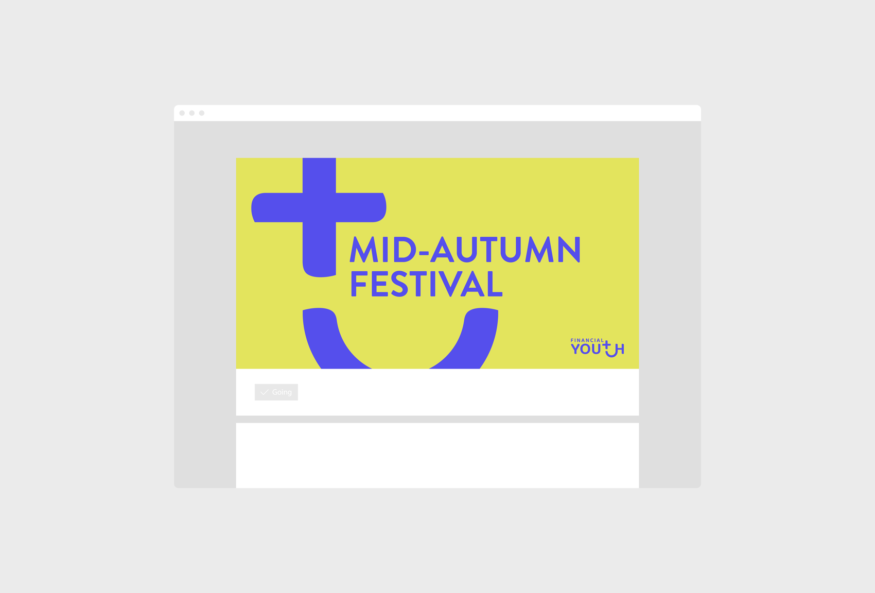
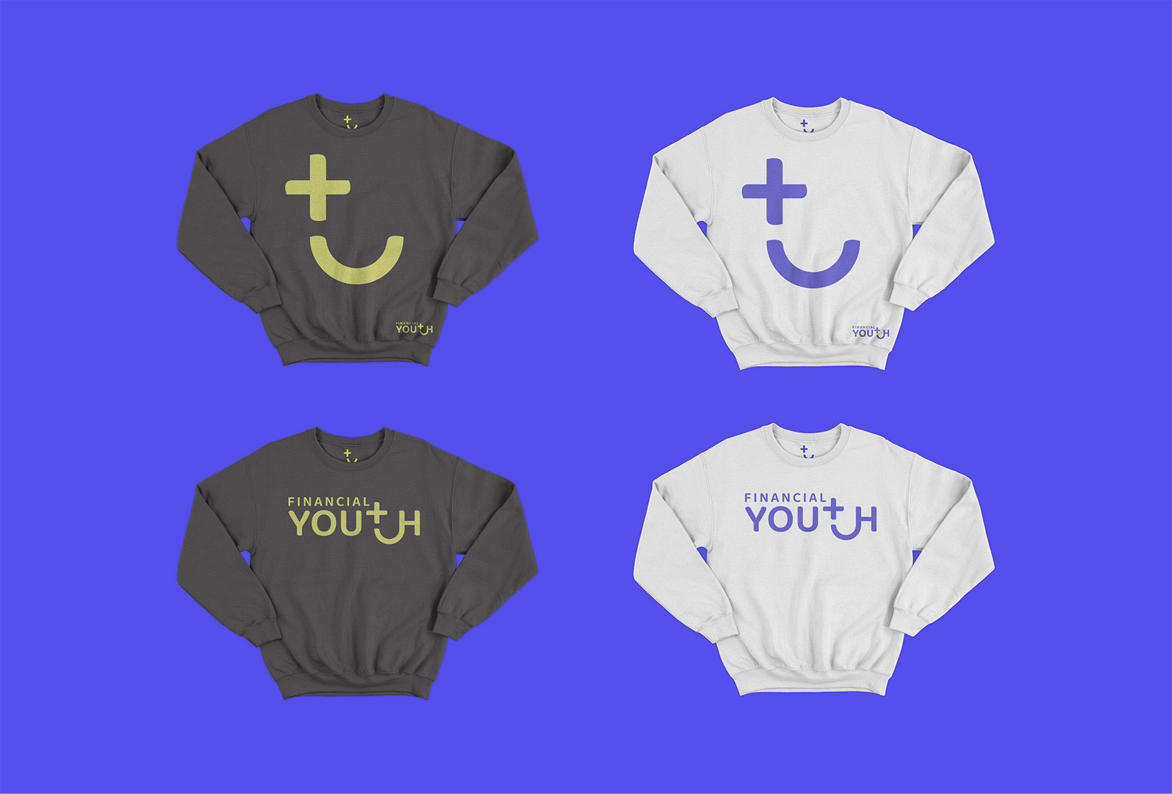
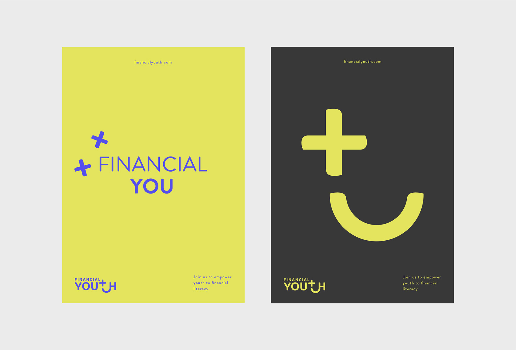
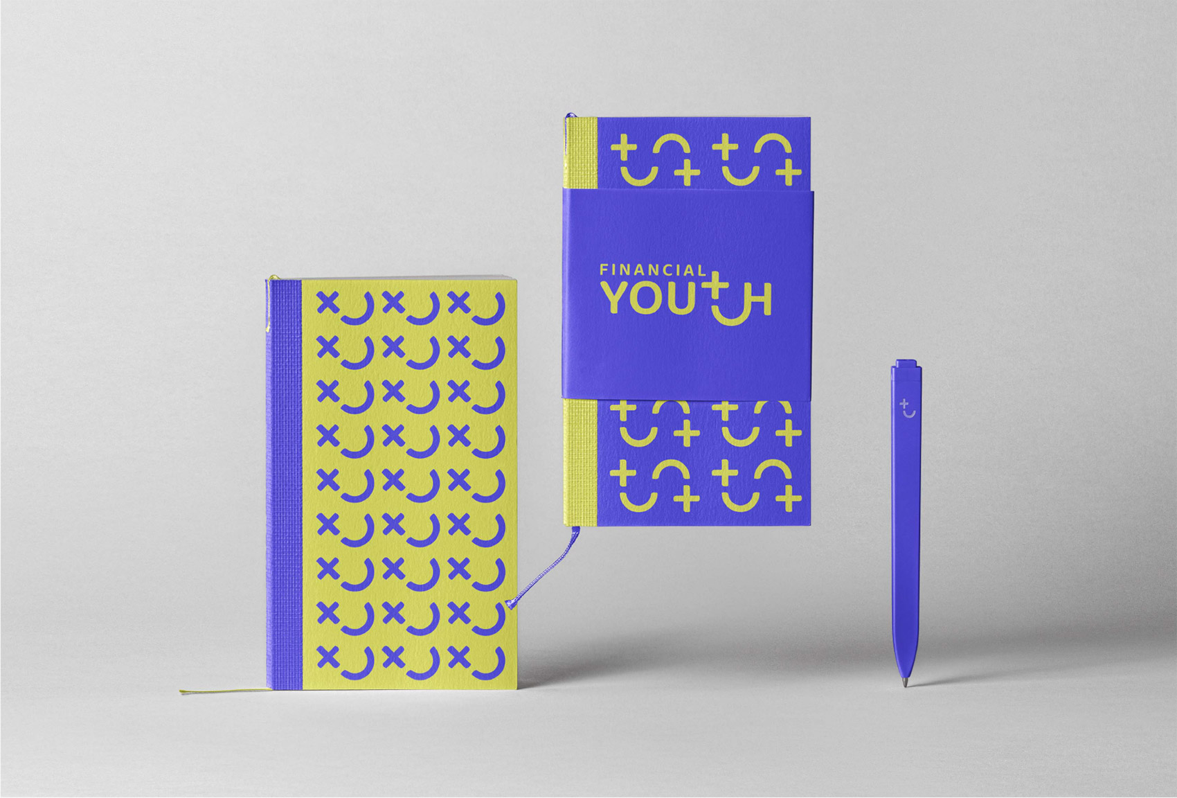
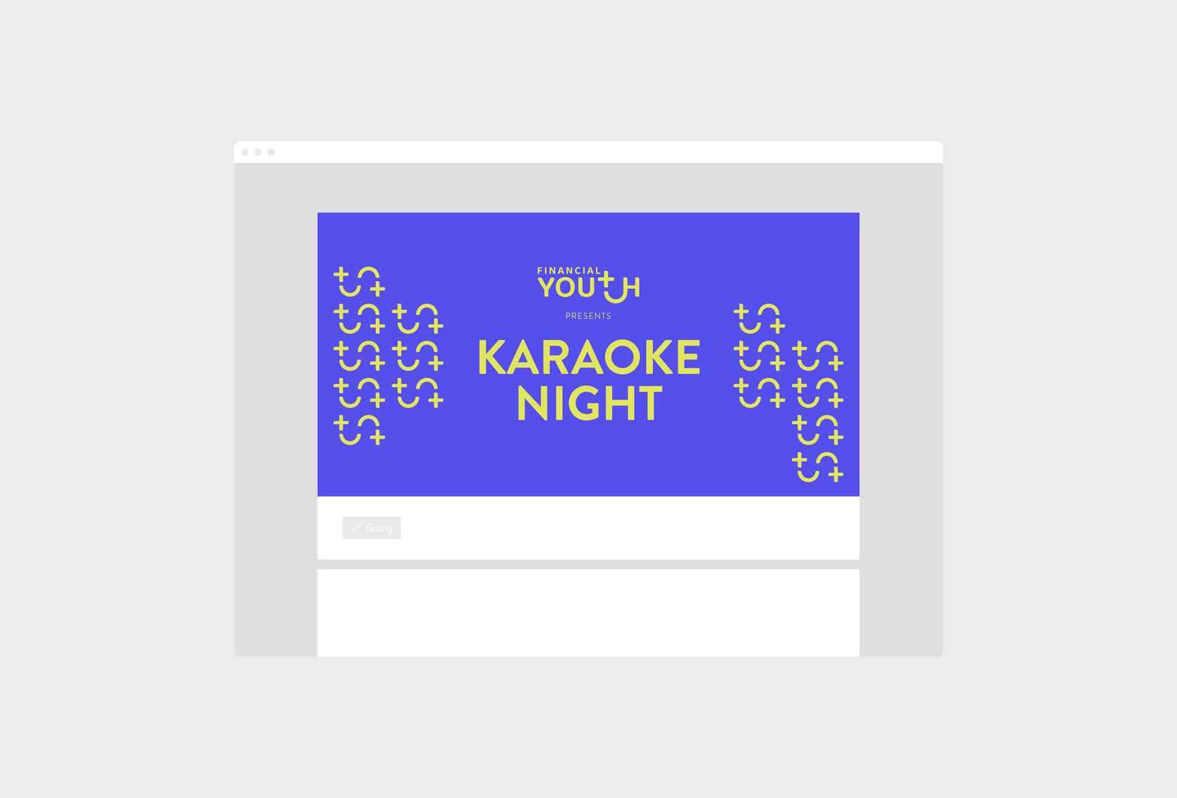
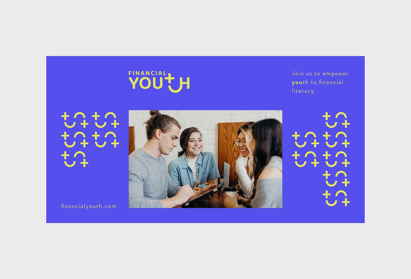
Financial Youth
Identity
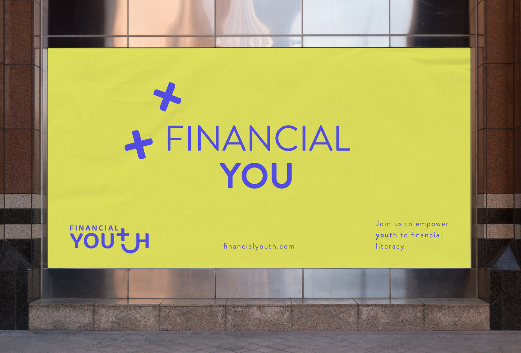
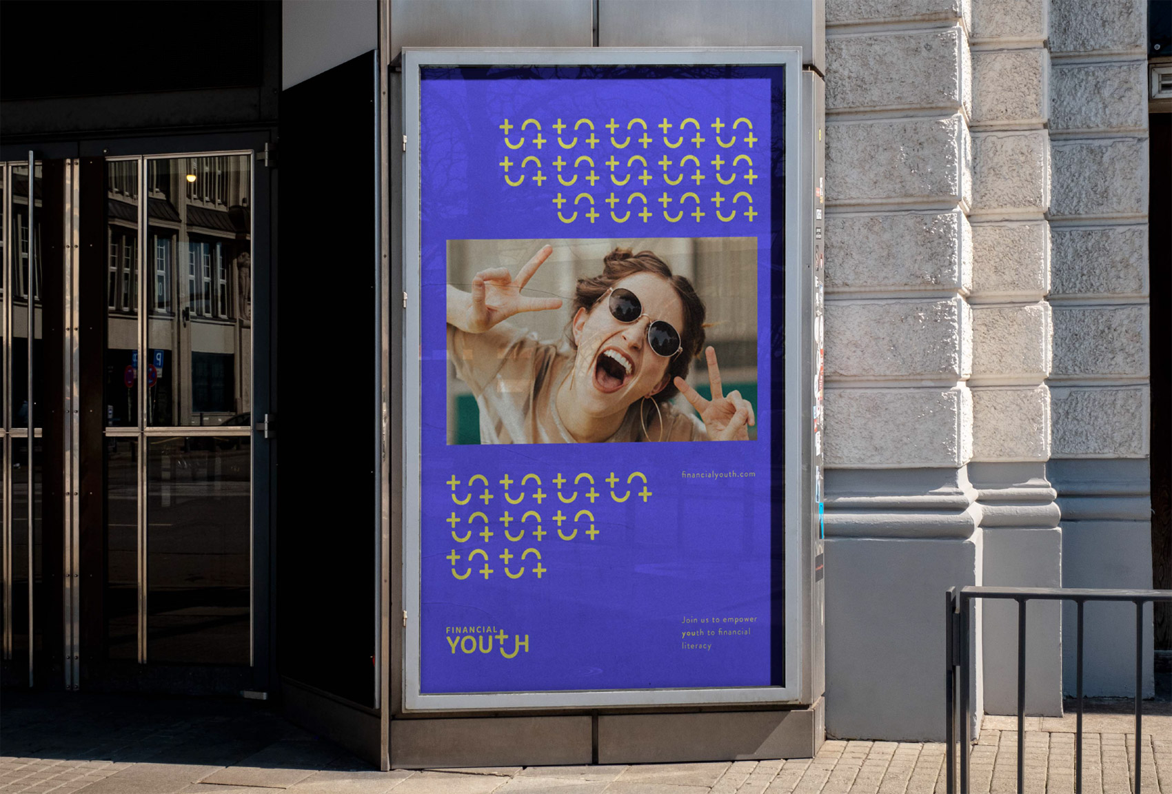
Financial Youth is a student club established by a group of college students who realized how hard the transition from teenager to adult could be with the lack of knowledge about financial literacy. Financial Youth Student Club aims to guide and empower the youth of our society to seek knowledge about financial management and probably entrepreneurship in the near future. Financial Youth's purpose is to help provide solutions for all aspects of financial management and investment in order to give people equal opportunity to a brighter future.
The logotype aims to give off the feeling of intelligence through the letterform of lower case t, which is split in two creating one plus sign, which refers to investment, and the extended tail connected to one stroke of H. On the other hand, the letterform of "t" creates a smiley face blinking one eye referencing the smartness that comes with being financially literate. This way, the brand vision is carried and reinforced in the logotype.
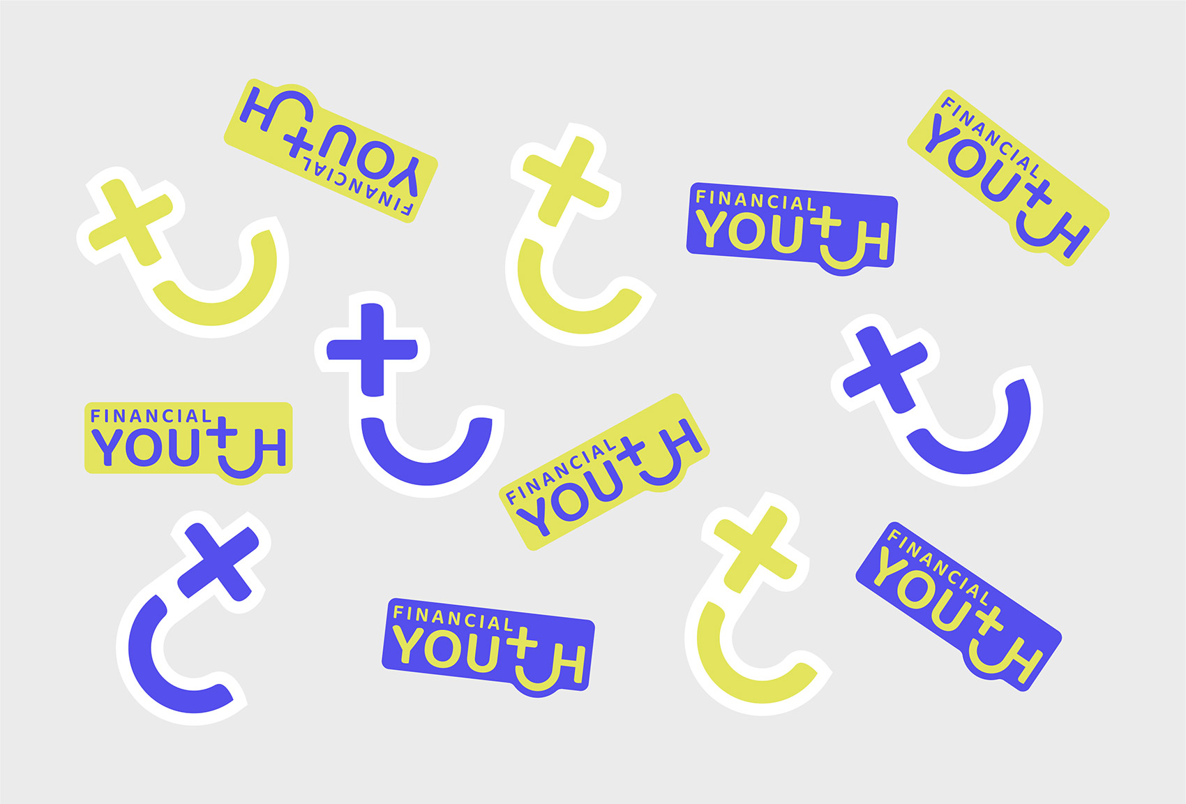
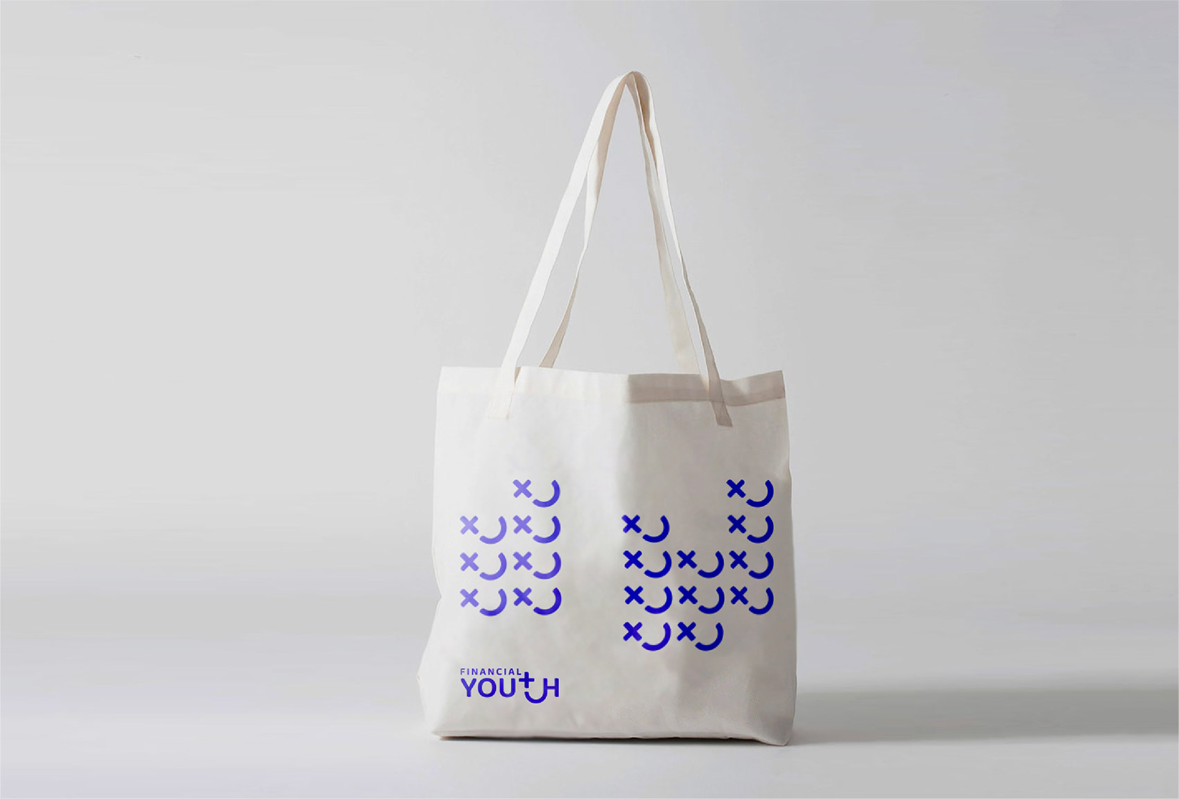
As a main graphic element, extended "t" extruded from the logotype is utilized and it represents financial literacy.
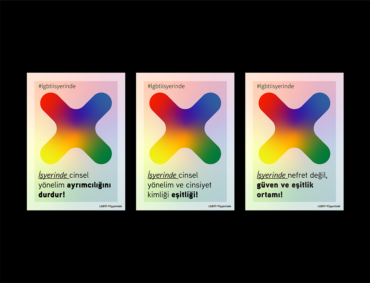
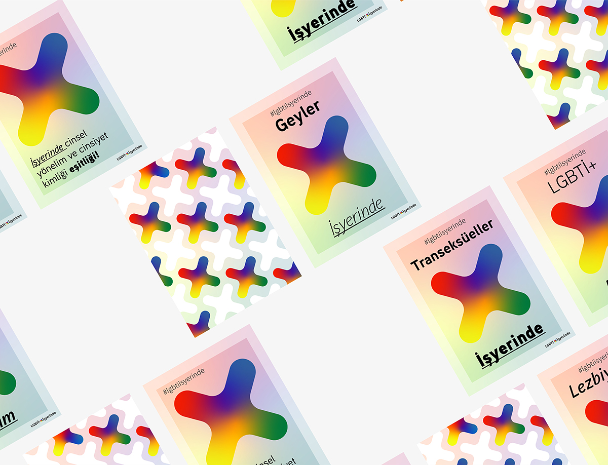
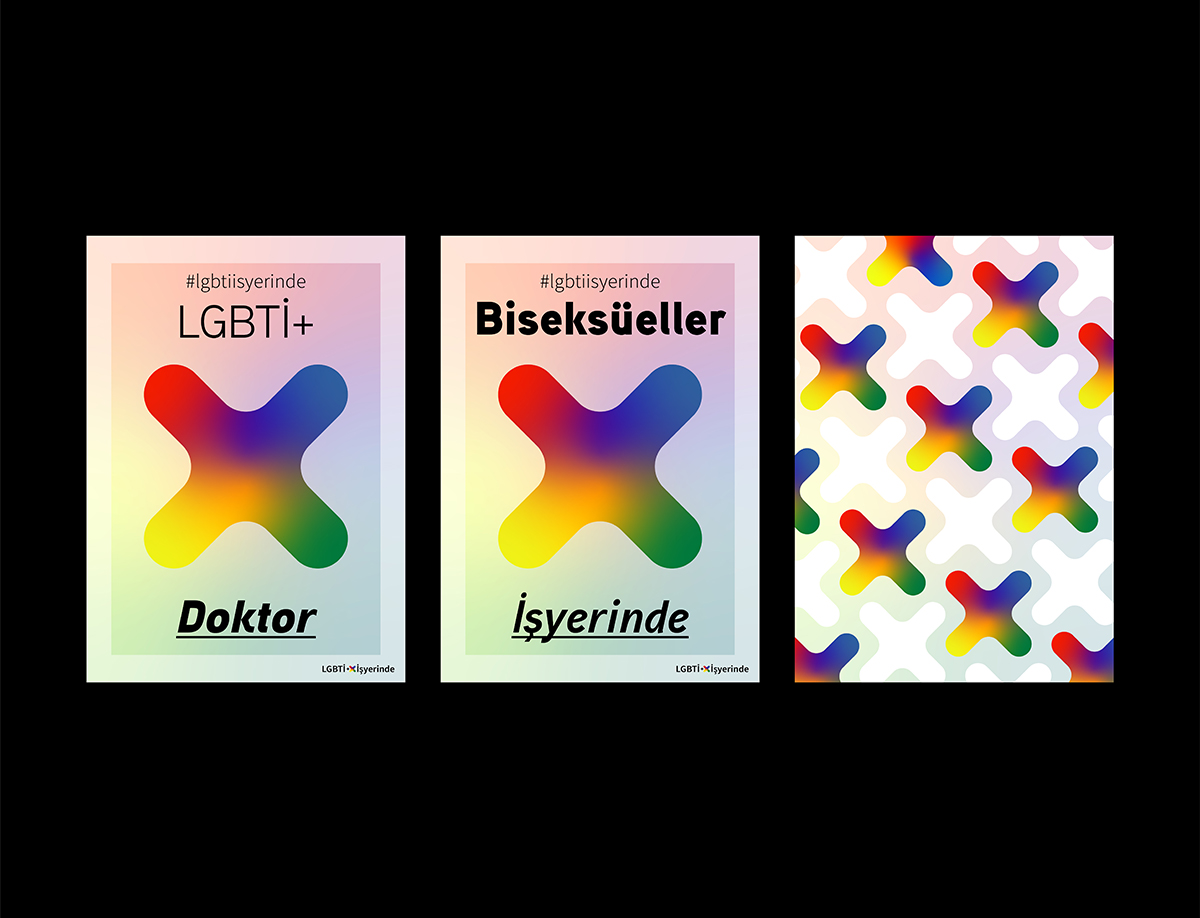
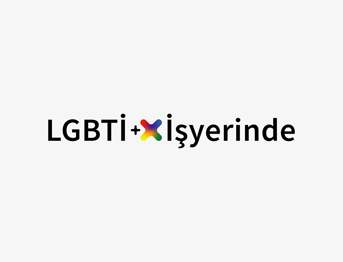
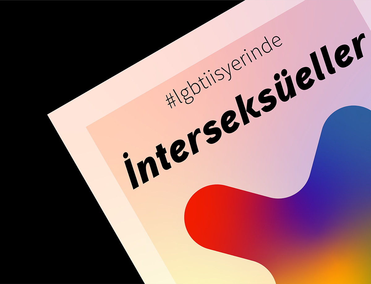
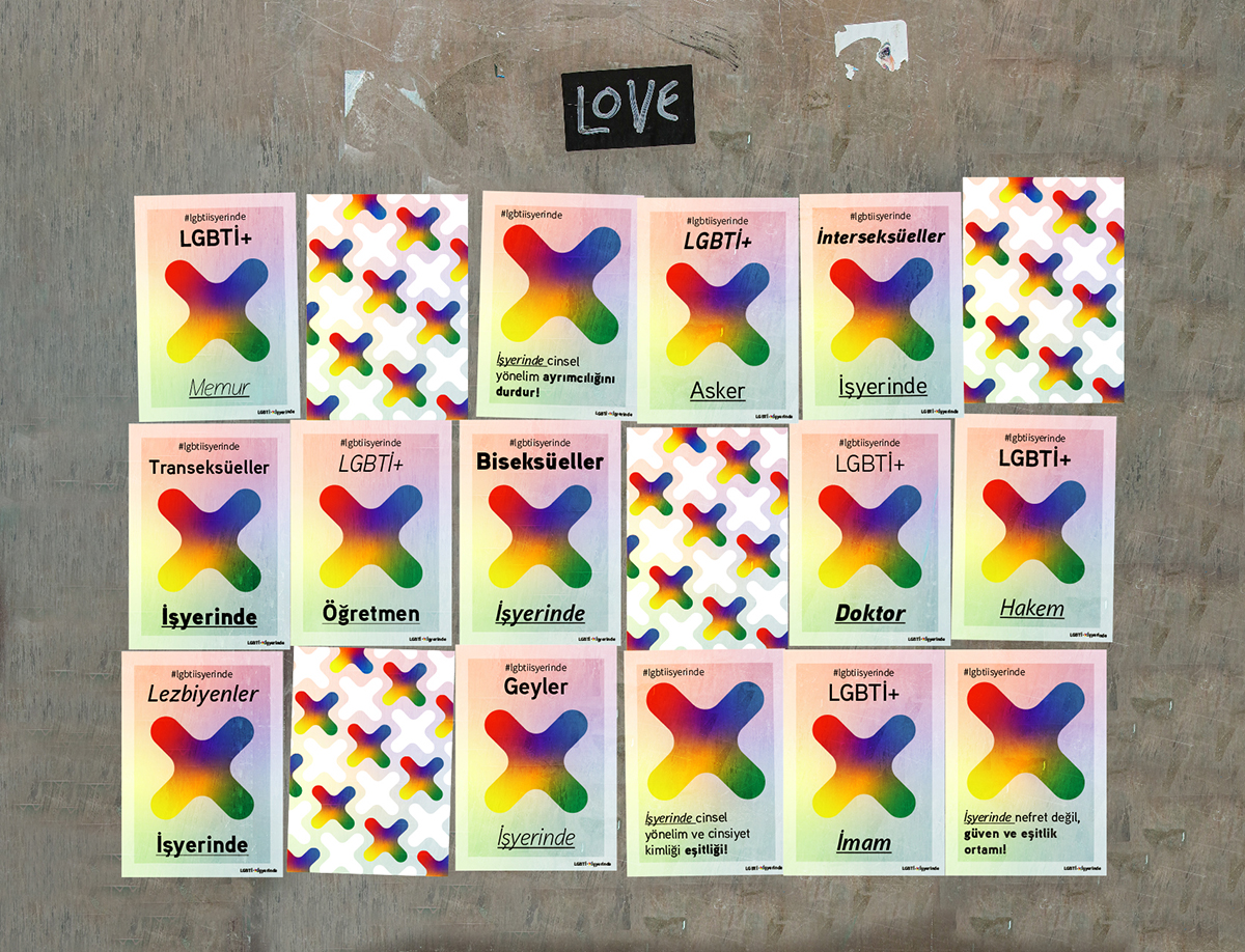
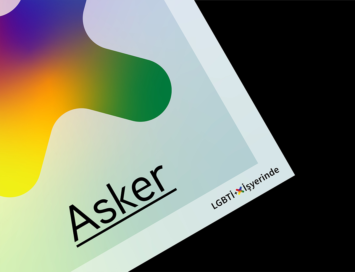
LGBTI + At Workplace
Poster Design
This poster series aims to raise awareness and address the issues about discriminatory behaviour that LGBTI+ people face in the workplaces by stressing the importance of inclusion and diversity through graphic and typographic language.
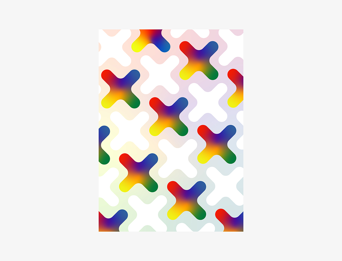
In the signature for the poster series, alongside plus sign is used the tilted and bigger version of it as a main graphic element. And these two graphic elements fit each other to deliver the feeling of inclusion and connection in between LGBTI+ people and the workplaces.
The colour of the main element is a blend of the colours of rainbow flag which reinforces the meaning of inclusion, diversity and togetherness in workplaces. The bigger usage of graphic element also correlates with raising the issue and increasing the visibility. Along with the graphics, using a variety of font styles also further contributes to the idea developed around embracing diversity as I, myself did in my design.